 T w e n t y S i d e d


If all of that sounds like a lot of work, then just roll a barbarian. This ain’t no Writers’ Workshop.
Shamus Says:
Here where we get to the stuff that really clicked for me. I love the reality-switching. This is what made the comic fun to write.
Super-pretentious art wanking: The in-game reality we see is an odd sort of meta-reality that only exists for the audience. When we see a fantasy shot, we see Ramgar as pictured by Chuck, Josh’s character as pictured by Josh, and so on. We’re seeing this blend of what everyone is picturing. That’s a fun idea.
Shawn Says:
Yay! The gnome paladin! Love that guy.
Artist Rambling #4, may be of interest to no one but me:
I’m surprised at how much I like the really sketchy look for Ramgar and co. As the comic went on, I moved to a much less sketchy, more iconic art style. I think were I to go back in time and do the comic again, I’d keep the in game scenes looking like Ramgar here does, and make the tabletop scenes look flatter and less detailed. More scribbles on the Player Characters, less on the Players.
If we were to do it today, I’d suggest using Comic Sans for Josh. The font has a reputation for being the typographical equivalent of a trollface, so it would suit him. And despite its reputation, Comic Sans is very readable.
Shamus Young is a programmer, an author, and nearly a composer. He works on this site full time. If you'd like to support him, you can do so via Patreon or PayPal.
Mass Effect Retrospective
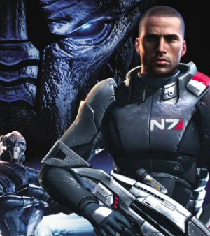
A novel-sized analysis of the Mass Effect series that explains where it all went wrong. Spoiler: It was long before the ending.
Games and the Fear of Death
Why killing you might be the least scary thing a game can do.
The Terrible New Thing

Fidget spinners are ruining education! We need to... oh, never mind the fad is over. This is not the first time we've had a dumb moral panic.
Black Desert Online
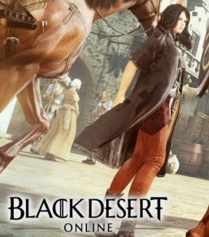
This Korean title would be the greatest MMO ever made if not for the horrendous monetization system. And the embarrassing translation. And the terrible progression. And the developer's general apathy towards its western audience.
Philosophy of Moderation
The comments on most sites are a sewer of hate, because we're moderating with the wrong goals in mind.
Assuming Josh’s is the “Hey!” line, I didn’t even skip a beat reading it (and I’ve never seen CB before this run).
Josh is “Silvershaft”. Or possibly “Sliwershafipl”.
Then I was even more confused because I thought that was the GM talking and the font indicated shock/surprise (I didn’t pick up on fonts beings tied to characters in the previous strips). And yes, it’s moderately hard to read.
Different colors, like in the Telltale The Walking Dead games would work well.
Is there an introduction somewhere that I’ve missed that shows the name of each character and which font they are using? I am very confused as to who is speaking or being spoken to when their speech bubble is disconnected from their face.
Also, I agree that the font used for the person sitting at the far right end of the table is nearly impossible to read.
We’ve had speech bubbles leading to each character in previous strips, if that helps.
It also becomes more clear as the strip gos on; all the characters have pretty distinct personalities.
…no names, though, come to think of it. I only know some of them because I’ve read CB before.
So Big Red Beardy man is Chuck.
The thin curly-haired power-player with the handheld console is Josh.
Quiet blond man with the red tie is…um…
…Dan?
And the guy with the glasses and the tiny moustache is…er…the GM.
Casey (the GM) and Chuck (human Garfield) say each other’s names in #1, Casey says Josh’s name in #2. I think the blonde guy doesn’t get named until his character creation, probably #6.
Marcus is the blond guy, right?
Comic Sans tends to be associated with a certain other character today. But not everyone will immediately think of it.
It’s a beautiful day outside. birds are singing, flowers are blooming.
Comic Sans is VERY readable, and we dyslexics appreciate its use.
Honestly, I don’t get the hate for comic sans. It’s not ugly, and it’s very readable. I think it just got overused by ’90s and early 2000s websites and the backlash for that got blown way out of proportion.
Yeah. Was Chainmail Bikini written around the time of the backlash? Hence Shamus & Shawn picked something else.
Shame. Honestly, hyperbole on the internet is a worse scourge upon humanity than AIDS and cancer combined!
I see what you did there.
To many people, myself including, Comic Sans is incredibly ugly. Part of the hate must be coming from this.
Ugliness is not a reason to exclude the disabled.
Does it really help? Can you explain this to me? I never heard about it before, so I’m a blank slate in this matter.
Every letter in Comic Sans is distinct in ways they are not in other fonts, so it makes it a lot easier for dyslexics to read the words without mixing up letters.
I think the best compromise is a transcript (like the one provided under Darths and Droids) in whatever is agreed upon to be the most readable font. That way, the comic can look however the creators would like, but the transcript can be consulted for anyone who cannot follow the original version.
I dig Josh’s font a lot. It tends to be a bit hard to read, but to me, it only adds something to the experience. I MAY BE in minority here, but I like it. :-)
Barbarians are the best class – and it’s surprisingly flexible. The ideal adventurer.
And, in 5e, they get to FIGHT NAKED which is amazing.
Fighting Naked, eh?
Enemies take -2 on To Hit Rolls because they’re trying to avert their eyes?
Chest hair counts as natural armor?
The unwashed beard counts as a shield that leave your hands free?
In other news…does that Gnome Paladin have hair on his warhammer? And his armor?
The answer in 5e is “Chest hair counts as natural armour”. Barbarians get to add their Constitution bonus to AC.
I liked Josh’s font. It made him sound like an Elder Evil struggling to speak through the mortal vessel it possessed, which was appropriate to his character.