T w e n t y S i d e d
This is about the dumbest thing I’ve ever seen done with Adobe Acrobat, and that is saying something. I’ve seen companies use PDF files to document various API’s (computer code stuff) for developers. (Note that this is astoundingly annoying, since you can’t cut & paste text out of a PDF.) I’ve seen PDF used for stuff more suited to HTML. Heck, I’ve seen it used for stuff that could go in a simple plaintext file. PDF files are naturally slow, akward, difficult to navigate (no hyperlinks!), and more bandwidth-intensive than they need to be. Once in a while Acrobat is the right tool for the job, but the program is abused far more often than it is used.
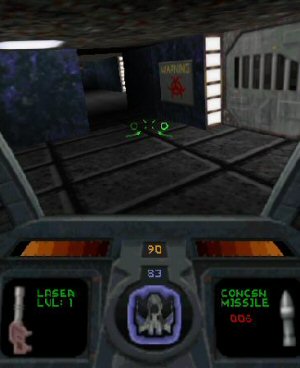
But this example takes the cake. It’s a map of Kennywood, a smallish amusement part near Pittsburgh. Instead of being a simple image, the map is made from icons / symbols / vector graphics which draw in very, very gradually. Here is what it looks like when it’s fully rendered:

Note that everything on the map is a little doodad that must be drawn. Every tree, every icon, every building, everything. These little bits render a few at a time, slowly filling in the image. On my 2Ghz machine I clocked it at about a minute and a half (!!!) to complete the entire process. Note that if you do anything that requires a re-draw, it must start over at the very beginning. You can’t scroll, or zoom, or switch to another window, or resize the window, or anything else. You just have to sit there and not touch it for 90 seconds while it paints the map a few elements at a time. Note that the most important info – the labels – are drawn last. Most of the time is wasted drawing the little trees.
Pathetic.
Who’s idea was this? I can’t imagine the level of misunderstanding that would lead to developing and distributing a map this way. If they had taken the final map and simply turned it into an image, (as I have done above, took less than a minute) it would have been about 1/5 the download, it wouldn’t have required Acrobat, (which the user might not have) it would have rendered instantly, and it would have allowed the user to scroll around and examine it in detail.
UPDATE: It just keeps getting better:

Shamus Young is a programmer, an author, and nearly a composer. He works on this site full time. If you'd like to support him, you can do so via Patreon or PayPal.