 T w e n t y S i d e d
This has been on my to-do list since Josh and Mumbles began posting here. I need a quick visual way to let the reader know who wrote the post. Usually this is done in a byline, at the end, which I always thought was a bit late for that sort of trivia. I know this is causing confusion for some of you. (And me, to be honest. I’m still not used to the idea of sitting down and finding new posts on my own blog. It’s like finding new groceries in your fridge. Awesome, but disorienting.)
Having a picture of the author is obviously the way to go. I can easily pull up the avatar for the author and make it whatever size I like. We already have the author’s name at the top, but since that says “Shamus” 99.99% of the time, there’s not much reason for people to look there. Then Mumbles says something like, “As a woman, I’m offended by Shamus’ willingness to put words in my mouth!” and people read it in my voice. Suddenly it sounds like I’m [even more] schizophrenic, gender-confused, and an idiot.
Where the picture should be put? I could put it on the right of the title, opposite the category pic. I could put it beside the category pic. I could put it on another line just below the category pic. The important thing is that the header should be as compact as possible, while maintaining some sort of pretense of caring about aesthetics.
Any suggestions? Any blogs that do this properly that I might emulate?
EDIT: IT IS DONE.
I’ve made a plugin that will add the author’s icon to the beginning of every post. Except, it wasn’t that easy. I had to make it search past all the images and youtube embeds and whatever other crap might be sitting at the top of the post, and then scan down and find the first real paragraph of text. And then it has to tuck the icon in between the opening <p> and the actual first letter of prose.
But it seems to work. I might fuss very slightly with the theme, but let’s see how this shakes out. It might break some obscure old posts in my archives. Rather than inspect all of my thousands of posts manually, I’ll just wait for one of the many archive-skimmers to notice and say something.
Thanks for the feedback.
Shamus Young is a programmer, an author, and nearly a composer. He works on this site full time. If you'd like to support him, you can do so via Patreon or PayPal.
Shamus Plays LOTRO
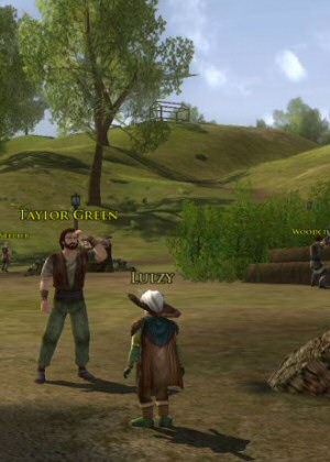
As someone who loves Tolkein lore and despises silly MMO quests, this game left me deeply conflicted.
Blistering Stupidity of Fallout 3
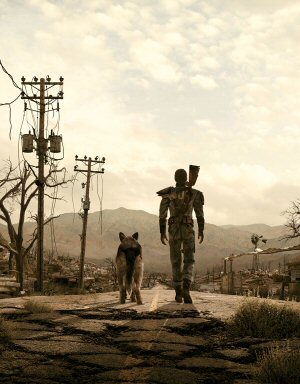
Yeah, this game is a classic. But the story is idiotic, incoherent, thematically confused, and patronizing.
Programming Vexations
Here is a 13 part series where I talk about programming games, programming languages, and programming problems.
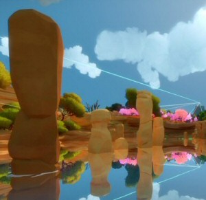
The Best of 2019

I called 2019 "The Year of corporate Dystopia". Here is a list of the games I thought were interesting or worth talking about that year.
Black Desert Online
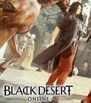
This Korean title would be the greatest MMO ever made if not for the horrendous monetization system. And the embarrassing translation. And the terrible progression. And the developer's general apathy towards its western audience.
Why not use your avatars as a sort of text illumination? Put your (or Mumbles’s or Josh’s) avatar at the beginning of the first line of text. That way, we all know who’s talking.
EDIT: And for those posts where you all add bits and pieces, jut change the avatar at the point in the post the speaker changes.
This. Brilliant solution.
was going to say something then I read this… Nuff said
Personally i’d just color your names differently, along with increasing the font a bit to make it stand out, maybe switching priorities from “posted in, by” to “posted by, in”. Would only be a problem if a multitude a people suddenly started posting.
I hate to say it, Shamus (because it involves a tad more work on your part), but the answer is obvious.
Look at these comments. Our avatars are top-left, next to the “title”. That’s where people expect them. That’s where your author pics should be.
It’s the category pic that needs to move… (Probably top-right.)
I completely agree. Consistency is key.
However, two icons in the article header would be a lot for that space. The category icon, name, and navigation could be pulled into a separate space above the article header.
I third this as well. The current layout is just not really compatible with having multiple authors for posts, assuming you want to actually make the author of the post relevant.
The problem I see is that we often go for weeks without a non-Shamus post. My icon, over and over, prominently, at the top of every post. That sounds… unappealing.
I can just imagine how that would look to newcomers. They would conclude I’m a massive narcissist.
You could perhaps change the category picture to an avatar of the poster only if the poster is not you.
It would not be as clear as having an avatar picture for each post, but I do think it would be an improvement over the current situation.
I would recommend having the category picture show user avatars if the post isn’t from you. Or you could make a whole new category for guest posts, so people would look at the authors name when they see the guest-post symbol.
I think the simplest solution is to other people post in their own category. So Mumbles would post in a “Mumbles” category, with it’s own picture.
If guest posts ever reach a frequency where guest posters need to distinguish categories within their own posts, this system would need to be revised, but for now it would work well.
Except…
Spiler Warning posts all go in “Let’s Play”. If they went into their own category, it would brak the prev / next post navigation, causing that post to not appear with the others.
Is there a way you could code things so that if someone else make a post it override the default category picture?
So if Josh posts a Spoiler Warning episode, it has a picture for him instead of the Let’s Play one.
Are you not able to assign multiple categories to a single post? Or am I thinking of tags?
It seems like the cleanest, but most complicated way to do this is custom avatar code.
If Author == Shamus then Icon = CategoryIcon
Else Icon = AuthorIcon
Oh, I see. I had missed that it was the Spoiler Warning episodes that were being posted by guests. Hey, you should add some sort of photo so we know . . . er . . . never mind.
Problem with this is that several of the Spoiler Warning eps get posted by Josh and co, yet we wouldn’t want those posts to be filed differently than the other SWs.
EDIT: wow, ninja’d by Shamus
Ha!
If most of the posts are yours, a distinction is only necessary when your “guest” authors post. How about displaying their avatars but hiding your own?
You could make it only show an avatar if it’s not you. Otherwise, either leave it blank or show something more generic, like your 20 sided icon.
Otherwise, I think you need to add something for when someone else is posting. It’s too easy to just gloss over that small text at the top that is only slightly different. Add something in a different size, font or colour that indicates, hey, this is not Shamus. Then we can read the “by” bit to see who it is.
Hmmm, a different font for different authors (i.e. speakers)? Sounds like something that was done in Chainmail Bikini… :)
Now you know what my Facebook page looks like.
So wait, if you put avatars, it’s going to be your picture?
If I may be so bold, if you do put a picture we are supposed to associate with authors here, it should be some sort of caricature commissioned from one Mr. Skarn. The picture he did of you guys for Spoiler Warning was great.
It wouldn’t even necessarily need to be something original. I automatically associte hobos with Rutskarn, hermits with Mumbles, and bonnet-wearing, murderous psychopaths with Josh. That just leaves you, Shamus.
“I can just imagine how that would look to newcomers. They would conclude I'm a massive narcissist.”
So?
I’d way rather look at your mug than mine, so…
So I take it you decided you were a narcissist after all. :P
Then make your Icon something else that won’t create that impression. Such as maybe instead of a photo of you, a photo of a twenty sided dice?
This sounds right. I’d suggest that the avatar wouldn’t be necessary in your posts, Shamus, being a sort of a default. (As in, I still start reading every post as yours until something doesn’t seem right.) Only having the avatar when it’s someone else posting would also help people notice the difference, I think.
And of course, the most important reason is that otherwise we’d have two Shamuses (Shami?) staring at us at the top of Personal posts.
Edit: Oh hey, you agreed in advance.
Edit II: Though even if we did see your avatar displayed rather too prominently, it wouldn’t be quite as questionable as when all your “ads” were pictures of yourself. ;)
I’m going to be contrary: I think it belongs on the right side, because we’re already so used to seeing category icons in the top left for articles. So it looks like this:
Category Icon Title Goes Here Poster Icon
Gives it a book-end effect.
I’m with krellen. As it is now, there are two icons one above the other, and a blank space to the right of the post title.
I’d do both what RTBones and poiumty suggested.
The Avatar is a handy visual cue for the speaker, and pushing the name in front of the category puts it closer to the avatar and makes it more relevant.
+1. Use of Avatar, larger size for name, and different color.
In truth, I don’t like any of the above solutions, but has already been mentioned, the layout of the site isn’t that compatible for multiple authors.
On a positive note, no matter what you try, you can’t FUBAR it to the degree Gawker Media has done with their blogs.
In the RSS feed, there is simply the post title and the author below. Works great for easily figuring out the writer.
So possibly implement some of that simplicity here? Move the “Posted in,” “Previous in,” date and time to the bottom (which will eliminate the duplicate “Previous in” as well). This leaves only the title and the author at top. Make the author text a bit larger, and you’re golden.
This sounds like a pretty good idea to me.
Make it into a tiled background, flashing between positive and negative exposures. Probably want to add some glittery scrolling marquee text that floats over the post, to keep the reader’s attention
Maybe also add a distinct catchy jingle for each author that loops endlessly in the background.
This is an excellent suggestion. Obviously there are TWO ways to eliminate reader confusion, and eliminating the confusion is much more difficult.
Mumbles needs a bee hive ambient sound!
Nah, Mumbles and Rutskarn need the beat boxing track they did during the Shadow Broker.
Josh can have his “STOP SHOOTING ME!” lines, maybe a randomly generated one each post.
Shamus…can have the opening theme of Spoiler Warning?
No, Shamus’ would have to be “I love System Shock 2.”
I personally appreciate the confusion. I can see why people don’t like it, and I’m the aberration, I know, but getting to the end is just another chance to laugh at not paying attention, and the inconsistency and misreading can lead to some hilarious mental pictures.
Des cries at the new version. It breaks up the page too much. Double-sad-faced-accino
You could create new categories to put things in; instead of Josh posting in Spoiler Warning, he posts in Josh’s Words or something, with the category avatar being his. Same with anyone else who posts here; they get their own category, and people start to recognize the avatar. Might be easier than the other options.
I don’t think you even need to use avatars. If you move the “Posted by ____” line up so that it appears to the right of the post title (still small font size) I think it would be a more natural read than it is currently. Maybe even shorten it to “by _____”; I envision it being more automatic to read it as “Post Title by Author”, rather than read the title, then intentionally read the posted-by line. Keeping the font small would separate it from the post title.
I think you ought to just have representative avatars instead of your own avatars for posts. So Shamus has a D20 rolling a 1, Josh has a picture containing ludicrous amounts of Dakka, Rutskarn has Rutskarn starring as Rutskarn, and Mumbles has BEES.
I always notice the post author. Always. If the existing solution is good enough for me, then by gum, it’s good enough for everybody. And this is how you can tell that I’m an expert designer with lots of experience putting himself in the shoes of other readers, to whom you should listen intently.
You could put an overlay icon for whomever is posting on top of the category icon. Some small 16×16 thing in the bottom corner, or an outline perhaps.
Huh. I always read the ‘guest’ posts in your voice anyhow, since you’re my hero. So I just channel my inner Shamus and there we go.
How about giving a different color to the post’s title depending on the author?
Blue, Green, Red, Pink, purple, etc…
It looks nice now.The only problem I see is when you post in the personal ctegory,and we have two slightly different pictures of you one below the other.
What you’ve done with the avatar looks good… when the first part of the post is text. When it’s a picture (or Youtube embed), it just looks silly, because there’s this lonely little icon floating all by its lonesome.
As far as the “I’m going to see myself a million times if I do this”, perhaps you only need the icons for when it’s someone else posting (as mentioned above), or only for the Lets Play category. You could even have a double picture; Star On Chest with the author’s avatar right next to him. That would eliminate the lonely icon problem.
Simple solution
First line of post text:
“Josh here”
“Hey, it’s Mumbles”
“Look, it’s a flying taquito…no wait, it’s just me, Rutskarn”
People may overlook the title block, author section, category, and avatar pictures, but everyone reads the post…or if they don’t, who cares who the author was.
I really like this idea actually was thinking something along the same lines… maybe colour the sentence differently..
just a short one for each poster and if it’s Shamus there doesn’t need to be one, to avoid it being a highlighted mess like one of my textbooks
I have to say that I’d prefer what eides suggests here. In my opinion all of the post-update links, headings, subheadings, and pictures make the blog look really cluttered now. Then again this is from a lurker’s perspective who just likes to get in and get out clean and easy.
The problem is, your icon is you, and everyone who frequents this website knows what you look like. Josh’s icon looks like it might possibly be him (I have no other reference) but when I see Mumbles’ icon I don’t think “Mumbles” I think “Holy crap, it’s Batman!”
I asked my roommate for my Robin pictures from Disneyland. Perhaps a Gravatar change shall happen in the near future.
Mumbles isn’t Batman?!
STOP THE PRESSES!
This I did not know. I thought the arupt voice change was Batman’s voice box gadget at work.
She is. It’s just more attempts at keeping that secret.
Batman’s insidious reverse psychology tactics will not work on us.
OR WILL THEY
to the right of the title, opposite of the category would be easiest. Best (but also hardest) would be snuggled with the text at the top-right of the first paragraph with the text around it. I don’t do wordpress so i don’t know how easy that would be. but my two cents.
Can you get rid of one of the “previous in…” lines? Having two of them is a bit overkill.
Eh, not really digging the picture thing. Seems… odd to me.
I’d rather you have Josh/Mumbles say “Josh/Mumbles here…” at the start of each post.
The little avatars at the start of everything is annoying. To me at least…
Ah…no longer shall I think Shamus is talking in the 3rd person when its really Josh or Batman talking.
I might be the first one to point out a broken post…
However, the Avatar placement in your Anniversary post isn’t right
http://www.shamusyoung.com/twentysidedtale/?p=10513
@Shamus: It broke! Your recent anniversary post has a caption as the first piece of text so your photo is in the caption box.
I like the pictures. It seems to have skipped all the DM of the Rings posts, which is good.
Apart from the Dungeons and Dragons character introductions, the plugin doesn’t seem to affect anything.
And, even at that, it doesn’t break the character intros that drastically. Barely noticeable, I’d say. It only inserts Shamus’ smiling mug between the character portrait and the text.
I only mention it because Shamus did.
(Also: Correct me if I’m wrong, but Heather doesn’t have an avatar set. Her’s appears as a G, turned such that the opening is facing upwards, mimicking a “Power On/Off” switch.)
EDIT: Oops, missed one. When an article begins with a quote box, the avatar is included INSIDE it (As in http://www.shamusyoung.com/twentysidedtale/?p=10258 . It seems like Shamus is talking, but the quote he pulls is from a commenter. A tad confusing.)
Because of this, I’m interested to see what happens when an article begins with a strikeout.
It broke the link to the full image you wrapped around the first line of Postcards From Minecraft, Part 6.
http://www.shamusyoung.com/twentysidedtale/?p=10593
Also, its really silly for your “personal” posts. Since those already use a picture of you.
Different image, though.
And what, more Shamus isn’t good?
Came across a now-obscure post in the archives that is now hilariously broken.
I have now immortalized the hilarious brokenness with this picture: http://img543.imageshack.us/img543/8620/brokenlol.png
Since you asked for it, your avatar image shows up a bit too late in this post: http://www.shamusyoung.com/twentysidedtale/?p=5501
How did it manage that?
Edit: Whoops, wrong Gravatar!
Fixed, thanks!
Now that the change has been made: I don’t think the two Shamuses in most Personal posts are too much. On the other hand, gah!
Anyway… another broken post.
Fixed. I see the problem is with posts that have a tall image, right-justified, right at the top. I have a lot of those in the archives. But I’m not sure I can make the plugin smart enough to know where to put the image in those cases. There’s a lot of tags and sometimes a caption for the image and…
I need to think about this.
If you don’t mind me bugging you more, very long titles don’t play nice. (This instance chosen for the appropriate theme of the title.)
Also, the couple of extra-wide “deleted” comics overlap the right-hand links, see here. Interestingly, I notice you chose a part of that version for the category picture, while the original has some more text. I guess it’s nicer to have less of the small image be a speech bubble?
While finding these, I stumbled upon a draft for a devious Lucasesque plan in your comments on the original #1 strip, and step four caught my eye: “Then come out with a prequel comic which wrecks continutiy with the original.” I can only hope you’ll do (the first part of) this when you get your hands on the prequel film.
Seconding the ‘long titles don’t really work with this plugin’ is this post from yesteryear.
EDIT: And while I’m on the subject, this post now has a dangerous Shamus overload.
Hey, we think alike, I already linked to that second one.
My spot checks are notoriously low.
This looks great and will probably resolve a lot of confusion. Until, of course, Mumbles and Josh decide to prank Shamus by changing his avatar to something random and then steal his avatar for themselves. Then no one will know who is posting what.
I’m actually really liking the new theme, looks very sleak and actually draws my eye to the poster name.
Shamus, on another note: has this update of yours decreased the column width of your posts? Because I’m getting the sense that there’s a lot more empty grey space on either side of the comment pyramids than I’m used to.
Could be I’m just being neurotic, though.
Actually, I think I’m seeing that too.
Weird.
You still haven’t fixed the double “previous in”. And as much as i don’t wanna say it, i don’t like the new formatting below the post title. You kept the same font size (actually, it’s smaller now) for the information but made the whole thing a lot more bulky. Having a big |AUTHOR| section is a bit redundant with the avatar at the beginning of each post and even so, the text is smaller to read which means no one will bother anyway.
The prev / next is a feature. Sometimes you need to page through posts. Sometimes you read a post all the way to the bottom, THEN page to the next one.
It used to be those links only showed up when reading a single entry, and not on the font page. Then some update in WordPress broke it. Perhaps if I could sort that out I could remove one of them if you’re reading the front page.
That would be ideal. Not that it’s a life-changing move but consistency is often nice to have in interface design.
Found some more broken posts:
http://www.shamusyoung.com/twentysidedtale/?p=1639
http://www.shamusyoung.com/twentysidedtale/?p=1630
The extra Shamus icons really do seem superfluous. Most people just assume that it’s you until there’s something about Batman or yelling at people to stop shooting you.
Feedback:
on the next post (Mailbag #3) the title overlaps with the category/author thingie…
might be my resolution (I’m on a netbook with 1024×768, firefox 3.6) but it is an ugly sight ;)
maybe you could link it to the title instead of the picture, so it gets shifted down when you have a longer title (which you quite often have)
I think the new theme is awesome. My only complaint is the huge abundance of identical vertical lines. It’s hard to tell where one post ends and another begins.
I cannot see the avatars. I get a white box with a red “x”
I already checked, and I am able to click thru to the websites they link to, I just can’t see the image.
I will try again when I get home, and see if it is just this computer.
I was poking around and the new icon looks a bit odd right next to a big picture of you on the About the Author page. Since it’s a special case, perhaps you could add an exception in your plugin?
I don’t see there’s much point having the author’s avatar at the start of the post, now that you’ve made it clearer who the author is. In cases where two authors write a single post (which I don’t believe has ever happened) it would be useful, but at the moment it’s redundant.
It says Author: Shamus, I don’t also need a picture of you. It looks especially silly for the Personal category which has your picture already, and would almost always be written by you anyway.
Given how vertically large the category pictures are now, couldn’t you just put their avatar in the author box at the top? Again this would look redundant for Personal category, but it’d be better than what you have now. You could even get rid of the Category: Text box and just put the Text underneath the category picture itself.
Essentially right now you have:
Category Picture – Category Text – Author Text – Date
Author Picture – Content
Category Picture and Text should be combined, as should Author Text and Picture.
Author was always printed at the top of every post, and people still overlooked it, because it was always the same. You notice it now because it’s new and it draws your eye, but in a few days you’ll tune it out again.
And I have always had category pic and text. The pic is a great visual cue, but it doesn’t tell you the name of the category.
Yes, it was printed at the top of every post, but it was hidden amongst other text. Now it is separated out and much clearer than it used to be. Yes, it is still text, but there is more empty space around it than there used to be, so it stands out more on its own.
Also, I’m not saying you should get rid of the category text, or the author text. Just that you should put them all together in the same place – put the category text under the picture of the category, and the author name under the picture of the author.
I would go a step further and say “if author is shamus, do not display author picture, else display author picture” because in the Personal category we don’t really need 2 identical pictures of your face in or near the header.
I’ll chime in with the “now there’s too much clutter” crowd. Between the larger category images, the Category/Author/Date row, the prev/next row, and the author avatars, the content-to-descriptor ratio has hit an unacceptable low. I’m not criticizing the *amount* of descriptor information on each post (indeed, that’s barely been increased), just the incredible amount of space you’re allowing it to take up.
Recommendations: Kill the huge category images, kill the author avatars on Shamus posts, and revise the layout of everything else so that it doesn’t take up so much vertical space. In other words, go back to the previous version of the theme, except with author avatars added to non-Shamus posts (and possibly also larger/highlighted author names on such posts, as well). That’s all that’s needed for clarity; the rest is just glitz, and glitz is a poor fit for Twenty Sided. (It’s like we’re one step away from seeing bling-mapping on Shamus’s own blog! ;) )
I agree, all that you needed was to add avatars to non-Shamus-authored posts.
I do think that if the other writers will have author pics, then I should as well. It will seems strange to newcomers that the main writer isn’t pictured, but the others are.
Always remember that any single post on your site can be someone’s first visit. If you only write for the audience you have, you’ll find it hard to attract the audience you don’t have.
I’m not following your logic. Pictures of you are all over the site, so if anyone wants to know what you look like, they’ll have no trouble finding out. The point of a Mumbles avatar on a Mumbles post isn’t to tell us what Mumbles looks like, it’s to flag the post as Not By Shamus.
If you’re concerned about making that concept clear to newcomers, you could alter the author-identifying text to read “Posted by Shamus” but “Guest-posted by Mumbles” and the others. That would help new visitors to get the idea that this isn’t a group-run blog, but rather Shamus’s blog that a few other people sometimes post on in a limited sort of way. What you’re doing now—labelling Shamus posts and Mumbles posts in exactly parallel ways—is *more* likely to confuse newcomers, since it gives the appearance that Shamus is just one author among several.
If in the future the frequency of guest posts increases greatly, then it would be appropriate to treat Shamus posts and non-Shamus posts similarly. But presently, the status of Shamus is very different from the status of all other authors, and the site design should communicate that fact, not obscure it.
(Yes, your name is in the URL and the title image, but there exist websites that are named for someone who’s no longer the principal author, and these will only get more common as the internet gets older….)
…Aaah! It’s different!
*runs around in circles, waving arms in the air*
Aaaaaaahhhhh!!!!
*calms down a bit*
It’s OK, it’s OK, it’s OK, just breathe. Eventually you’ll get used to it…
:-P
At first I was iffy on it, but as of now I am quite liking this new layout!
You probably already know this, since one of them was already linked in an earlier comment, but almost every post in this section is broken:
http://www.shamusyoung.com/twentysidedtale/?tag=comic
This post has Shamus’s head inserted into the image’s caption. Aside from that, the new layout seems pretty nice, although I would add a little bit of padding around the author image and get rid of a bit of padding around the previous/next buttons.
Oh oh, I found a broken post!
http://www.shamusyoung.com/twentysidedtale/?p=1524
Heres another broken post (notice the HTML tag at the top): http://www.shamusyoung.com/twentysidedtale/?p=40
Also, the image at the bottom of this post is broken, but that might not be related to the change: http://www.shamusyoung.com/twentysidedtale/?p=816
Did you mean to change the posts to display the full text on the main page? The more link(or whatever it was called) isn’t there anymore. I’m getting the whole article, making it hard to scroll through and open each individual item in a separate tab.