 T w e n t y S i d e d
I actually made today’s comic twice. The one I posted is the second version. Below are a few observations about making comics and using different layouts, as well as the original cut of today’s comic.
People have been emailing me links to various other webcomics and putting the occasional link in the comments, and so I’ve been reading through a bunch of webcomics I’ve never seen before.
The obvious uh, observation, is that the ones with a non-grid layout are a lot more interesting to look at. They are more exciting, more dramatic, more whatever-the-artist-is-trying-to-do. The less grid-like the layout, the better. EXCEPT: If the layout is too formless then it becomes difficult to read. I’ll jump to the wrong panel, read the punchline in the middle of the joke, or get confused about who is talking. If this happens then the layout is far, far worse than a plain-Jane grid. I have this problem with mainsteam comics all the time. There will be several partly-overlapping panels in a crazy top-left to lower-right diagonal and I’ll get confused or lost.
I doubt either style makes a strip more or less funny. Provided the information still makes it across, the joke is the same.
Still, just to amuse myself I’ve been trying to break out of the grids, but Comic Book Creator is my enemy here. The layouts are stored in XML pages. So, when I start a strip I have to know ahead of time that I want the 6-panel, or the 5 panel one with a huge closing frame, or whatever the situation calls for. There are a lot of arrangements to choose from, but you can’t edit them on the fly. If I decide I want to steal some space from Faramir’s panel and give it to the next frame, the only way to accomplish this is to edit the XML document to put the frames where I want, and then start the comic over from the beginning.
Because of this, I end up abandoning my fancy-pants layout and going with Yet Another Grid Comic. This was fine at first, but the longer I do this the more it bugs me. Now I’m wondering if there is any other comic software out there? I’m using a PC, so Comic Life isn’t an option.
For comparison, below the fold I have the original “grid-style” layout of today’s strip.
 |
Shamus Young is a programmer, an author, and nearly a composer. He works on this site full time. If you'd like to support him, you can do so via Patreon or PayPal.
The Best of 2017
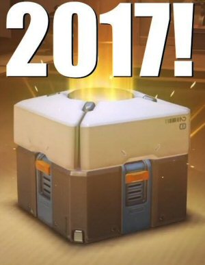
My picks for what was important, awesome, or worth talking about in 2017.
Tenpenny Tower
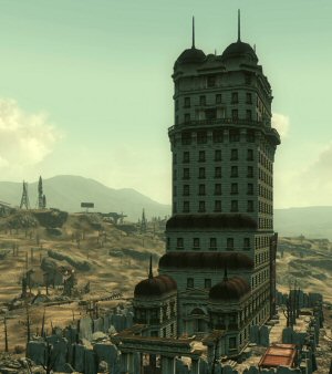
Bethesda felt the need to jam a morality system into Fallout 3, and they blew it. Good and evil make no sense and the moral compass points sideways.
The Gameplay is the Story
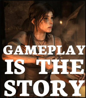
Some advice to game developers on how to stop ruining good stories with bad cutscenes.
Do It Again, Stupid
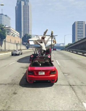
One of the highest-rated games of all time has some of the least interesting gameplay.
Bethesda’s Launcher is Everything You Expect
From the company that brought us Fallout 76 comes a storefront / Steam competitor. It's a work of perfect awfulness. This is a monument to un-usability and anti-features.
I like the freeform comic, but that’s just my graphic design nerdiness coming out.
I like the one you actually used better, too, but for a different reason: the pics of Boromir in this one are just too similar, making the comic either too repetitive (because there are too many Boromir-head-lying-on-the-ground pics) or not repetitive enough (because there are two other non-matching pics semi-randomly tossed in among the Boromir-head-lying-on-the-ground pics.
Of course the latter might just be obsessive-compulsive…
While I would tend to agree with Justin, that the frames do look a bit repetitive. The smug look on Boromir’s face in panel 5 fits so well with the dialogue, that it’s a shame to have lost it.
It was certainly a stronger choice to go with one image the size of 3 rather than having 3 frames with the same image in varying levels of zoom. Worked out pretty well, I think.
I think you made the right decision here. The “smug Boromir” in panel 5 is nice, but the total effect of the posted one is better overall.
That’s interesting. I prefer the original 6 panel comic, except that the “smug Boromir” looks out of place compared to the others. Isn’t he dead? Why is his mouth moving?
The free-form could work, but the dialogue was too busy, and I had to read twice to catch that the DM was speaking as Faramir. I didn’t like the big shot of Boromir because the different resolution was distracting–it looks out of focus compared to the other shots. (I don’t think you could have done a long body shot of Boromir, however, since I’m pretty sure Aragorn is just off screen.)
I think the traditional frame style works (for me) because I don’t imagine this comic strip as a traditional comic. I imagine it like a movie. And, of course, with a movie the frame is set 100% throughout. To a large extent, you have to rely on choices made by the cinematographer to communicate action and movement and the like. Putting the extra layer of freeform comic design just serves to remove me from the movie experience.
That’s a lot of complaining for what is still (in either form) an excellent comic strip. Keep up the good work.
ngthagg