 T w e n t y S i d e d
Dear people of the future: This was originally posted on April 1st, 2013. For about 12 hours, the site was decorated with a My Little Pony background. In fact, the site looked more or less like this:
 |
Ha ha.
But a lot of people really liked having some color in the background there, which had previously been some low-contrast abstract grey rectangles. I like it too. Ironic pony-placement aside, it does add something to the site. Of course, maybe I like it just because it’s new. I get the same thing with my desktop wallpaper. After a few weeks of the same image I get sick of it, and whatever replaces it looks “better” simply because it’s novel, not because it’s objectively a better image.
So I’ve put some color on the background in the form of more thematically-themed dice. You know, as a nod to those tabletop games I’m always writing about on this site.
Some other modest adjustments have been made to the format. Let me know if I’ve created any usability problems.
Shamus Young is a programmer, an author, and nearly a composer. He works on this site full time. If you'd like to support him, you can do so via Patreon or PayPal.
Overthinking Zombies
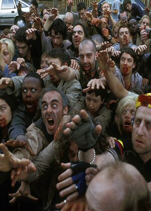
Let's ruin everyone's fun by listing all the ways in which zombies can't work, couldn't happen, and don't make sense.
What is Vulkan?
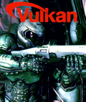
There's a new graphics API in town. What does that mean, and why do we need it?
Skyrim Thieves Guild
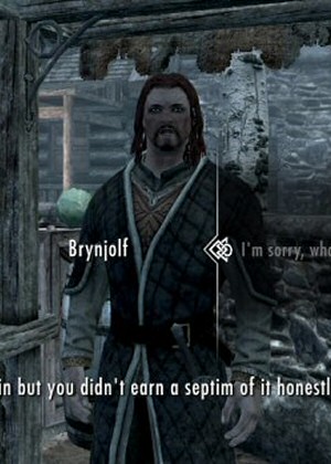
The Thieves Guild quest in Skyrim is a vortex of disjointed plot-holes, contrivances, and nonsense.
Control
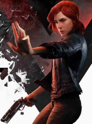
A wild game filled with wild ideas that features fun puzzles and mind-blowing environments. It has a great atmosphere, and one REALLY annoying flaw with its gameplay.
MMO Population Problems
Computers keep getting more powerful. So why do the population caps for massively multiplayer games stay about the same?
I vote that if you do not post some tabletop gaming relevant article to support your dice background soon, that you go back to the pony theme.
Agreed.
Thirded.
Agree.
Sold!
Now somepony needs to distract him until it’s past “soon”.
Well, soon became 6 months, and still no tabletop gaming.
Shamus, you know what you must do.
I miss the ponies already.
I think I just barely missed the best thing ever.
I share that feel.
I actually really liked them. Added a nice touch of colour.
I honestly wouldnt of minded if that was permanent :D
I prefer the dice myself, but for those of you who enjoyed the ponies you can have them by installing the Stylish plugin and then using this style:
http://userstyles.org/styles/85429/twenty-sided-ponies
Eeeeew color
To clarify, I was not serious about the background being ugly – I was attempting to be funny or something.
Gah. Okay, 2 things:
1. Having colour in the background is very nice, It’s a good idea.
2. Can you do something about the yellow? The yellow and white background combined is very sharp, for whatever reason. To exaggerate a bit, it feels like I’m looking at a Bethesda Bloom overdose (otherwise known as Oblivion).
Basically: the purple dice: very pleasant to look at in the background. The 2 darker red dice? Also agreeable. The dice closest to the yellow ones in both colour and proximity? Moderately acceptable to look at.
The yellow dice? very uncomfortable. The green dice? Again, more agreeable to look at, about at red dice comfort level.
Does anyone else think this, or is it a problem on my end?
Aside: I think it’s a good idea to arrange the colours horizontally, like you did here. For whatever reason my first instinct is to work vertically which would have been a bad idea here.
I was actually thinking these same things but make it a habit not to complain about thematic changes to somebody else’s website. So I’m glad you had my specific complaint.
Same here. My eyes keep getting pulled away from the posts because the background seems “brighter” than them somehow.
I opened up the website and it felt like I was staring at a spotlight. I think it’s purely an optical illusion, but with the bloom effect it seems brighter than a plain white background. It’s rather disorienting.
I like the color -and actually right now (fairly far down the page away from all the links) it isn’t a problem. But like the others, the clash of colors -pastels and grays -was a bit blinding when I first got here. I’m sure I’d learn to deal, though.
(edit)
I just figured it out -it’s the blues. The blue text boxes sort of bring it together in a way the gray boxes don’t.
Okay, and now include a system whereby the dice rolls in the images are randomised.
Oh no, you didn’t just… damn, he might actually do it…
well, on the bright side he might do it and write about it!
I dunno… I feel like it’s a bit busy now. Especially in the areas like the sidebar and the instructions for commenting, which don’t have a background of any sort.
I actually liked the ponies one a bit better, I think because it was fewer, larger objects. Maybe it would be better with bigger, more spread out dice.
Definitely needs some backgrounds wherever there is text though.
I agree that it feels busy while the MLP one did not. Again I agree that it’s probably because they were larger fewer objects. Like others have mentioned, though, the major bloom kind of hurts. I’m sure that’s something Shamus would regret next time a migraine hits.
It is a bit bloom-y. (That’s a word, right?) Something about it grabs the eye more than a background usually should. It might be the bloom. It might be too high contrast. If it were me, I’d consider lowering the contrast (making it greyer), or, oddly, brightening it (which would also lower the contrast).
I think the problem lies in the fact that A it’s not uniform enough, all those different shapes make eyes go over them searching for meaning. Secondly, the background of the dice is gray. If it was white, and dice were more subdued it would provide much better contrast to the posts. As it is their colors are too similar to allready colorfull posts.
I agree. Having contrasting dark spots on a clear background draws the eye to them and distracts from the main content. I really enjoyed the former style’s soothing color scheme. The use of color and light details gave it a very calm and comfortable feel that encouraged a methodical and thoughtful mindset while reading the articles, which I believe was very well suited to your style of writing.
I don’t mind changes and some variation might be interesting, but I personally hope you also manage to preserve the sort theme and feel that the previous style had.
Having something there in the background is nice, but right now it’s really bright. It’s like when you’re driving at night and an oncoming car has their high beams on. They’re far enough away that it’s not blinding, but it’s still bright enough to be a slight annoyance.
This is pretty much what I was thinking. I love the idea, but at the moment it’s too bright or there’s too much contrast or something.
I think the word you are looking for is ‘bloom’. Needs more lens flare!
Yeah, it is pretty heavy on the bloom. I’d suggest turning it down a bit.
Well…it looks kinda pretty, but to me it’s very peripheral, since I mostly browse in tight windows, only displaying any site’s content, while showing less of the surroundings if not currently needed. Also, I feel they are a bit distracting.
Site seems to be running as good as ever since the last changes.
Btw: Glad to know there are more people who really regularly change their desktop theme…I usually change mine every 3 days, sometimes more often…need to find some new ones now:D
I have a directory with ~20 images in it; I also have a cronjob that runs a script every 10 minutes that rotates the current background image from the list. Makes sure that none of them get too boring, though the time between rotations could perhaps be adjusted depending on the person.
And now I want to say something along the lines of “let’s see you do *that* with the tools that come with a standard install, Windows!” — but it would be a bad idea, because it’d probably start a flamewar. So I’ll just refer to it one meta-level up instead. That should be safe, right? :-P
Actually, Windows 7 has the ability to switch backgrounds every N minutes from a list as well. Unfortunately, it only does with the theme that isn’t Windows 98 enabled. You know, the new one, whatever it’s called.
Actually I just checked. If I enable Classic theme on Windows 7 it still lets me select multiple pictures as background, and probably shuffles them.
yeah but, at least for me, it isn’t working properly.
I can use randomly changing backgrounds, but it will only change them until I reboot then it will just use the one that was active at the time of logout permanently.
Friend of mine told me the same happened to him, so I assume this is a common bug.
If it’s not too much trouble, I’d love some new themes. Personally, I think the Pony theme would work better with a nice, solid dark pink replacing the high saturation white(because the pony heads are diaphanous), and maybe replacing the blue trim with some violet.
The current theme works better with the white, give that their up against solid, monochromatic objects. The text boxes should probably be made a bit darker to contrast better with the blinding light effect.
This is entirely my opinion. I’d love someone else to chime in.
Oh f♥♥♥, my eyes!
… I concur. The colors are way too bright and are extremely distracting, the photograph isn’t very good and the dice aren’t well-arranged, the bloom is causing AUGH MY EYES syndrome… All said, this change appears to be a complete mistake. The previous background was much better.
The yellow dice are SCREAMING at me. I’m entirely too close to re-enabling adblock so I can kill the background image. The ponies were fine. The abstract grey boxes were fine, if a little boring. The dice are not fine. I have to close the tab before the cacophony overwhelms me.
yeah, too bright for me
Like others above, I like the colors, but wouldn’t mind if you toned down the brightness/bloom a bit. The yellow against the white especially shine quite some.
Very reminiscent of the OMG Ponies! theme Slashdot did a few years back. I like the new theme, and I like the MLP prank. Good work!
Can’t say I’m a fan personally. The range of color just makes focusing on the text more difficult – though most seem to prefer it.
As others have stated the ‘bloom’ effect might just be the issue.
I have to agree with several others – I have no objection to the basic notion, but it might be better if the brightness of the image were lowered a bit.
yeah don´t like it the brightness fit with MLP but with dice it just distracts change something please.
I like it, but I’m thinking you should hide a Derpy in there somewhere.
The problem with April Fools is I cant figure out if this is serious, or an extension of the joke.
Either way: It makes me squint, and I imagine would lead to some fairly significant eyestrain if I spent too long on the site in one go.
Just before I got to your comment I realized this must be a joke. Shamus gets such horrendous headaches and if he had to work on the site at ALL during one of those he might just stab his own eyes out.
You want the People of Future to tell you if you’ve created any compatability problems?
Well yeah, now that you mention it; it doesn’t work with the Firegasm browser past version 4.2, or with Windows 11’s holographic 3d touchscreen.
It also makes my iNeuralInterface glitch out and crash every fifteen minutes or so.
Agreeing with some of the others. I like the color, but it seems too bright. I can’t really explain why or how.
Also, I’m not sure if this a bug or a problem or just YouTube, but I can see the background through the embedded Spoiler Warning videos. It’s faint, but there’s definitely some transparency.
I liked the MLP prank, but I don’t like the dice. I would prefer darker background. The text box is lightly transparent – for a while I thought I was imagining those changes in color of the background.
Too bad you cannot have more themes for people to choose from, like in the good old days…
Wow. I must say I’m tasting the rainbow (on a roll of 5 or higher).
Aren’t we gamers of a certain age supposed to complain that there are too many frivolous and garishly-colored illustrations in our materials, increasing prices, reducing print runs, and reducing space for relevant information in the form of charts and graphs? I don’t need pictures of orcs, I need a table that tells me what rotted foodstuffs the orcs will have in their storage areas based on hit dice, tribe, and time of year (modified by the appropriate festivals).
Where can those of us who missed the full size version get a copy of that wallpaper?
Here you go….
http://www.fanpop.com/clubs/my-little-pony-friendship-is-magic/images/33233052/title/mlp-photo
According to my calendar, it is still April 1. Where are the ponies!?! :-(
Edit: As for the dice, they look great! I wouldn’t change a thing. :-)
I like the look, but the site chugs a bit when scrolling. Not sure if that’s related to the new layout, though.
Shamus, I love you like a brother. Which is why I feel I can say, this background hurts my face.
I’dont mind the color, but the bloom is just burning my eyes. I hink you can find a compromise between what you had before and the new style. Something like this, but with thicker lines and not made in paint.
I think some of the problems with the dice background can be seen by comparing to the ponies:
The ponies background, judging from the screenshot, seems partially desaturated. Despite the lightness, the pony saturation never really eclipses that of the site’s main content.
Compare to the dice – the lightness may be cranked to wash them out a little, but the saturation of the colours still approaches the level of some of the site content, making them a bit distracting.
Some people have noted that the blue/purple dice look less distracting while the reds/yellows/greens are more out of place. The site has a bunch of main elements coloured blue throughout it – comments, headers, etc. These are all at a fairly high level of saturation which drowns out the blown-out blues in the background. Red and green are under-represented in the site, which may be why the red-orange-yellow-green portion of the spectrum stands out.
Just some theories, anyway. May be worth experimenting with? I don’t know!
No you’re right. I keep finding myself glancing over at the orange, red, & green ones. They contrast a lot w/ other elements of the site.
It looks fine @ the top of the site with the colorful buttons on the side. But the dice become a lot more distracting as I scroll down into the comments.
“low-contrast abstract grey rectangles”
I LIKED that background! >__<
Can you include the old one as an alternate theme, like how you used to have the Lawful Good/True Neutral/Chaotic Evil theme options? Please, PRETTY PLEEEEEEASE?
Seconded, but I would also like the pony background as a tertiary option.
I find the colour to be distracting, and much preferred the rectangles.
Lawful Good= ponies
True Neutral= gray rectangles
Chaotic Evil= asymmetrically arranged off-colored dice
Bah! Ponies are totally evil.
But… the dice are trying to kill you!
Fair point.
Perhaps they should be labeled as Evil, Different Evil, and Marginally Less Evil.
Lawful evil, I’d think. After all, they still manage to screw you while following the laws of physics.
What’s the picture for Chaotic Stupid though? Top-hat, Bonnet or Cannibal Cuftbert? (And, just for laughs, my computer wants to change Cuftbert into Culbertson. I think my computer is trying to get into the April Fools spirit)
Kindly n-thed. Now it’s like there’s a bright explosion of light or something and the dice are flying everywhere.
Again, I can’t thank you enough for putting up the ponies, you made my day Shamus.
Interesting that there are no black dice, all my d20s have been black and I think black would fit better than the yellow.
Probably want something behind all the links and stuff too, they’re not pleasant to look at right now.
Don’t mind the dice personally, but preferred the ponies; they were more symmetrically arranged, less pointy-jagged and had more palatable colors.
Ahhhh I missed it.
Soooo… uuhh… what’s that Pony background called? Not that I wanna know or anything…
Here’s a link to it that the other guy linked to it with.
It’s okay, man. I think we’ve statistically determined that this site’s reader base is at least 30% brony.
[Shining]
Come play with us, non-bronies….
for ever, and ever, and ever…
[/Shining]
Personally, I find it visually distracting when I am reading a blog entry. At least with a video I can just full-screen it.
THANK YOU for the desaturation. It’s taken the image from “heavy metal being fed through a woodchipper” to “windchimes” in terms of what it does to my sensorium. It’s actually relaxing to look at now!
I think it’s way too bright and way too distracting. Really, I haven’t been that keen on the site’s theme since the color choices stopped being a thing (my eyes are sensitive to light, so I always used the chaotic evil theme) but they grey was okay. This, though, is enough to make me stop visiting the site if it’s not toned down considerably.
Edit: I just refreshed, and the desaturation is a good touch. The background still seems awfully bright, but at least it’s not physically painful anymore.
I don’t know if this can help but here you go : http://lifehacker.com/259456/invert-web-page-colors-with-the-darken-bookmarklet
The second paragraph is all you need but feel free to try the greasemonkey script in Firefox. You should be able to do the same with other browsers.
I’m a few episodes behind on Spoiler Warning, and I still have a tab open with the old grey background. If I close it, I’ll never see it again!
(But seriously, new background is good.)
While this one is somewhat nice,I must say I still prefer the ponies.I think its because they arent of a uniform color like the dice that is their main appeal.Or maybe its the lack of whites on the ponies themselves.Could you recolor the dice so that the numbers are grayish,or something that doesnt clash this much with the rest of them?Or just filter the theme through a
greenfitler.OK, now when you brought down the color saturation/brightnes some elaborating:
1. Any background which is not basically a noise (dice aren’t, though randomly placed) and is at the same time in relative high contrast to its surroundigs (its “subbackground” – the base color, but also the rest of the site) draws attention – and distracts from the main parts of website.
2. Any pattern contaning background breaks the space when it shows up between related objects (e.g. it comes up between each post thread in comments, or between articles – these share same space, they aren’t supposed to be hovering alone like some Win8’s Metro shit, whatever MS calls it)
I propose you:
1. include the dice bckgr only to the top of the page with vertical fade to basic bckgr color
2. put a news-column wide monocolor background with horizontal fade to the dice, thuse the dices will stay at the empty space on the sides only
You might also try very low contrast monochromatic dices. I know some people want color but we are talking here about style
I like the newness. I’m actually in favor of Shamus changing it up every few weeks to keep it fresh. Something new to look at makes the blog feel more alive and new.
What strange resizing algorithm did you you on that screenshot to create those weird color artifacts on the text?
It looks like you screen-grabbed it from and AppleII.
Is that just an artifact from sub-pixel font rendering? It seems far to dramatic to be that. (Unless, like I say, it was taken on a AppleII.)
I believe if you zoom in on the screenshot, the various colored letters spell out the names of the appropriately-colored background ponies.
I like the dice. The color is nice and while the ponies where wider and had less possibility of distraction, I actually prefer the the bustle since it gives my eyes somewhere to go and gives a stronger reference as you scroll down. Even with the grey background and the different colored text boxes I can still feel like the text area is punching me in the face and get lost trying to move between conversations: the dice fix both of those.
Hey Shamus, the font used for the articles seems blurrier than before. The comments haven’t changed though. It’s not very much (actually looks a bit like JPEG compression), but it gets tiring to read.
May well be an artefact of the article’s textbox being ever-so-slightly translucent: you may be picking up on the die images behind it.
Can’t say I really care for it. It’s just so busy now. I much prefer the minimalism of the prior design.
Ordinarily, if someone has already expressed my exact thoughts, I don’t feel the need to just post to agree with them. On this occasion, however, I feel that my vote should also be noted – I don’t like it. Way too distracting and bright and busy.
I’m slowly getting used to the bloom, yet… I liked the previous theme. I remember when it had the orange tiles among the grey and it didn’t look good and now we have all that color on the white and it kind of… Doesn’t look good.
Yeah, I have a usability problem alright. The site’s looking better, and I’m gonna end up spending even more time here.. ;)
I’m that weirdo that has used the same background for well over a decade, tries new things any time I get a new computer, and then decide that none of them are as good as what I’ve been using (and put it on the new computer if it doesn’t come with it anymore, even though it was originally native).
Yeah, I know, other people like change. “Because it has always been this way” doesn’t trump many reasons, even for me, but it does trump no reason at all.
I do recognize “because is has always been this way” is reason enough for some people TO change, even over very good reasons not to. The “very good reasons not to” part is really the only problem I have with them… change isn’t bad, it’s just more work. More work for something worse than what we have (or even just “not better”) is dumb.
Edit: all of that to longwindedly forget to say, hey, put whatever you want on the background, as long as it doesn’t impact readability. It’s your place, have fun… but you’ll have a lot fewer readers if the background makes it hard to read. And I think this doesn’t do affect readability, so um, yay and stuff? Yeah, that.
It’s a bit too bright for my taste (The Light! It burnsssss!) But I like the dice and the newness and the randomness
To borrow from an old tune, “The blog is so bright, I gotta wear shades! I gotta wear shades!” (10 points if you get the reference.)
Its, uh, REALLY bright in here.
And another: “Change changing places. Root yourself to the ground” (Another 10 points here.)
And another: “A change will do you good.” (No points, thats a free one.)
Seriously, though, to this all, I say BOCCOB! (Obligatory gaming reference, 15 points if you get it.) Here, let me say that backwards, BOCCOB! (Its a pallindrome. I know. Dont you get it? Yes, I just dont care. Oh, really? No. Boccob, oh, I get it now!) Perhaps its that I am old (not really). Perhaps its that I am stuck in my ways (maybe). Perhaps its that I just don’t care. (not maybe but perhaps. See what I did there?) You want to blingify your bountiful blog by blasting us with beastily bright bones, by all means, bowl us to bits. Braaaaiiiiiinnnnnsss….!!!!!!!!!!!!!
The yellow dice really look weird somehow. Looks like one channel is clipped and then reduced again, into that weird greenish yellow that does not look healthy.
Apart from that: The first thing that I noticed is how the background is interrupted by the posts. Somehow that grey-ish background matched the background of the posts much better. … is there a way to make that semi-transparent…? :)
Also, while it looks a lot brighter, I don’t find it blinding, but I do find it distracts from the contents because the background is either too contrasty or the pattern has too large a scale. Or both. I think it might work better scaled down and/or with reduced contrast.
This site being yours, it would probably deserve a non-repeating, procedurally generated background… I will not suggest that you try and implement that in wordpress, though.
Actually … bigger is good also, now that you’ve changed it again.
The Yellow seems to look better now, but I’m on a different monitor now than before (and the one before was properly calibrated…)
The reduced contrast works well, and it’s much less distracting to me now.
You know . . . if you wanted to write about tabletop games more, I guess that would be okay.
(Yes, yes, I know, you’re not playing any right now. Piffle.)
“Piffle”?
My grandmother used to say that, and she’s been dead (of, essentially, old age) for a few years now.
I’m not trying to imply you’re old, I just enjoyed the memories that instantly brings up, and it makes me wonder where you heard that.
I don’t know if you care, but it seems to break on my iPhone. The dice form a repeating pattern covering all the sidebars so I can’t read the links or the posting instructions, for example.
I don’t know what these guys are talking about, I think the new background is fine.
It’s not distracting for me(at least, less distracting than the ponies). The articles/comments are still the focus. It’s just there in my peripheral vision if I want it, unobtrusive and docile. The way a background should be.
If it were less pale or had obnoxious light bloom or something, I’d understand the complaints. But I think it’s a worthy change.
While I am not one to complain about other peoples design choices, I am relieved by this most recent change. In fact, I’d go so far to say that the current version is perfect.
Dude… the dice… they’re getting bigger…
Can I point out how over-represented the numbers six and four are in the background? I mean, you’re giving us OCD with stuff like that.
Truth: I didn’t pay any attention to what sides were up. I should have, but I was so focused on getting enough light and getting the right mix of shapes and colors I stopped thinking of them as dice and just thought of them as objects to be arranged for a still life, like fruit.
You inspired me to do a GIS for “Still Life With Dice.” The results were kind of nifty, especially this one.
You also appear to have a few vintage dice amongst your collection. A d12 was part of a past background that looked like it was from the “use this crayon to fill in the numbers” era. I treasure my slowly disintegrating random-number generators from that bygone age, even if they are slowly starting to look more like they could fit in as boulders for the tabletop terrain.
Okay, current feedback:
OH MY GOD IT IS GETTING WORSE
Wy are there so few dice, and so large gaps between them now? Also where is all the colour? NEEDS MOAR YELLOW Also MORE BLOOM AND MOTION BLUR seriously why isn’t there motion bur?
And can you turn the Anti-Aliasing down on the background, it might improve the website’s performance.
The background was hurting my eyes so I modified that theme posted earlier in the comments to make the background black: http://userstyles.org/styles/85480/black-theme-for-twenty-sided?r=1364985297
P.S. I think if you faded the background gray it would be a lot easier on the eyes.
When I saw the front page (well, you know, the twentysidedtale front), with the bigger dice, I thought “oh, so bigger dice on the front, and smaller on the inside…” But alas, no, the bigger dice are everywhere.
I think they are too washed out now, making it is almost difficult to even recognize what they are (esp. when there is other content filling most of the page, you just barely get a peek at them). Could you increase the contrast or something, while trying to keep it light/non-overpowering?
(P.S. I like it yesterday with the smaller, brighter dice. Maybe do both as selectable themes?)
I like the new theme, but I’m probably seeing it at a different zoom level or aspect ratio to you. For me the site has a lot of empty space which just got to busy with all the small dice, but the newer background looks great. I think we just need to figure out what works best for most of the users here and stick with that – it won’t look the same in every browser or screen size.
To contrast with the above, I am perfectly content with the current background.
Ah, contrast, nice. Yeah, I see what you did there.