 T w e n t y S i d e d

This is really something. For this first time since I started reading it back in 1999 or so, slashdot has changed the look of the site.
This was really disorienting. It’s like seeing another face on Mt. Rushmore. There are some things that you just don’t expect to change.

Charging More for a Worse Product
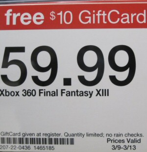
No, game prices don't "need" to go up. That's not how supply and demand works. Instead, the publishers need to be smarter about where they spend their money.
Games and the Fear of Death
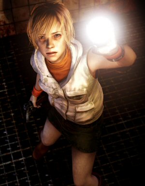
Why killing you might be the least scary thing a game can do.
Batman: Arkham City

A look back at one of my favorite games. The gameplay was stellar, but the underlying story was clumsy and oddly constructed.
Best. Plot Twist. Ever.

Few people remember BioWare's Jade Empire, but it had a unique setting and a really well-executed plot twist.
Top 64 Videogames
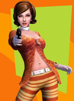
Lists of 'best games ever' are dumb and annoying. But like a self-loathing hipster I made one anyway.
Maybe it’s not as shocking, but AnimeNewsNetwork just changed their art and color scheme too. Ewwwww. Where’s the cute elfie chick? Who needs all these Naruto clones? And that’s a very… agressive color scheme, guys.
It’s SlashDot XP!
I saw the preview last week, so I knew it was coming. Very pretty, but seems a little distracting. I’ll probably get used to it quickly enough.
I like it – it still has all the classic /. design cues but just looks more professional somehow. Viva la CSS!
It’s a good thing I stopped reading Slashdot two or three years ago. At that time they started reporting things two or three days later than LWN. Never looked back, so I’m happily ignorant about the new layout.
The new ANN looks good, though of course I’d prefer original characters. Using Naruto characters is asking for legal trouble, unless they reached an agreement with ViZ. In that case, good for them!
Gad; the new ANN color scheme is dreadful.
Gad; the new ANN color scheme is dreadful.
It looks like they were going for a “flames” motif and somehow ended up with “Ketchup & Mustard”.