 T w e n t y S i d e d
Only because everyone else is doing it.

This is a visualization of this site. (The only difference is that when this graph was built, the post you are reading wasn’t there.) Each dot represents some aspect of the page. Let’s see if we can decode what we’re looking at. According to the page that generated this, the colors are:
| Legend |
|---|
| blue: for links (the A tag) red: for tables (TABLE, TR and TD tags) green: for the DIV tag violet: for images (the IMG tag) yellow: for forms (FORM, INPUT, TEXTAREA, SELECT and OPTION tags) orange: for linebreaks and blockquotes (BR, P, and BLOCKQUOTE tags) black: the HTML tag, the root node gray: all other tags |
So let’s try to map out these dots and see what they mean.
It’s pretty easy to tell that the top area is the sidebar. The sidebar is just a bullet list of links. This means they should look like a bunch of grey dots terminating with blue dots, which is exatcly what we see at the top. Sadly, we can’t tell the categories section from the archives, since both have exactly nine nodes right now. We can see the six-link node for Anime Sites. We see the three-link node for Geek Sites. The Read Me and Meta sections are also ambiguous, since both should have four nodes. The Search section is easy to spot. The input box is a form, and so the yellow dots clearly represent the Search area. The lone purple dot in this region is the dice roller.

At the top of every post is a little table I use to keep things lined up. So this should look like a red dot (the table) which leads to another red dot (the row) which forks off to two other red dots (the two cells of our table, the one with the icon and the one with the post title). One fork should lead to a blue dot (a link to the post category) and should then terminate at a purple dot (the category image). The other red dot should lead to three links – The post title permalink, the category link, and my name, which links to the “about me” page.
So, these little branches that start with a red dot represent post headers. I have the blog set to show at most ten posts, so we should see ten of these. Sure enough:

The black dot is the root of everything else, so the grey cluster next to it must be the HTML headers, since they don’t lead anywhere. We can also spot the stuff at the top of the website. The rotating dice image, the title of the page, and the random quote all appear within a table. It’s easy to spot the red dots that lead to a terminating purple dot.
The only unresolved thing is that cluster of 16 links at the bottom. What the heck is that?

The rest of the dots are individual posts, which aren’t going to follow any pattern, so I’m not going to try and unravel them.
Still this is a pretty cool way to look at the data.
One last note is that lots of people are taking these pictures and uploading them to Flickr. Have a look a the gallery.
LATER: I get it. That cluster of 16 links is my post blathering about the Lexicon Plugin, which was knocked off the front page by this one.
Shamus Young is a programmer, an author, and nearly a composer. He works on this site full time. If you'd like to support him, you can do so via Patreon or PayPal.
Overthinking Zombies

Let's ruin everyone's fun by listing all the ways in which zombies can't work, couldn't happen, and don't make sense.
The Strange Evolution of OpenGL
Sometimes software is engineered. Sometimes it grows organically. And sometimes it's thrown together seemingly at random over two decades.
The Plot-Driven Door
You know how videogames sometimes do that thing where it's preposterously hard to go through a simple door? This one is really bad.
id Software Coding Style

When the source code for Doom 3 was released, we got a look at some of the style conventions used by the developers. Here I analyze this style and explain what it all means.
Civilization VI
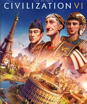
I'm a very casual fan of the series, but I gave Civilization VI a look to see what was up with this nuclear war simulator.
I typed Dice Roller into the search bar and came up mt-handed?
I regret not finding your website sooner.. :D
FYI… 1st!