 T w e n t y S i d e d
The site overhaul continues. I apologize for the upheaval. I think we’re nearly done. I want to thank everyone for their patience, bug reports, screen shots, CSS advice, layout advice, and general suggestions.
The changes so far:
- WordPress itself has been updated. Always dicey, that. I’ve updated a dozen times over the years and it’s only ever broken the site once, but it’s not a fear you forget. Also, the whole “upgrading your database” thing gives me the willies. I make backups of the database now and again, but the thing is a monster and I’m not sure I could actually restore it easily if something went really wrong. Heck, it’s really a challenge to load the database on my local machine where I don’t have to worry about transfer speeds, transaction timeouts, or other arm’s-length concerns.
- Plugins are updated. There are a lot of dang plugins on this site. Okay, half of them are mine, but still. The Facebook button shouldn’t grab a giant area of the screen the way it used to, and the comment editing thing seems to have gotten a fresh coat of paint.
- The new section icons in the right sidebar should do a much better job of grabbing the eye showcasing the best content. This should let newcomers get a sense of what the site has to offer, and should be better than panning for gold in the archives or fishing in the category list.
- Posts are now shown clearly in individual boxes. This solves the “endless scroll of stuff that runs together” vibe the front page had.
- The book advertisement is probably going to be nixed. I like it because it shows off two books, but it’s slow loading, Amazon-specific, and eats more space than it should. Also, I’m annoyed that Amazon doesn’t offer an option to just randomly show one book or the other, it MUST animate between the two. I’m still exploring alternatives.
- I’m still messing with the ad placement. Since leaving my day-job and having a go at full-time writing, I’ve come to count on the ads. They bring in a couple hundred a month, and we really count on that money. On one hand, I don’t want the ads taking up prime real estate and making the site less engaging, interesting, or welcoming, but I also don’t want to hurt our income. So, I’m moving them around and fooling around with the income / intrusiveness tradeoff. In short, I love shoving the skyscraper ad way down the page, but I’m not sure it will get the job done down there. We’ll see.
- I’m showcasing videos, comics, programming, and spoiler warning now. Is there any other content that should get its own section? Not just individual posts, but a series or block of posts that could justify having a page of their own? Those section icons on the right are nice, but they will go down in value if I add too many, so they all need to count.
- The new background image. It’s a huge improvement, even though I’m not totally crazy about it. I’ll be the first to admit that graphic design is not my strength. After experimenting, I realize that a good, low, contrast, low-visibility image is really useful for making the site “pop”. However, the one I have now is kind of middling. It’s not awful, but a real artist could do better. I do like how the background boxes sort of mimic the post boxes. Also, the current background image is 100k. That’s not a deal-breaker by today’s standards, but it is a bit pricey for such a small thing. It seems to work best when using greyscale values between #AAA and #EEE. Using color, or brightness values out of that range, makes the background distracting and “noisy”.
- The logo and dice remain largely unchanged. The dice have been a part of the site since the first or second year. The logo dates all the way back to 2008 or so. I think those are the closest thing I have to “branding”, and so I’m not going to mess with them.
- The blue menu bar has been trimmed down and focused on a few small things. I think this is good. The menu bar is for general informational stuff, and the section icons are for showing off content. Previously, these ideas were mixed together. I think the “New Here?” page needs a cleanup.
For future generations who read this post in the archives, here is a screenshot of how the site looks as of this writing:
 |
Shamus Young is a programmer, an author, and nearly a composer. He works on this site full time. If you'd like to support him, you can do so via Patreon or PayPal.
Resident Evil 4
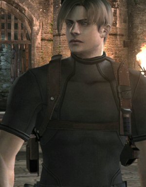
Who is this imbecile and why is he wandering around Europe unsupervised?
Bethesda NEVER Understood Fallout
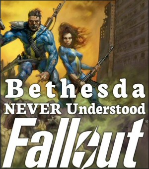
Let's count up the ways in which Bethesda has misunderstood and misused the Fallout property.
If Star Wars Was Made in 2006?
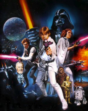
Imagine if the original Star Wars hadn't appeared in the 1970's, but instead was pitched to studios in 2006. How would that turn out?
Charging More for a Worse Product
No, game prices don't "need" to go up. That's not how supply and demand works. Instead, the publishers need to be smarter about where they spend their money.
I Was Wrong About Borderlands 3
I really thought one thing, but then something else. There's a bunch more to it, but you'll have to read the article.
Nice going, Mr. Young. I kind of like the new look and I look forward to see how things will turn out.
Hmm, a non-repeating background image eh? Why not make it fixed?
I’m also partial to a slight background transparency to div.entry, though you’d have to use rgba() for declaring that colour rather than the #000 format.
(e.g. #E0E0E0 with 60% transparency becomes rgba(224,224,224,.6) )
Oh, another thought: You could try replacing the <input type=”submit” value=”Post Comment” /> for posting comments with a <button type=”submit”>Post Comment</button> as you have much more control over styling it; even images can be included. These default buttons are a little boring.
caniuse.com reports 78% of the market supports rgba, so declare it last:
{
background-color: #E0E0E0;
background-color: rgba(224,224,224,0.6); /* This will be ignored by IE8 */
}
Nevermind, you’ve changed the background to repeat x and y now.
When it comes to repeating backgrounds, I always try to use the Cicada Principle
Pretty interesting stuff.
I love all the changes. Personally, I’d take your ads as intrusively as you wanted to make them, but I’m not a newcomer to the site, so I have a larger desire to increase your income than a newbie would.
Speaking of increasing income, Shamus, do you get any more for a click-through than you do for a page view?
>>> I'm showcasing videos, comics, programming, and spoiler warning now. Is there any other content that should get its own section?
I think my favorites are DM of the Rings (already there under Comics) and Let’s Play. I don’t know if Let’s Play is worth a heading today (I wish you did more of them but understand why you don’t), but if I wanted to go back to them or point a friend to them how would I do it?
Yeah, I wouldn’t mind if a link to the adventures of Lulzy and the Champions Online bit were somewhere.
I would love if Lulzy and the rest were added to the comics, yes.
Or even their own section – I’ve snagged Shamus a couple new readers by linking them to Lulzy and Champions Online. They’re one of the more hilarious things on the ‘net.
Thirded.
I loved the written Let’s Play (don’t forget what’s-his-name the warlock), more than Spoiler Warning.
The Let’s Plays are some of my favorites as well, and I think they deserve a showcase. On the other hand I think they’re mostly hosted at The Escapist, but a link to them would be great.
Very much yes.
Add my vote to the hat for a Let’s Play link.
I’ll add my voice to this request. I would love a link somewhere to past lets plays.
I’m also voting for a Let’s Play link. The adventures of Star on Chest, Lulzy, and the others are too awesome to hide and follow on well from DM of the Rings.
Showcasing the bast content? Can I now buy furniture or carpets here?
And Egyptian goddesses!
I like the spell checker and comment expander.Could you include the tags into it like this,so that we can avoid copy/pasting or typing them anew?
But the border is really distracting when there are nested comments.
EDIT:A delete button?Now thats a welcoming sight.
A delete button? I can’t find it
See, he pressed it, so it deleted.
http://www.youtube.com/watch?v=3X2ALG9iGPg
Have I been trolled? :D
Not really.There is a request delete button.At least there is for me.Its a welcome addition.
I requested deletion of my first comment, because I wanted to try it out and I figured that the only time my comment would only not make sense if I was able to successfully delete :). Sent it to moderation and it didn’t get deleted :D Then I tried to delete my second comment and it happened again :)
I agree on the border. I think it should only reach around the blog post, not engulf the comments as well.
I’m a huge fan of the new layout. A+ would read again. :)
That was a good idea including a screenshot at the end. Someone reading this 10 years from now on their cyborg arm-mounted browser screen would probably be lost otherwise.
I was just hoping that the screenshot would be a shot of the very post he was currently making, including a screenshot of the post in the screenshot … and on down to subpixel nothingness. But that’s probably harder than it sounds.
Well…it would mean to make a screenshot and edit the page a couple of times…not hard, but a bit of effort :D
Actually it’s very easy. (haven’t tested it, but this is how I’d do it).
Use a placeholder image (bright green or pink). Screenshot. Then in the paint program, (paint.net for example) duplicate, halve the size and paste over the placeholder. Duplicate resize and paste. Repeat. It would not take many rounds at all. The placeholder will in the end be a tiny dot of green. And just to mess with people, changed it’s color to the least used color in the image.
Like this. (couldn’t resist)
http://postimage.org/image/m6rdsimgt/
It only took 5 images. Not odd really since this is logarithmic (the inverse of exponential).
Well done!
Conversely, have a different website in each nested layer.
The only change I would’ve said I didn’t like, you already said you’re nixing. I’d love to see your books show up in the sidebar (even though I already know they exist, it’s for people that don’t I know), but Amazon’s thing isn’t good and Flash really doesn’t play nice with my computer so I don’t have it installed (I use Chrome if Flash is entirely necessary). It may not be a huge issue, but I doubt I’m the only one that avoids flash and seeing a “Missing Plug-in” message takes a lot away. For most content (videos) there are ways to get around needing Flash, but not so with Amazon’s widget so it’d leave you either showing “Missing Plug-in” to some visitors or having to create something that displays if Flash isn’t installed.
Shamus could knock one up in javascript using only a few lines of code.
The issue however is that it’s more complicated to make a wp plugin heh..
You really wouldn’t even really need to do that, assuming it allows for generic text widgets that accept HTML. Could bang out an INCREDIBLY easy, incredibly simple HTML w/JS thing that would cycle between the two images/links. Building a plugin for it (something that would change very, very infrequently) kind of reeks of over-architecturing…over-architecting? Whatever. MORE WORKY.
Alternatively, He could knock up an image for it and link to the Amazon author page.
Ooh, new comment shapes.
I like the black background for the title. It stops the blue menu bar from looking like it’s just floating over an otherwise contiguous page and instead makes it look like the border between two sections.
I’m not really a fan if only because it’s the only place where black is really used in the site’s colour scheme – it doesn’t feel like it fits as well as the old blue/grey gradient.
I like the black bar at the top, though I think the gradient at the bottom should go for a simple black background as well. Give it some consistency, and I think the bottom part of the website could do with some padding on the top for the text (the “This blog is powered by WordPress and uses the High Roller theme by Shamus Young,” bit) and made a little smaller. Having it be black and both top and bottom would give the site a nice frame.
Maybe continue the blue of the separator up behind the logo? Would probably have problems with contrast, though.
Hmmm I’m liking it so far, ‘cleaner’ and yet with a nice nod to the past, bravo sir!
It looks really nice!
One suggestion I’d make, though, is that you add a “Gaming”-type category, for your game reviews and thoughts on game design. That’s what brought me to the site, and it’s the most attractive aspect of it, to me.
This is an excellent idea. Shamus’ thoughts on game design are enormously interesting and deserve to be showcased.
I’d also suggest Rants, because those tend to be entertaining to read, but that might not be a category title you want on the front page being all confrontational. Who knows?
As for the design itself, I quite like it. It’s slick and clearly presents the content to the viewer. A nice facelift all around.
I’m loving it Shamus Young!
It is very sleek now.
Looking lovely. Too many websites only manage to make themselves more confusing and harder to navigate and force you to relearn how to navigate the site when they change things around. Only the background imaging with the dull gray when you scroll down to the comments feels a little off.
And I do like that new spellchecker.
If you’ve got Firefox (and I assume Chrome) it’s pretty easy to find add-ons that will spell check anyway (although the British one has a terrible habit of not favoring Queen’s English)
If you ever get rid of the dice, I’m leaving. That’s it, no more, I quit, I’m outta here. The dice told me right off the bat that I was at a blog that fit me.
And as I mentioned in a totally inappropriate place, I like the changes. A lot. Since you didn’t nix the dice, I mean. If you had done that I’ve had hated the changes.
Just saying.
I like the changes. They make the site nice and clean, but still give it personality.
I don’t mind the “Buy My Dang Books” thing. You should sell your books on your site. Perhaps it might be best to just put some links to listing on a few sites instead of doing a flash ad. Another idea is to make a age for them, with a quick summery for each and links to listings selling the book.
I’m just throwing ideas out there.
Looks very sleek. Good job all round I say!
Why aren’t the squares in the background icosahedrons instead?
Because art is hard, and squares are easy.:)
Yeah, art will cause programmers to go in circles trying to get it right.
FWIW, I *am* a graphic designer, and I wouldn’t change your background art. I kind of feel like a wee bit more contrast wouldn’t kill me, but without testing it out I can’t be sure. What I can say is that the background looks very, very good without feeling ‘arty’ – which is perfect, because your site should feel fun (games) and technical (programming), not like it’s about The Arts or something. :)
As for showcasing content, without using too much screen real estate, would it be feasible to keep four or five boxes but randomize the content? Add (as mentioned above) Let’s Play, Personal, Rants, Escapist, etc. and just rotate them in.
Hmm! The same javascript code cold run both the category highlights and book highlights.
Shamus, maybe a “clickable image” rotatory plugin/script would make sense after all.
+1. Having the boxes display various options also allows you more flexibility in what to feature.
I really feel like the categories drop down menu is really hard to notice, and unappealing.
I think a section icon titled articles that then went to a page with the different categories would make it much easier for newcomers to find all the great stuff you’ve posted.
Well! The look, and the width can be fixed with CSS. Make it auto fit the column width maybe.
As to the list itself I’d suggest to show 3 items at a time. Like: lt select size = ” 3 ” gt
I think you need an icon for your text Let’s Plays (Star-on-Chest, the WOW warlock dude, the LotRO halfling chick…). Some of my favorite reading was in those, my poor memory for names notwithstanding.
The new design is pretty great. Specially the revamped header, it has much more personality now.
I’m not digging the new background though. It looks like a steamy bathroom wall. I liked the fixed fading squares at the top better.
I quite like it actually, I think they look like dice
I was looking through pages you made for showcases, and I was troubled by the comic page…
Is Stolen Pixels actually dead dead, like permanently? Last I knew it was on hiatus…
The hiatus…
of the grave.
It looks really good Shamus, but the most important thing is convenience and the new style has kept that intact, good job.
So many sites i go to lately have been messing things around and getting rid of options for convenience – like for example destructiod binning there “previews” tab.
new layout = good
not having the little buttons that lead to a list of all post in that category = sad face.
I’ve never been a fan of the month by month lists especially when I want to read a specific post and I’m not sure when it was posted. it creates a alot of needless hunting when I could just scroll down in a category archive. if you could make a list of the categories and link that.
also never been bothered by ads, I’ve been conditioned by the internet since the days of yore to just ignore and focus on what i want. i’d say place where you’re book stuff is now.
The list of Categories is right below the archives. It’s all there, just in a drop down menu.
This is sort of my “complaint” too. (Though I will say everything else looks great) Those icons were an important part of the flavor of the website, to me. Those icons were a great invitation to just click on them and explore through pages of interesting posts on pretty much whatever.
A drop-down list, if you’ll pardon me being slightly dramatic, is just cold and uninviting. Some of my favorite content on this site are just random brilliant posts that I found just scrolling through the archives. (These Two come to mind, for example)
I mean, the video game stuff, comics, and programming are great; but they aren’t really what define the site for me. (And I’m guessing others)
I would really like to see the icons come back in some form. (Especially, at least, labeling the posts) Perhaps the categories drop down could be replaced with the icons filling that space?
And regardless of whether it’s icons or drop-downs in that space, I’d like to see the “Categories” section moved up in the sidebar. Part of the “cold uninviting drop down” thing is that you have to scroll two-thirds down the page to see it. I’d argue that it should be at the top, or right above (or replacing, if it gets nixed) the “Buy my dang books”.
Like this. I think this would fit the new layout well, while preserving some of the old feel.
Whoops, bad link on that one.
This is what I think the “Categories” section should look like.
Very interesting. Possibly less useful, but also possibly more engaging. I’ll consider it.
Perhaps you could have both, with the drop-down below the pictures?
The pictures may be less intuitive, which having the drop-down there could help, but they’re way more engaging and also quicker access, with a single click.
Yes, please retain the dropdown in any case; the icons are not especially easy to interpret, when I’m looking for a category that I don’t view regularly.
If you’re worried about information overload in the sidebar, don’t go with the picture icons.
I do agree that the category dropdown ought to be higher in the sidebar. Since dropdowns are so small, you might even them first two items in the sidebar, above all the new topical rectangles. Perhaps put both dropdowns under a single blue title “Browse”, instead of separating them as “Categories” and “Archives”. If they were placed at the very top of the sidebar, that “Browse” title would then appear to describe the new topical rectangles as well….
Random and unrelated: Whenever I end a sentence with four dots, the fourth appears larger than the other three. Is that something strange my browser is doing, or something strange your comment software is doing?
Not seeing any difference. Miht be your browser/OS auto-picking three sequential dots as a single symbol and leaving the fourth astray.
I see it too. It’s probably some sort of auto-formatting thing where it takes three periods and shortens them together.
I’m in Chrome, by the way.
I think it looks good on my default android browser. As a suggestion for content, I rather liked your plot hole examination bonanzas, as with Fables 1 & 2.
So y’know. I like the new look, it kept the essence and allows,me to actually look at stuff.
Site looks good!
For backing up the WP-database (and all of your WP installation basically) I recommend the WordPress backup to Dropbox plugin. It schedules automatic backups to your Dropbox so you always have something to fall back to in case disaster strikes.
Of course, if you don’t use Dropbox, you can ignore all of the above.
Is there a reason why you can’t just have a couple jpegs that link to Amazon? That seems like the simplest solution, plus I think that would get around add blockers (maybe-I have no idea how they work). That way you could make them take up exactly as much space as you want them to, and they wouldn’t take long so long to load.
Also, the background is much better now that no individual square is too pronounced.
For Number 7:
I found over the years that your Game Reviews (perhaps movie reviews too) are well worth reading (Remember that Hooge FFX series you had for example?) Basically everything that was under the “flying Mario Glaxy” tab on the previous site should be its own category, you even have space in the header for another category or two! =D
Aside from that the site looks Much better, definitely an improvement on the old layout, and the best “new” layout so far.
Aside: Have you considered a footer?
I like it.
Hi Shamus, the site looks great I am usually an RSS reader and I had to drop on in to see how things are looking.
I appologize if you have already seen this (or if I am posting too late to be useful), but Scott Hanselman recently went through a site redesign for mobile and he blogged about it here.
As far as revenue goes, have you looked into putting an ad or 2 on the RSS entries, I see it from some websites, perhaps you could up your ad impressions if you have ads appear there (not sure how difficult it is to do this though).
Also along the revenue lines Jeff Atwood has a post about taking some of his blog posts and turning it into a book. It may be worth a look to see how that turns out for him, I know I for one would spring for a book form of DM of the rings if you are looking for ideas of ways to make money.
Very nice. I like the new layout and general coloring.
As for the database backups, what kind of engine is running in the background?. If it is mysql i had pretty good success in using the tools directly provided by mysql.
Nowadays that would be the Workbench. In ancient times they had the all the parts in separate programs, but now it’s all one big application. You only need the administrative part for the backups, and an account with read / write access to the database (which you should have). This of course assumes, that the server is reachable from the your location at home. The workbench is able to connect to the server in various ways, even through an ssh tunnel all configurable from it’s own options. This way it allows for a nicely encrypted data transfer.
Check the workbench out and play with it.
Love the new design, it was kinda hard sifting through massive archives before. Now I think if a newcomer dropped into the site they would find content way easier. Good job!
This new design looks really great.
The “Page:” heading above comments looks pretty bad, especially on pages where comments are turned off. Can you nix it easily, or would that require editing the comments plugin?
Also, the “Comments Off” notice kind of runs into the end of an article, so ideally, it would be separated somehow. Come to think of it, would it be possible to style the comments section so they’re in a separate box, kinda like what you did to separate posts on the front page?
I have a question that I’m probably about to explain very, very poorly.
Why is this not the main page of the website? Like, it seems like the “main page” is shamusyoung.com/twentysidedtale instead of shamusyoung.com, and shamusyoung.com is just a bulleted list of things on your site with Twenty Sided not even being the first choice. It looks a lot less sleek.
/twentysidedtale has all the important bits displayed front and center, so having that initial page lead to it just seems unnecessary. Maybe you could just have shamusyoung.com redirect to /twentysidedtale.
That’s another task on the long to-do list. I was using the front page to direct new visitors, but nobody ever went there and I never kept it updated and… eh.
Yeah, I should just redirect them here.
I agree.
With all the changes Shamus has made to TwentySided, the first page I need to click through seems rather unnecessary now.
(Also the ‘about me’ page is borked. Like, ‘no-kidding super borked’ borked. No styles or images load, and the sidebar moved itself to the left side of my screen.)
EDIT: Bah! And while I was typing I got Ninja’d by Shamus.
DOUBLE EDIT: Figured out the problem with the ‘about me’ page. URL tries to go to page_id=148 instead of page_id=149.
I agree with this. Now that Twenty Sided has been revamped and is so much better as a result, the home page is redundant. You should probably just scrap it since everything is on here now except links to Free Radical and Drawn to Knowledge. It’d be best to just add links to then on Twenty Sided.
The home page at shamusyoung.com is just another block between you and the audience. It doesn’t really contribute much to the site and the contrast between it and Twenty Sided is just so jarring.
Edit: Double Ninja’d
I like the style of the main page. I also like that the style is different to the rest of the website. It is a static root directory. A static root has value simply because it’s root. A blog will always be slightly different each time you see it. But a static page looks like a proper website as opposed to just another wordpress blog. IE it’s professional.
I disagree with JPH. Having a bulleted list of different content types is more sleek, not less. It’s the difference between a business card and a flyer. Both are useful because they have different communication goals.
Compare the specific urls (not whole sites):
http://google.com
to
http://news.google.com/news?ned=root
http://www.wikipedia.org/
to
http://en.wikipedia.org
Note the completely different style. Either of those subdomains are arguably more useful than the main page. I’d bet that practically no one even has http://www.wikipedia.org/ bookmarked. However there is a simple elegance to those root pages and it works.
shamusyoung.com = the website
shamusyoung.com/twentysidedtale/ = the blog
They being different is a good thing. They communicate different things.
The medium is the message.
How is something unused / useless “elegant”? Superfluous rubbish is superfluous, and there is no elegance whatsoever in uselessness.
This would be true if the site was more than a blog, but that isn’t the case. This site is a blog. All the other options were just specific pages within the blog. Anybody who has any interest in the site should be lead straight to the blog, because that’s where all the important content is. Making them pick that option from a list is redundant.
This site is more than a blog. If that’s all you believe it is, then I believe you are suffering from a self selection bias. Anyone who replies to a nested 35th comment would rate the blog portion as particularly important. However a visitor that comes for specific information (DMotR, a video, a potential employer, etc) is looking for archive info first and blog second.
People loading up the blog are not coming for specific information. They are coming for brand new content and can’t possibly know what they are going to get before loading up the page because that content didn’t exist 2 days ago.
Think about this from a user perspective.
Anyone coming for the blog is either A) already aware of the website and want brand new content or B) following a direct link to a specific post.
Even if they’ve never come to the website before they already know what it is they are looking for. They are coming for specific content or today’s and getting the material they want immediately. There’s no hunting to do.
What needs to be considered is the brand new user. The one who comes to the website and doesn’t know what they want or have an idea of what they are looking for beyond the most general of ideas. (And every brand new user automatically has a self selection bias not to be able to comment here otherwise they wouldn’t be new.) They may have typed “Shamus Young” into google because they got his name off the front cover of Witchwatcher or off the Escapist, they might be an architect that noticed Pixel City, or someone who got a 3rd hand reference about a guy who might be interested in a job on the project they are working on etc etc. Consider the complete random surfer. The defining characteristic is they don’t know what they are looking for beyond the broad strokes.
For this class of user the most important thing is keeping things simple to navigate while presenting the broad strokes.
Anyone who needs to be told about the various content types or archived content is either an existing user broadening their interest (who are well served by the standard blog design) or a brand new user. A brand new user who doesn’t exactly what they want will always start at the root -and- they are the only ones who will be going to the root. Therefore the root should be tailored to them: Broad, and simple to navigate.
I know I’ve already lost this argument because shamusyoung.com is just a redirect now. But I want to give one final example: Craphound.com
I love me some Cory Doctorow. And there’s a lot of similarities in content types between Shamus and Cory. I read Shamus’s blog daily. I started reading the comic and transitioned into the blog when DMotR ended.
But I never ever go to craphound. Why? Because craphound is crap. It’s a blog first and foremost at the expense of everything else. I’m sure there are some great Cory essays I would love to read. But I don’t know the essay’s topics let alone their names so I can’t find them. It’s ridiculous site to navigate, so I don’t. Because the content is so badly categorized and hard to find, the blog has no opportunity to reel me in.
It doesn’t matter to me what changes Shamus makes to the website. I’m hooked on Shamus’s content regardless. I use this as a cautionary example regarding site design and the medium being the message (seriously check out that concept). Shamus is getting my attention (and ad views) because his website was more welcoming to a new user than Cory’s.
You go to a url for specific content.
You go to a main page to find content types.
You go to a blog because previous content has reeled you in.
However you don’t follow a blog if you haven’t been reeled in yet.
Redundancy and superfluousness is bad in programming.
Redundancy is good in delivery of media.
Redundancy and superfluousness is bad in programming.
Redundancy is good in delivery of media.
Yeah, anytime I clear my browser history or get on another computer I will always type the entire URL “shamusyoung.com/twentysidedtale/”, and never the root domain.
Looking good so far!
One suggestion… when you hover over anything major like the comics/spoiler warning/etc on the right, perhaps a tooltip with a description of what is there?
New look is sweet. I have one suggestion though, in the comics section could you include links to comics that aren’t related to DM of the Rings, Stolen Pixels, and Chainmail Bikini? Previously there was a link to all three and various links to various posts that you did comics for.
Would be a neat little feature, and could get people to jump around the site to see more content.
I appreciate that you’re trying to get a good background image, shamus, but the current one just makes me think there are smudges on my screen.
Somehow I don’t think that’s the style you are going for…
I do like the variety in size, for what it’s worth.
Uh oh, Shamus: the Twenty Sided logo looks really nice on that black background… but it means your name interstitial’d through it doesn’t actually show up! Perhaps change the ‘s h a m u s y o u n g’ part to be bright instead so it contrasts?
Also, I know this was mentioned repeatedly the *last* time you were redesigning the site, but I still think it’s a good idea: Stick a big blue d20 between TWENTY and SIDED. It’d be another way to incorporate dice into your theme, since with each redesign they seem to be getting less and less prominent….
I’d say to make the D&D game one of the buttons, as it not only drew me here but got me into gaming, but it’s not really relevant content to the website anymore. Alas, I guess I’m a “legacy” reader.
For the book-vertisement, didn’t you have a post that outlined all the different places and ways one could buy your book? You could have the button link to that.
I agree. The written up DnD campaign is one of the best reads on the site.
+2
+3
+5 and various other enchantments.
Looks great! I shall enjoy reading the site even more now!
I think the “Buy My Dang Books!” header should remain, but be converted to a link to a new category, that being posts about your writing. So long as you include the posts where you explain where to buy them, that would be more useful and informative than the Amazon ad.
That generally looks great, yay.
A couple of minor thoughts. Possibly change “new readers click here” to “most popular articles you may enjoy” or something like that: the first is more meaningful to the author, but I think the second is actually likely to be more meaningful to the reader.
Similarly, it would be good if the links to cartoons was a header which listed them underneath, so people can say “oh yeah, DM of the Rings, I’ve heard of that” or “Huh, I wonder what that is”. The banner is cool, but specifics may get people in more. But that’s a very minor point, I don’t suggest changing things round now you’ve just upgraded everything, but possibly something to think about another time (assuming I’m not just talking out of my hat :))
+1 for the changes… No real feedback, just a general, “I like”
For whatever my opinion may be worth, I am okay with almost any amount of ad space at the top or the side, as long as its not animated. Although I hate running adblock on your site, some of the ads are so flashy and distracting I can’t concentrate on the content with them in my periphery.
I like it, though it feels like the “content” area has a lot of wasted space (on the main screen), but maybe its just because there happens to be a pic and a video in one screen.
Might be worth lowering the font size on the subtitle stuff like date, author, and what not. EDIT: now that I look, the gap between posts seems a bit big. But this is nitpickery.
But otherwise looks great. I like the sidebar much more now.
Mostly cool.
My only suggestions are
1) As someone mentioned above, the dark background for the title image means the “s h a m u s y o u ng” part is invisible.
2) For me, the menu bar is too bright. Its not a bad theme, just that its brightness strongly draws attention. It makes the menu look like the most important part of the site, and correspondingly that the two most important sections of the site are your books and the minecraft server.
For the books, thats probably good. For the minecraft server, imo its probably not worthy of looking like its significantly more important than the comics, programming, etc that are in the sidebar.
New background is much less straining for my eyes at least; and the ads have no over/under lap issues on any PC I use, including the one that has to keep Ad Block turned on. I’m positive of the changes overall, thanks for the choice to update in a multi-post loop, feels very connected to our little community.
(Sorry if this sounds hyper critical.)
I wish the sidebar images were less ugly. The .jpeg compression looks pretty horrible on them (the source comic on the first one might not help?), and the font seems ill-fitting with the rest of the site.
Aren’t the New Here and Author sections pretty similar? Would it not be easier to merge the two somehow?
I also wish that the titles for each post were bigger, but maybe that’s just because I hate change and everything’s different and aaaaaaaaaaaaah
I’ve got a major objection:
The ‘fading’ effect on comments makes the second (and successive even-numbered comments) blend into the parent comment. Although you can still tell the nesting by indentation, I find it quite disorienting. I’m really, really used to having nested comments clearly demarcated by a box or color offset.
Also since we are on the subject on comment differentiation. Sometimes, navigating these great sprawling comment trees with several concurrent branches can be somewhat confusing. With two more comment colours, it would be possible to make it so no two same-coloured posts are adjacent to each other, per the Four Colour Theorem. I can’t speak about the ease of implementation, but I feel a neat system like that would be a fitting fixture on a programmer’s personal site.
And you fixed it! And added a section for Lulzy and Friends! Awesome!
The new site looks great!
Have you considered using the sides of the screen for ad space? Your content/links column is going to be a fixed width, but you might be able to place ads outside that central column without adding scrollbars (No, I’m not sure you can do it scrollbar-free). If possible though, that’s probably the best place for them.
And one little nitpick: I think the Spoiler Warning image should be placed above the Videos image. For that matter, perhaps place it on the top, followed by comics, programming, and videos. This is just my opinion though.
Rockpapershotgun uses the background for ads. You could do that too. Might be a good deal.
And sorry if I sound elitist, but if you really need those few hundred dollars to survive, you really need to do something (like get a shitty job), because you have to backups in case you get sick or into an accident. US health care is precarious enough as it is. I’d be worried about that.
Heh. I actually might have to get a job, but I’ve found I’m really enjoying the full-time writing gig. A shitty job would directly impact both my creativity and my free time, and the first thing that would impact is my blogging output. It would essentially be giving up on this writing gig.
MAYBE I’d be lucky enough to find another work-from-home job like I had with Activeworlds, but those are not easy to come by.
I’m much more interested in quality of life than money, and being able to do what you love is a massive boost to quality of life. I realize I’m chasing a dream here, and 40 years old probably isn’t the best point in life for this sort of experimental stunt, but we’re giving it a go. It all depends on making the numbers work.
I think you’ve got enough of a base (regular website readers) to promote your writing career.
You’ve just got to fight against the fact that most novelists have to publish 3 or 4 similar novels to develop a following that reaches critical mass.
You may have heard in the news yesterday all about Microsoft and NBC splitting ways.
Then, additional stories indicated that Microsoft wants to start their own news team.
And following that, I heard that means they are looking to hire around 100 writers, to provide that news. (I live local to the Seattle area, so may have heard more details than the rest of the country/world?)
Sounds like a good job opportunity for you!
I’m not against chasing your dream, at all. I realize “get a shitty job” is not what you (or anyone else) wants. But I’m really not talking about luxury, it’s just that if you scrape along the thin edge of poverty and something unforeseen happens, you’re really screwed. Stupid crap like slipping and breaking a some bone, but having no insurance to cover either the medical bill, nor to survive while you can’t really work. Call me a pessimist.
Shamus take a look at this http://wordpress.org/extend/plugins/content-slide/
Make sure to check out the demo/examples links.
By the looks of it it’s similar to what many media sites use.
But I wonder if it’s possible to also use it on the righthand side.
You could replace the amazon thingy.
Or the category images (would let you have more of them
in one “box” too).
As to rotating images or rotating ads or whatever, bunch of that stuff on the wp site.
I like the new design more than the last one. A few things:
– The additional box around the comments is a bit irritating. There are just too many borders and vertical lines now. I’d keep it for the post itself (there it’s *really* good), but drop it for the comments. That also differentiates between the two parts.
– It would be neat if the comments spanned all the way to the right, to under the ads. There are so many comments nowadays, and most of them are long. You have to scroll until your mouse wheel starts to bleed.
– Make your own pictures for the amazon link. That way, you can use smaller and less annoying links. That might also circumvent adblock. I’m pretty sure that even someone who dislikes ads would not mind a pointer to YOUR content. The difference between “buy my book” and “go play Evony” is significant.
I don’t know if you’ll even get this far down, but I would recommend putting “videos” at the bottom of the list of side buttons, and putting “Spoiler Warning”, higher up. Since they are fairly similar, and yet Spoiler Warning is more likely to keep people viewing the site, it would make more sense to draw more attention to it than to your other videos.
No more Google +1 button?
(I don’t know what value it provides but I liked clicking it.)
I’m pretty sure that it’s the Google+ equivalent of Facebook’s like button.
Sure, but what value does having it on the site provide to Shamus?
…The same as the Facebook like button.
When you like something on Facebook, it shows it to your friends. If you +1 something on Google+, it shows it to your friends (or something similar, I’m not very clear on how Google+ works).
It doesn’t influence Google search results, if that’s what you’re wondering.
I don’t know how it works on Facebook. I heard it posts stuff to your wall or something (whatever that means). On Google+, as far as I can tell, your +1s are listed in your profile under “+1’s”. People would have to go to your profile, then click on your “+1’s” and only then would they see the link. That doesn’t give it much visibility.
I do like the new look: clean, simple, and with the good stuff clearly highlighted.
I can’t seem to edit comments any more, though: The comment box is empty when I click Edit, it doesn’t contain the original comment. And if I retype the edited version in there, it just vanishes rather than replacing what I originally wrote … Come to think of it, this could be just an interface problem: I’m later than the usual half-hour allowed to edit comments, but it’s still offering me the option of “Click to edit”. So perhaps changes aren’t actually allowed, but it’s still taking me to a box that looks like it’ll change things?
EDIT: Yes, for *this* comment, clicking on Edit a few moments after submitting it, everything works properly. It may be that the “Click to edit” was just left over because I hadn’t left the page, so it was still there even after the countdown finished. So it’s a minor oddity.
Of the recent new backgrounds, I like the current one the most by far! (This is the one with cubes arrayed diagonally, and at other angles, rather than in a flat grid.)
(Also, the new design as a whole is most excellent.)
I think the sections on the right (Let’s Play, Comics, Programming, Videos, Spoiler Warning) covers all the important stuff, though you may want Spoiler Warning to be a bit more prominent. Maybe just arrange them alphabetically?
Also liking the new background. The rotation really helps it to avoid clashing with all of the rectangles containing the content.
Would it be feasible to stick some (low-contrast) pips on the squares, to make them into actual dice? Or alternatively, throw in some triangles and pentagons and whatever-you-call-the-sides-of-a-d10, for a more subtle dice vibe?
I’m liking the new look. It has always been a bit of a challenge to find older material in the archives, so I look forward to using the new dang site :)
Also, Unrelated but I thought you might be interested, I ran across this over at Kickstarter. It falls in nicely with a lot of your comments on the video game world…
Open Source/Android/Root-able/Free to Play Console
Shamus went mainstream. He sold us out!
But seriously, liking the new layout. :)
Where are the Half Life 2 episodes of spoiler warning?
It was nice to have you guys reiterate what other game writers and developers do wrong that Valve does right.
I think that this is a thing that should be brutally shoved into every major publisher and game marketer’s face… Preferably with hot irons.
And then the latent heat should be used for provoking Valve into writing more games…. and then finishing them in a timely fashion.
http://www.shamusyoung.com/twentysidedtale/?page_id=16386
Near the bottom of the page.
They are below Season 1.
I suggest a Detailed, Verbose Nitpicking (working title) banner because all the best stuff is there. One needs only to read the Fable 2 plot deconstruction to know all there is to know about the site. Shamus himself declares to be a nitpicker more often than anything else, and if anyone has any doubts it’s not his true nature, your futile attempts at convincing me will be welcomed.
Search your feelings, you know it to be true.
As an aside, it is my belief the DMoTR picture is not really the best it could be, since it only features the idea of RPG-fying the films and none of the trademark Shamus dialogue. Though I can’t point to any specific better example right off the bat, I’m sure there is something more representative of your style that fits the bill. A good example is the picture on TVTropes’ page (link withheld to prevent excessive loss of time and sanity), though obviously you need something more concise.
Love the new borders.Clean and really distinctive.
Well,next thing Ill be trying to do is provoke the post filter.Guess Ill have to wait for the spoiler warning for that though.It does require a bunch of verbose posts to be conjured quickly.
*sigh*That black border around the title makes me nostalgic for the evil theme…You wont be dabbling with those again I guess?
Oh,about those ads:Why not extend the side thing with a few more ad spaces?I dont think people would mind a column of ads running next to the comments.
Could run into issues on posts without comments or that have comments disabled.
I guess you should showcase your posts about your experienced points articles, so as to make it clear to newcomers you write for a well-known website semi-regularly?
Also, you should probably also showcase in its own category your rants. You’re a masterful ranting machine and some of my favorite posts of yours are when you’re grilling sony/ubi/capcom/whoever for their immense disservice to their customers.
One thing, the new layout is somewhat slow on my macbook air… not really an issue for me but you asked for feedback. It takes about half a minute to load a page, it didn’t before.
Also, I think the edit comment button isn’t working for it either. I trying adding it as an edit (because I don’t think it is good internet etiquette to reply to your own posts), but it just opened a blank window with a “comment editor” tag… it remained blank for 2 minutes. So… here, more feedback. Sorry if I’m being too vague.
Did anyone notice that the dice don’t show for nested comments?
Edit: in fact, it only numbers the non-nested comments. Mine was approximately #115 but it shows up as #65 on the dice.
Iirc they never did before as well..
I love the new website design! And very glad to hear the book ad will be changing. I can’t deal with animated ads.
Wow…. I remember the logo update. Can’t believe i’ve been reading this blog for more than 4 years!!
Sh*t, I’m getting old!
Well, I think one button is definitely missing from the sidebar: Game Analysis. The posts that I value above all others (yes, even above Star on Chest and Spoiler Warning) are the ones where you really dig into a game and pick it apart with thoughtful, engaging analysis. Your bits on Silent Hill 2, Saints Row 3, the entire Fable series, and others are some of your most awesome work. I think if the sidebar needs one more button, it would be a link to all of your game/plot analysis articles, and I do believe they are good and numerous enough to warrant their own button.
As I said earlier, I’m willing to add more, but I don’t want to over-do it.
Anyone else want to second this? Or +1 it? Or Digg it? Or whatever it is you kids do these days when you agree?
I’ll give it a good old-fashioned “Me too!”. :)
I do see what you mean about an excessive number of the image links, though. Would it be possible to make each one (slightly) smaller vertically, to reduce the clutter effect a bit?
If it comes to that, I’d like to see the Game Analysis one added even at the cost of losing one of the others. Perhaps Videos could be dropped, or perhaps Spoiler Warning could be combined with it?
Yeah, I’ll add my vote for this as well, as those seem to be what I most often try to find via the search bar.
Shamus! Such foul language! Such poor etiquette!
Here on the interwebs, we, refined gentlefolks, adhere to the old and proven custom.
Observe:
EDIT: No, I’m not just fooling around here. I fully support the notion of that motion.
I came to the site for these analyses. True I stayed for SW, but after SW, your analysis of a game is my favorite part.
So yes you should have a section about that
I didn’t stay for spoiler warning initially, as I still had a measly 50GB quota back then (the average in Australia is 5, and SW videos even at 240p use a hell of a lot).
Then I got unlimited, and have now watched them all.
I think I saw somewhere further up a person suggesting that your Rants deserve their own icon (they mentioned game rants such as Fable I believe but included rants against Netflix, The Old Republic trial, etc). You could always lump non-game and game-centric rants into the Rants category, or the Analysis category, as you throw praise in there as well, or heck make it a Ranting and Raving (Respectively) category.
I’m not sure that this fixes the clutter problem, as all of the other icons you have up there right now are well worth displaying and I can’t think of any that should be removed. So adding a Game Analysis (or Rant/Rave) category would probably have to squeeze itself in there. Although the suggestion to merge Videos and Spoiler Warning could work… though, on the other hand, Spoiler Warning really is a separate entity.
I’m just a big fan of these…. [plural form of “analysis”]. It’s always insightful, well written, and entertaining. I’m struggling with my own fledgling dreams of becoming a full-time writer, so maybe I’m biased or a niche case when I say that the analysis articles are my favorites. A big part of those analysi are plot dissection, and your look at character inconsistencies and thematic hypocrisy in various games (Oh god especially the Mass Effect 2 articles, pre-Spoiler Warning) are like big orange caution signs that stick out saying “This is bad writing! NOW YOU KNOW.”
Of course, they are all damn well written and entertaining to boot, and even when they aren’t waking me up to something stupidly obvious I missed before (Shepard’s death in 2 really didn’t affect the story whatsoever, did it?) I can laugh along with the stupidly stupid (ME2 final boss is a Terminator lul) and get interested in games I haven’t even looked twice at before (Silent Hill 2: bought and played through after reading your analysis. Spoilers, I’m bad at them).
Commentary like this is exactly what makes Spoiler Warning so cool too. That, and everyone on the show being pretty darn funny.
Is +1ing your own comment legal? Just thought I’d elaborate a bit.
As an aside: I go to this site a LOT but comment very infrequently so I haven’t said this yet: Congratulations on getting the Witch Watch out! Like I said, I am struggling with writing, and really appreciate the accomplishment. I hope your writing career continues to kick ass :) and that the Witch Watch I ordered will arrive soon.
“Your bits on Silent Hill 2, Saints Row 3, the entire Fable series, and others are some of your most awesome work.”
quoted for truth
+1
Personally, I tend to skim most of the non-game analysis posts. Take from that what you will.
Put another down in the “me too” column. Game analysis is what brought me here and what keeps me coming back.
No procedurally generated background? I’m disappointed, Shamus :P
Honestly, though, I have no idea what it takes to generate a picture and plaster it aganist the back of a website. Probably less simple than I’m thinking.
Oh, right, actual suggestions. Well, I’m pretty sure someone else has mentioned it, but have you thought about changing the comment box gradients? They don’t really fit in with the new site design.
EDIT: I guess the top title also has the same gradients. Well, do at your discretion.
I would love to see a procedurally generated site background. New one every day or something like that. Maybe new one every time a post goes up? Shouldn’t be hard to pull off… just takes time is all.
I’m pretty sure Shamus is writing furiously on his new book at the moment. Maybe when that’s done he’ll come back to a few of the fun things to do with the website.
Also, while I’m at it, Shamus, you really should apply the “four colors suffice” law to the comment backgrounds. I’ve seen a few nested comments blending together already.
It’s probably too late for this suggestion but…
You are using 250px wide boxes to display your different categories in the right sidebar: why not, instead of the tall banner, place two 250×250 pixel ads. That way you will have 3 ads instead of 2, wouldn’t that bring in more money?
I know it’s a late question but I am courious if google pays more for bigger ads. Thank you!
What is this “search” button business? And what happened to the nice “gimmeh!” demand that presented me with content I wanted and relieved pent-up aggression?
Also, since we’re being conscious about our collective future selves, wouldn’t it be a good idea to have the image of the web-site before you made the changes (for comparison purposes)?
I was pleasantly surprised to see that shamusyoung.com automatically redirected to shamusyoung.com/twentysidedtale/, I literally went “ooOOOooo!” out loud ;)
The page at shamusyoung.com always struck me as one of those flash videos that used to open websites way back in the day.
Very glad with the changes to the site ^_^
Sigh.
I guess I’m the only one that hates it when a blog is the root page.
I’m toying with the idea of making a PARTICULAR page into the front page. Once I get the “new here?” page fixed I might make all the root traffic redirect to that landing spot. I’m not sure if that would help the problem you’re discussing.
But yes, the blog front page is a bad landing spot, or a good one, depending on what post is sitting on top. Right now it’s really bad, since the top post is this one, and I can’t imagine anything less interesting to a new user than a long discussion on the formatting changes to a site they’ve never seen before.
Yes, that is what I’m saying, and that would fix the issue.
Anyone with an interest in website design, game design, narratives or media content in general needs to understand the concept “The medium is the message.” I’m stressing this because that includes a lot of us here. A lot of Shamus’s game dissections have this concept at their core.
If you find stuff like this interesting and insightful then you really need to keep at it until you get the concept. 99% of Extra Credits is about this concept without explicitly mentioning it. Once you understand that a lightbulb is a medium and this stops sounding like rambling nonsense (which it likely will) then you understand the concept.
This is an interesting way of looking at it, but what’s the point of your comment?
Generally, he hates the fact that this website is Shamus’s blog and not a useless 10-layer-deep nesting of said blog behind “roots” and whatnot. Apparently, this blog is supposedly just a minor subpart of the ShamusYoung empire.
Thus.. Idk. A blog doesn’t give a right message? A web blog is a different medium than a nested obtuse webpage hierarchy? I can only guess based on Steve’s previous comments – that one on it’s own seems to lack a message.
I’ll be honest, I think Shamus’ thing is a bit bloggy than else. I remember being a bit confused when I first arrived if there was a lot of other stuff I was missing and twenty sided tale was just a part.
People were right, it’s off putting arriving at that page. If you’re vaguely interested and just trying it out, having another layer of stuff to understand and click (particularly when it’s kinda out of date and ugly) is just enough to make it not worth it for some people. Now they get directed to places with content and flashy buttons, all easy to understand.
I guess it’s be selling Shamus short to say that this is just a blog, but then it doesn’t look the same, when things are just a blog, you’ve got no menus, no style, cheap background and nothing but an about me page and date archives for surfing. Twentysided already looks like something that has more to it and been given more thought than that. All the stuff he’s just added makes it clear that this isn’t the sort of place where only the top pages worth of writing is even relevant anymore
The point was that this website is undergoing a formatting change. This is Shamus’s most recent post about that reformatting. My comment is about that subject so I don’t see why it would be out of place.
The format directly affects and shapes the content. Fully understanding that concept and it’s ramifications is important in media delivery; be it web design, game design or narrative structure. Don’t be afraid to use different mediums within the website if it aids in the expression of the content. The format is a tool of expression, not a goal in and of itself. (Turning a tool into a template is a pitfall game designers fall into when copying The Hero’s Journey, as a recent video I linked to explains.)
@X2Eliah: Well that’s a bit of an unfair and incorrect characterization of what I said, and comes close to being a troll. A better summary would be “This site has a great breadth of content types. Some are distinctly different and not well served by the strong emphasis on dates and time that is the natural medium of a blog. The root page helped convey that to new users simply by it’s formatting.”
tl;dr
I liked the root page as it was for more than just aesthetic reasons.
See, you say that, but looking through the side-divisions (programming, comics, videos etc.), everything links to a page on the twentysided blog. What’s the point of a “root” page if ALL links on it lead to the same subdirectory, or same subsection, with just slightly modified listing parameters?
Also, you keep saying that the medium is the message. Well then, what is the message that a functionally redundant contentless 1990s-looking ‘page-o-links’ all linking to twentysided implies? (And I say functionally redundant because all the links it had are now present on basically EVERY page of this blog via the sidebar).
As for me being a troll – maybe. Others might say I was just being sarcastic, snarky and hyperbolic. I’ve heard there’s this guy, Shamus Young, who also often writes like that – you should check out his blog, it’s somewhere on the Internet. More to the point, the problem is (and I’m being straight-up here), you keep preaching that “the medium is the message” and linking all over, but you don’t explain yourself WHY you keep saying that and WHAT you want from Shamus exactly. It’s like giving the justification for an argument without ever expressing the argument itself. The only explicit thing you have said is that you want a simple link-stuffed root page – I just don’t see how that suggestion is linked to “medium is the message” in any way.
I can’t recall any post or comment Shamus has ever made that was sarcastic, snarky and hyperbolic and directed at a specific individual that didn’t end with “you’re not welcome here, don’t come back.” Directing it a specific individual is the difference between interesting writing and being a jerk. What do I want from Shamus? Nothing. Shamus is soliciting feedback on webdesign. I’m presenting a concept that aids in webdesign. That is all. The concept is complex but the reason why I’d put it on page about webdesign is not… understanding it is helpful in design. I’ve explained myself Ad nauseam to you. And you’re definitely trolling now. I’m done replying to your comments.
Love the new design, definitely rocks!
If you’re curious about mobile users, here’s how the site shows up on my phone. Not bad, but not great either. Definitely cluttered on a 4 1/2 inch screen.
Have you given much thought to a mobile-specific CSS file that would make the site a bit easier to use for mobile users? When a site makes it easier for me to read on my phone, I tend to browse the site more often, rather than letting Google Reader handle the content ( on my phone — on my desktop ,I tend to open up tabs for sites like yours because I know I’m helping out by giving you page hits ).
If you need any help with a mobile version of the CSS, I’d be happy to help.
So, I’m not sure if this has been brought up yet or not, but something appears to be wacky about the date-based archive pages versus every other page ever. Crazy Twitter font, gigantic links font. Wild. Like that in both IE and FF for me.
May I also express displeasure at the death of post blurbs in the archives as a whole? I see a list of titles, and I say “What are these things? What am I even looking at? Who knows?” Similarly, the category icons used to help with that, and alas for them.
On a slightly different note, am I the only one that finds the new squares background interfering with the legibility of the Twitter feed? It’s not a huge thing, but the squares and letters have a tendency to blur together for me. A solid background like the posts would really help. The squares background itself, of course, is cool.
That said, may I also express much greater pleasure in how good the site is looking now. I thought the old version was pretty great, but I’m impressed by how the new one is coming.
Loving the new layout.
PS The squares in the background made me think of the cobbled streets in The Witch Watch.
Liking the header font change.
Totally minor gripe, but I’d change the “Let’s Play a Game” image to just say “Let’s Play…” (with the ellipsis), since most people who’d be interested are familiar with Let’s Plays.
Also, if you could make multiple images for each link and display one randomly, some images might generate more interest than others.
EDIT: In the Books section you should add an Amazon link to “The Witch Watch” somewhere.
Small suggestions, but I’d decrease the size of the twitter area, maybe only show the latest 3 tweets? Also you might toy with placing everything beneath the twitter part to the left of posts (and make more space between the sidebars and main posts).
Lastly, I would have the spoiler warning section have the same layout as the rest of the site, right now it looks like I’ve entered an unaffiliated website
Just thinking about the SEARCH box – that is great for us long-time readers, that sorta already know what is on this site, so can use it to locate some old post.
But new people? Unlikely they will be able to use it so well. You already do so well at cross-linking in your posts, that a new reader can just click to follow such links if they want to know that other info while reading something else.
Since a lot of your changes were around trying to help new readers find your content — perhaps for them, you should offer a different button – RANDOM POST. And it does just that – goes to a random post on your site. Sure, sometimes goes to something they aren’t interested it, but other times might go to a gem that they wouldn’t ever even thought to ‘search’ for (your early D&D blogs, or school-trip adventures in hotels, etc.)
P.S. Clicked to edit, and first got a Stack Overflow, followed still by this editor. Odd…??
Hey Shamus, the ‘Software of dubious value’ link in the Author page links to ‘Projects’ when I think it should be going to ‘Programming’.
Also, multiple tags per post, woo!
I like the look of the new site. Very classy. One thing I’d change is to go back to a DMotR screenshot for your Comics button. DMotR is much more popular than Chainmail Bikini, and has the added bonus of having been completed. Don’t get me wrong, I think the art for CB is great, but if someone comes to your site looking for DMotR (which will become more likely the closer we get to the release of The Hobbit), they’ll have an easier time finding it if they can see it from the front page.
RE: The background
Sure, tilt some boxes so it’s less boring, but don’t throw them all in the same direction. It feels like the whole page is falling to the right.
The “New here” page has a minor formatting problem. The text under the bolded titles is in frames, which is fine, but the first three(Autoblog, Pixel City, Terrain) are not. It lacks cohesion.
I realise I might be a little late to the party but regarding the large background image I was also thinking of the Cicada Principle. Love that it focuses more on maths than graphic talent which I thought you’d like Shamus. Something like these cubes (though they’d need to be toned down and maybe simplified)?
Here’s the background I worked up. http://peripheralarbor.com/stills/Private/20s_bkg02_leveled_deedge.png
Looks about right to me, but maybe it stands out too much. Fun to make in any case. Reminds me of the old Windows 3.1 tiling backgrounds somehow.
I’d like to see some of the more optical illusion kinds of backgrounds like the marching cubes.