 T w e n t y S i d e d
I mentioned in my previous post that I need a vector version of my site logo. Someone identified the font I needed, and others suggested Inkscape. I’ve never done any vector drawing before, and my logo is kind of complex. It has a three-part angled gradient, an outline, a reflection, and faux-perspective shadows. I was prepared for a steep learning curve and a lot of work.
Forty minutes after starting Inkscape for the first time:
Amazing. The entire logo, done, in about the same amount of time it took me to make the original logo, using a program I’d been using for years. As should be evident from my site design, I am not a student of the graphic arts. The fact that I could get so far so quickly says a lot about the quality of the Inkscape interface.
Thanks for all the helpful suggestions.
Shamus Young is a programmer, an author, and nearly a composer. He works on this site full time. If you'd like to support him, you can do so via Patreon or PayPal.
Overthinking Zombies
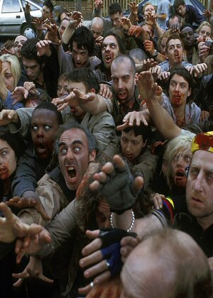
Let's ruin everyone's fun by listing all the ways in which zombies can't work, couldn't happen, and don't make sense.
Internet News is All Wrong
Why is internet news so bad, why do people prefer celebrity fluff, and how could it be made better?
Push the Button!
Scenes from Half-Life 2:Episode 2, showing Gordon Freeman being a jerk.
The Plot-Driven Door
You know how videogames sometimes do that thing where it's preposterously hard to go through a simple door? This one is really bad.
Programming Language for Games
Game developer Jon Blow is making a programming language just for games. Why is he doing this, and what will it mean for game development?
Very nice. I’ll have to try Inkscape myself at some point, then.
EDIT: ZOMG First!
Wild guess based on the small clip you’ve given us: Will you change the smaller letters to read “Shamus Young” instead of Twenty Sided?
Huckleberry: Yes.
I’m curious, what file format do you need to supply your logo in?
I am impressed. Thats a pretty quick learning curve. Makes me want to try it, despite having absolutely no need for it (and no time either).
I would have recommended Adobe Illustrator. It’s the most versatile vector tool I know, even if it is one of the harder ones to understand if you have never touched an Adobe graphics program.
Great job on the logo! I like this larger outline
Agreed, Inkscape is awesome. Some of us use it for Darths & Droids (latest strip I made with it was this one).
Inkscape is an astounding piece of software. Having used every single vector drawing package out (I owned CorelDRAW when it still used the Waldo logo) I can say that Inkscape’s workflow makes creating and designing a joy. More often than not I don’t need to boot up Photoshop. You’ve made a great choice in going with Inkscape and I can’t wait to see what you do with it!
I LOVE Inkscape. Use it for my RPG mapping, because it’s basically a direct feed from my brain to the image. The only thing that would make it any better is if I could use it on a Cintiq…
two words: vector magic… http://vectormagic.com/home
useful for situations where you cant recreate the logo/artwork for whatever reason (like if you hadnt been able to find the font)
Inkscape has Potrace built in, it performs the same task and is integrated very cleanly.
Inkscape has Potrace built in, it performs the same task and is integrated very cleanly.
@Julian – Inkscape is free
A few notes:
Inkscape does work with tablets, but support is not perfect. I’d wager using a cintiq with inkscape is not the same experience it is as using a cintiq with Adobe’s programs, but it is sensitive to pressure levels, and has several other features designed specifically for use with a tablet.
Second, it is completely open source, and produces text-based vector files–these compress VERY nicely. I can take a 3MB .svg file from inkscape and compress it to less than 1 MB. Easily. The other really nice thing about working with inkscape is that it because it is vectors, you can take an image and blow it up to gargantuan proportions in a way you could never do with other programs. I love it.
I made a game board that I print at 24 by 24 inches using inkscape, and it handles it pretty nicely. If only my computer was up to snuff!
I only use it for whipping out editable dnd maps and Order of the Stick spoofs but I guess it really works for anything…
The new logo is up, noticing pixels on the slants, did you export a png or keep the svg?
GeneralBob: Both. I exported as PNG for use her on the site, since I needed the transparency. I saved as svg for use later. And I saved as eps for sending off to marketing.
I see the pixelated edges on the W, and I must have botched the resize.
Have you considered putting a d20 in the middle of Y and S?
SolkaTruesilver:
I think a d20 would really help bring the logo in line with the rest of the site. The problem is that the shadows and reflections create an implied surface, and I’d need the d20 to look like it was resting on – and reflected by – that surface. If I just drop the “official” site d20 into the logo, it looks out of place. One of these days I might bust out the camera and take a low-angle shot of the ‘ol d20 and see how it looks.
Julian suggested Illustrator, which is fine if you don’t mind paying a fortune. Also, it is one of the weirdest and, I find, most complicated to use vector app out there. It can do some fantastic things but it takes you much longer than it should to get you there. Also, after years of using Freehand, it took me ages to work out how the heck to do just about anything in Illustrator.
By the way, Shamus, nice one on the logo. Speedy!
I see. How about photoshoping the shadow out of the site’s d20, and then adding a pseudo-reflection to make it fit the rest of the letters?
It’s impressive that you got it that fast, but somehow, I think the older one looked nicer. I can’t see it anymore to compare, but something about the outlines around the letters and something different with the reflections is making it look odd to me. But that could just be because I was used to the other one, and I might like this one fine after a little while.
I’m surprised at things people do in Inkscape. Here’s the Chris Fritz’s series:
http://thepinksylphide.com/2009/02/06/inkscape-web-comic-tutorial-border-breaking-balloons
Well done on the new logo shamus.
@cuthalion
The old chaotic evil logo is still up, you can compare to that ;) I don’t think shamus has made a red version (yet). You would need to be fast though, I think shamus will need only a few minutes after reading this to change it.
Yes! I called it! *childishly joyous*
Also: nicely done, in my completely uneducated opinion.
Inkscape is one of the better graphic programs to come out of the opensource movement. It definitely gives Adobe Illustrator a run for its money, it compares better than when you compare Gimp with Photoshop.
A weird use case that I had for Inkscape once was when my team mate made the map editor for our game using inkscape. It worked pretty well too, the secret sauce is the XML file that SVG files actually are.
Could whip up a 3d cg d20, but not with vector graphics. Would any other form be acceptable if the res were high enough? A d20 skin would be needed, preferably in spherical coords.
Thanks for the offer. But I already sent in the logo.
Maybe next time I fiddle with the site I’ll bust out the camera and put that d20 in there.
This may be the best endorsement for any software I’ve ever seen. That result, coupled with that learning curve, is just bleedin’ impressive.
Ahem.
Inkscape. Is. AWESOME.
…
That is all.
a+ dumps |