 T w e n t y S i d e d
A couple of weeks ago I mentioned that the marketing division of Twenty Sided (a subsidiary of ShamusYoung.com) got together and designed the site theme currently on display. I must admit I’m just a sucker for this “stuff-made-of-iPod-plastic” look. I really like the new Batrock layout, and it’s Orange for crying out loud. You could probably sell me a paisley design if you put a coat of gloss over it first.
Shawn linked to this collection of corporate themes, remixed in the plastic style. It’s supposed to be a joke, but I like them. I realize now that the plastic style is going to be my leisure suit, my paisley shirt, my mullet: It’s going to be the style I cling to when sexier, trendier people have moved on. I’ll still be using it when the look has become so old that it’s synonymous with “old fogey”.
On the web, I think that takes about ten minutes.
Shamus Young is a programmer, an author, and nearly a composer. He works on this site full time. If you'd like to support him, you can do so via Patreon or PayPal.
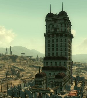
Tenpenny Tower
Bethesda felt the need to jam a morality system into Fallout 3, and they blew it. Good and evil make no sense and the moral compass points sideways.
Mass Effect Retrospective
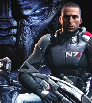
A novel-sized analysis of the Mass Effect series that explains where it all went wrong. Spoiler: It was long before the ending.
A Lack of Vision and Leadership

People fault EA for being greedy, but their real sin is just how terrible they are at it.
Crash Dot Com
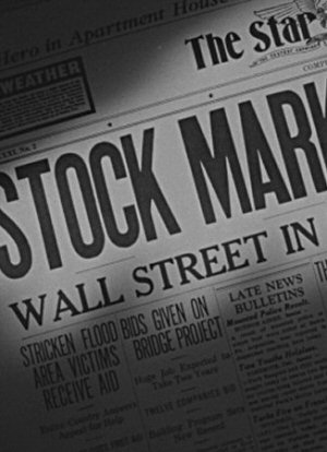
Back in 1999, I rode the dot-com bubble. Got rich. Worked hard. Went crazy. Turned poor. It was fun.
Was it a Hack?

A big chunk of the internet went down in October of 2016. What happened? Was it a hack?
They say everything old becomes new again. You just have to stick around until ‘Plastic Gloss Chic’ gets picked up by the retro hipsters of the future.
Then you’ll be the cat’s pajamas!
You can redesign the website every year to match the color scheme and glossiness (or lack thereof) of one of your other twenty sided dice. That way nobody can accuse you of following clichéd trends. You can simply retort, “It’s a dice theme!”
You’re not alone; I like them too. I don’t care if it’s used everywhere. It looks good.
This sort of sparse, cutesy theme is used extensively on the Wii, too. Pretty soon, we’re all going to start decorating like the future presented in Woody Allen’s “Sleeper.” ;^)
See, I’ve already moved on to the next big thing, minimalist website that are missing the vast majority of their pages/content!
http://shawntionary.com/
It’s like the new 1997.
Honestly, I think I’m fine with any decent looking website, unless it’s one that I write on. In which case I’ll be hideously ashamed of its sparse look.
By the way, Shawn: how are you gonna make this year’s Rent? Needs more frames!
On the page of corporate upgraded symbols, did anyone else get a laugh out of “Quakr 2.Oats” lol
Gahaz: “On the page of corporate upgraded symbols, did anyone else get a laugh out of “Quakr 2.Oats” lol”
Yeah, and the Krispy Kreme’s “2.0ughnuts” right next to it. Both gave me a good giggle.
And I love how many of the “web 2.0” icons have their words reduced to txts, like McDnlds, or Pfizr. Great eye for the parody, Shawn. :D
I never insult anybody’s webdesign unless it isn’t properly functional or is so difficult to navigate that I give up trying. I think that’s probably because my all-time-favorite color scheme involves black background with text in #0080FF and hyperlinks in #D80883 and a big logo in those colors with the “neon” effect. Yes, it’s exceptionally tacky and yet I love it. So who am I to judge? If you like plastic, make it plastic.
Maybe I’m weird too, but I also like glossy… though not so much the reflections. Just the glossy on the logo itself. It doesn’t have to be sitting on a reflective surface.
BTW, Shawn, I like the new 20-sided logo as well, even if it is “out dated” in terms of web trends. However, the d20 on the left is a little dark. It’d be nice to add a little brightness to that part of the image so the detail of the die stands out a little more.
It’s 2010 already, and you still use that plastic-style title. But i like plastic :)