 T w e n t y S i d e d

Yes, I know we’re all sick to death of talking about fonts, cascading style sheets, and site layout. But it needs to be done. I mean, you wouldn’t want the site to still look like this would you? Of course not. Let’s just get it over with.
The short version: I’m nearly done tinkering with the site. Let me know if anything is still broken in terms of usability. Please be specific.
The 1,000 word version:
If you’ve ever clicked on the “archives” drop-down box above, you’ve probably noticed that this site has been running continuously since 2005. There are people old enough to vote now who weren’t old enough to read when this site began. During that time, screens have become both larger and smaller. Desktop users have embraced 16:9 jumbotron monitors while mobile users have created a demand for sites that can be comfortably read on a five-inch screen.
The well of content is deeper and the needs of the readership are more complex. This wouldn’t be a big deal if I was one of those fancy professional web developers with hipster glasses, an iMac, and a $10 Starbucks coffee too complex to pronounce. But I’m an aesthetically numb engineer and I’m mostly half-assing my way through this increasingly challenging job. Some of the challenges are just a normal part of web development, while others are problems created by past-me. (That lazy bastard.)
So let’s look at the problems I’ve left for myself. Also I’m going to “decorate” this post with archived images of how the blog looked in years past.
In the Before-Time

I was making content back when WordPress was very rudimentary. Here in 2017 it’s evolved into this turnkey platform for everyone, but back in 2005 you still needed some technical knowledge like HTML (and maybe even PHP) if you wanted to do anything more complex than post simple text articles. There were no tools for images. It freaked out when you tried to embed things. No spell checking in the editor.
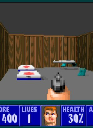
Way back in the early days of the site I used raw HTML tags to put images in posts, like so:
<center><img SRC="/twentysidedtale/images/ff7a.jpg" WIDTH=300/></center>
Which gives us:

But that was messy and cluttered up the text quite a bit in the editor, so I invented my own shortcode. Just like the shortcode you see in most forums, it was based on putting stuff in square brackets. For example, the very first DMotR comic uses this shortcode for the first image:
[image|comic_lotr1a.jpg|center|||Lord of the Rings, D&D campaign|600]
This was a terrible system, and I still wince when I see this stuff in the archives. You needed a vertical bar(??) between attributes. Attributes like image width, justification, caption, and URL link all had to be specified in a specific order. If you made any mistakes or had an incorrect space somewhere it would break the tag and screw up the post. The system was so obtuse and fiddly that even as the author of the system, it took me ages to learn to use it without making mistakes.
Sadly, I used this shortcode for years.
At some point, WordPress introduced their own style of shortcode. Theirs was way better. It had a better parser, and it was extensible to support whatever sort of markup you wanted to do, and it was less cryptic to use. Sometime in 2015 I got around to switching over to the WordPress style shortcode. For comparison, the code to embed an image these days is:
[img src="ac_batman1.jpg" title="TELL ME WHERE I CAN FIND THE RIDDLER! Or some of his trophies. Or Joker. Or the cure. Anything really. I'll be honest, I'm pretty lost tonight."]

The shortcode looks a lot like HTML, but the advantage of doing it this way is that the parser can expand the code into complex markup without me needing to clutter up my prose with paragraphs of script. That one line of shortcode can become a bunch of nested <div> tags with CSS class assignments. It can create captions, mouseover text, make it into a link, and so on.
As a result of this evolution, there are now three distinct eras of images on this site:
- Raw HTML. (Implemented back when the content was 600 pixels wide.)
- Homebrew shortcode. (Mostly used when the main column was 800 pixels wide.)
- WordPress Shortcode. (Which I implemented to be layout-agnostic and simply made all images span the entire column regardless of size.)
If you’re viewing the site on a desktop or other wide screen, you can see the transition from homebrew to WordPress happen during the Mass Effect series. At the start the images are the width of the text, and later they’re the width of the container.
Each of these image embeds works a little differently. On top of this, YouTube embeds have similarly evolved from raw code, to awful shortcode, to proper shortcode.
What a Mess

Every time I make changes to the site theme, there’s a risk I’ll break something back in the archives. I’ve tried to exhaustively check my work before updating the theme, but there’s just so much to check. Old YouTube embeds. New Youtube embeds. The three eras of images. The Diecast. Short comments. Wide comments. Posts at the start, middle, and end of a series. Standalone pages like this one, which are distinct from posts. Tags. Archive listings. Category listings. Search results. The comment entry field.
And then I need to check the mobile versions of all of that stuff.
And then all of that stuff, both normal and mobile, on a different browser.
There’s just too much to review. Even trivial changes would take ages if I properly tested every single CSS edit. So instead I check the obvious stuff and then just upload. I’m basically crowd-sourcing the site review. I know it’s a little annoying to have things malfunction on you, but doing things this way offers more robust testing and turns a weeks-long project into something that can get done in a couple of days.
Which is to say: I’ve worked my way through the major complaints with regards to the new theme. I thought I was basically done. Mobile users seemed happy. But then a couple of days ago someone said the mobile version was “unusable”. So I guess we’ll see.
So if you’ve got problems, please speak up. Remember I might not be seeing what you’re seeing, so be specific.
Project Button Masher

I teach myself music composition by imitating the style of various videogame soundtracks. How did it turn out? Listen for yourself.
Secret of Good Secrets
Sometimes in-game secrets are fun and sometimes they're lame. Here's why.
Skyrim Thieves Guild

The Thieves Guild quest in Skyrim is a vortex of disjointed plot-holes, contrivances, and nonsense.
Trusting the System

How do you know the rules of the game are what the game claims? More importantly, how do the DEVELOPERS know?
Artless in Alderaan
People were so worried about the boring gameplay of The Old Republic they overlooked just how boring and amateur the art is.
Agh. Lots of sympathy. I hope you figure it out.
Didn’t someone tell me about a magic tool which could display a website on lots of different screen sizes or even browsers at once? I don’t remember the details, but if so it might help the “is this horribly screwed up on mobile” check.
Litmus.
It’s designed for emails, but you can chuck raw HTML at it and then select a bunch of different web based clients
Just FYI- we do have several different mobile browser testing software things? (apps? I don’t know, whatevers), but there are an awful lot of possible situations and they don’t catch everything. SO, it might work on this ipad but not that one, or vertically on kindle but break horizontally work in android on this size but weird on that size and so on.
I suppose the problem is, the really good tools are probably designed and priced around people who do web design and development full time whereas Shamus is a content producer who also manages his own code.
But in case they happen to have a solution for you, there is Browserstack. I think it supports pretty much anything you’d want to test for.
Shamus says
You have the right fandom for it. The payoff of writing for this specific niche.
You can do this in Chrome (and I imagine the other good browsers) in the dev console. In the top left there is a “device toolbar” option that lets you emulate mobile devices. Very useful and no need for extra software.
It is kind of useful. But they only support a very limited range of devices. The Galaxy Nexus, the latest two or three iPads and iPhones and beyond that, they support testing their own browser at different resolutions.
Don’t get me wrong, DevTools is amazingly good for a free tool. Learning to use it has proven to be one of my best career moves as it has earned me the reputation as the guy who can save the day when others are stuck. (We can’t afford experienced devs in case you’re wondering)
Chrome understands the advantage of making a free robust tool for developers to test their websites for Chrome. But there are still reasons to pay for a better tool for device compatibility testing.
I recently found out about this so maybe you haven’t heard it either: The Chrome dev-tools have a “mobile” option that scales the page to different phone sizes and resolutions and turns your mouse into a touch pointer. Very nice for testing mobile layouts without firing up a couple of phones.
Hi Shamus,
I am having problems with the comments: Screen test
Chrome 57 on a 1920×1080 display
Yup, I’ve seen similar behaviour – the last few letters get cut off. Same goes for footnotes when expanded that go “beyond” the text. And you can’t zoom out or scroll to the side to see it, either.
This tripped me up for over an hour.
I noticed that I was getting a horizontal scroll bar when I really shouldn’t. All the content fit properly in the space, but then there was a scrollbar at the bottom that let me scroll over into nothingness for no reason. I thought some DIV had escaped and wandered over into the whitespace. (Well, black, but you know what I mean.)
Eventually I went crazy and just started locking divs to the desired width until it went away. Then later someone said “The footnotes go off the edge of the screen” and the light FINALLY came on. When a footnote is on the far right edge of the column, its box might pass the edge of the screen. I couldn’t figure how how to constrain it to the limits of the column while also making sure the yellow box was always touching its owner. So I gave up and undid all the work.
Now if you’re on a narrow view and there’s a long footnote and it appears near the right edge of the screen, then there will be a horizontal scrollbar. This seems like the least bad option.
Nice, I had the same issue and now it looks perfectly normal.
Using Chrome on Android, and I’m still getting footnotes cutting of the side and no horizontal scroll bar.
Huzzah Huzzah for the Web Master!
It all looks “right” for me now. Thank you.
You could use a bit of Javascript to detect if you’re past a certain percentage of the screen and anchor the box to the right corner instead of the left .
I’m seeing similar right-side cut-off in Firefox mobile on android when the phone is portrait. Pinch zooming does nothing to help. If you turn the phone landscape, the full comment block becomes visible, but the it doesn’t expand to fill the screen like the post block. You end up with lots of black space on tge right and miles of comments.
Edit: Well isn’t that interesting. Between starting this comment and hitting post, it appears something got fixed. Excellent.
Issue I’m having on mobile: the comments continue off the right side of the screen and I can neither reside nor scroll to read them. Android 5.1.1 on an LG K7
Otherwise the new changes have greatly improved the mobile experience for me. Great work, Shamus!
Same. Comments don’t fit and I can’t zoom out to make them
Update: fixed now
The desktop site has thankfully been working like a charm. On mobile, the actual posts are working just fine. However, the comment section is broken.
All of the comments have their right edge cut off, and it gets worse with nested comments, and since (I assume) you set overflow_x:hidden I can’t scroll right to read them.
If it’s any help: I was using a 1280*720 resolution Samsung Galaxy J3 android-based phone
Posts in both the desktop (FF) and mobile (also FF, on Android) versions work for me, only on Android the text looks a bit funny. I’m not a typographer but I think it may be the line spacing that’s too small … ?
That’s only the posts, though … the comments seem to still have the same problem that they are always fixed-width. That means on the desktop they’re much narrower than the post, and on my phone they extend beyond the screen, and I cannot scroll sideways, so I can’t read them in portrait mode. Reply posts (on both systems) are just pushed over to the right, meaning the right borders are not flush. Looks weird, is still usable, though.
I do like that the column width on desktops will now scale to window width (to some degree) — that makes the site a lot more comfortable to read, whichever monitor I’m on, and whatever else needs space on that monitor.
Wonderful, it works for me now!
Small nitpick: The fontsize for composing comments is a bit smaller than the regular size. I’d prefer it in the regular size
Supersmall nitpick: on Firefox with Android, the “click here if you’re not a spammer” box is twice as high as it is wide. ideally, I’d like it to be wider to have a bigger target on my phone screen.
Possibly linked: the “post comment” button has good spacing on top and bottom but none on the sides.
Someone might’ve already noted this, but, on the mobile version, the footnotes run off the edge of the screen when opened, making them unreadable.
This. Have to request the desktop version to view the pop up text for notes that wind up too far right. It seems to adjust for notes around 3/4 or less across the paragraph, but further than that it gives up and rolls off screen.
Followed by 997 words.Huh…Was that planned,or have you become that good at guestimating your verboseness?
Not planned.
That’s actually pretty impressive.
One of Shamus lesser known superpowers. And now I’ll leave you with the image of him in spandex tights as is superhero tradition.
Captain guesstimation man!
I’ll – uh – be in my bunk.
If only he hadn’t cut “fuck the police” from the end, it would have been perfect.
I thought his usual sign off was, “Peace out, bitches!”
He would have said “Screw Flanders” but that’d only get him to 999. “Screw Ned Flanders” maybe?
As a person from Flanders, one of those would’ve insulted me :P
If you leave the words ‘The 1,000 word version:’ in, it becomes 1001 words.
Shamus are you going to make some form of automated script and “update” all the old image tags to the WP tagging system?
And does the starting letter on a article (I forget what these are a called) need to be that large vs the text itself? Shrinking it to 75% of what it is now would look better in my opinion.
The category, archives and twitter dropdowns aren’t tall enough. I’d say they need to be around 10% taller, and the twitter one a bit more than that.
And this is just me nitpicking but I think the carousel would look better if opacity was normal when not hovered and instead darkened when hovered, that way one does not need to move over all to see more clearly what the images are. If you don’t like darkening then you could have a black border when not hovered and a bright border when hovered, thus allowing full opacity always.
I keep reading about the twitter dropdown but all I can seee is a link. That’s actually fine for me, as I prefer Shamus’ twitter profile to that box where you never know the context of the tweets.
The thing about the link is, though, is that it’s justified. somewhat like this: “tweets_____by_______shamusyoung”
The font still seems a bit Win-7-default fuzzy to me. There’s just a slight blur or dither or something around the edges of the letters.
Oh crap! Now I can’t unsee it! Yes, there is a noticeable blur.
The outside edge of the box around every second comment has a similar blur.
The “Leave a Reply” section looks funny to me. It’s useable. Same thing with the nested comments. It works, but it looks odd. I know you’ve wrestled with it.
I like the new Twitter dropdown.
Are the comment trees supposed to not be flat on the right side? Child comments jut out further and further over the side.
I don’t get it. Are you using WordPress, yes? Changing old shortcode to new shortcode shouldn’t be that complicated. Using a ready-made template and then modifying it it’s also doable in a short amount of time.
Well, I guess you already considered all of this. I still don’t get it.
How would you go about changing old shortcode to new shortcode? I can’t think of any way to do it besides manually editing thousands of posts.
I just realized this post is the 5,000th post on the site.
So, we missed 4096 ages ago then.
Congratulations on nearly having the site working the way you want on the pentimillennial post!
Glad to see we’ve got plenty of fist puns queued up as well. :)
You could write a program to automatically edit thousands of posts.
Automatically modifying 5000 articles, 12 years’ worth of content in different ways depending on the age and who knows what else? That will break way more things than it’ll fix.
This is what I was going to suggest.
Wordpress stores all its data in a (an?) SQL compatible database, by default MySQL. You would need to make a database user account (if you don’t have one already) and then write a program that can generate SQL commands. From there it just grinds through every entry in the wp_posts table in your WP database, downloading the contents, checking the post_content and post_content_filtered fields (and maybe the post_excerpt field?) for old tag formats. When it finds one, re-arrange the tag into the new format, and push the updated string into the field. You’d want to run it on one post at a time at first of course, and probably on a copied database so you aren’t mucking with the live data.
Bonus feature is once you’ve developed the software, you could use it to procedurally generate blog posts!
Might be easier to adapt existing code. Here’s a search-and-replace program written in PHP: https://interconnectit.com/products/search-and-replace-for-wordpress-databases/
Even that seems too complicated. There has to be a way to do this with MySQL commands, but I don’t know enough about the language to know what it is.
Yeah prob easier in sql than an oo or procedural language.
Update table
Set value=some_analytic_function(value)
Where value like #shortcode test goes here#;
Some_analytic_function would prob be some combo of substring and instring functions that pulls the URL out of the shortcode and concats it into the new format
I’ve done this sort of thing pretty frequently in a much higher stakes context. Definitely do a backup first though
It’s easy to program; the problem is that you may mess up a minority of cases, and if that happens, you won’t know immediately, and fixing it way later may be a nightmare. Better to have sub-optimal stuff that works.
Assuming Shamus knows from which date to what date certain tags was used it would be safe ff he was consistent.
I highly doubt he changed from his custom to WP then back to custom again.
And from old to new WP tags well, those should have been converted already if not then they are broken currently anyway.
Every post is stored in the database. Script can go row by row, search for old pattern in the text (regex could work, or you can add some custom code to recognize specific patterns), recognize the type of pattern, parse it and convert it to the new style.
You can break things if you are not careful with such a script so it is important to change the text only if the script is 100% sure that the pattern is recognized correctly. If not, script should write a warning and you can check it manually. But I’m sure that the simplest script could solve at least 95% of the tags.
It’s not the uncertain script you should be afraid of; it’s the script that’s certain but wrong. I really wish programmers were more cautious with regular expressions, those things are dangerous.
Many tabs, ctrl+ H and generous amounts of regex.
As far as using a new theme and making it work for all his old stuff. Yeah, no. I do wordpress themes part time and no. Just no. Too much esoteric code in there, old layouts that need reset, it would take months to get it working and things would still be broken.
And yes, running a script to change out old code for new sounds simple enough but with all his changes and old stuff in there, it would break something, probably many things. Just not worth it. Really. One of those, “Oh, that is a simple thing to fix… oh on everything is broken for some stupid reason and it will now take me weeks to track down the problem,” things.
Broken video embeds.
The original postings of the first 3 seasons of Spoiler Warning have been broken for ages. They were originally uploaded on Viddler, which deliberately broke its own code to force people to pay money for it. If you check the Spoiler Warning index pages they’ll take you to the YouTube re-uploads of all the early material.
“this site has been running continuously since 2005. There are people old enough to vote now who weren't old enough to read when this site began.”
This statement confuses me. I used to a calculator to make sure, but from 2017 to 2005 is 12 years. How many six-year-olds can’t read yet?
I guess I wasn’t counting being able to read a small number of single words or three word sentences as “reading”. I suppose it’s debatable where you draw the line between “able to identify words” and “able to assimilate new information via text.”
I would have been nine years old when the site started. Yeah. I wouldn’t have understood any of this writing, and for that matter, your old games writing.
Had I been one of the lucky people to find this site when you wrote DMotR, I probably would’ve gotten the comic enough to laugh and continue reading it.
I guess I forgot how much variability there is in how soon children learn to read. My first memory is reading signs to my mother at preschool at the age of 3 or 4 and being pleased (but not surprised) when she told me I had read them all correctly.
In Shamus’ defense: Where I grew up, most children started school in the year in which they turned seven, and most children did not learn to read before school. Maybe read and write their own name, but that’s it.
I, on the other hand, have been reading every day since the procedural night time city post or maybe since the roller-coaster bowling post. I think i found shamus through escapist back when it had good articles and no videos. Was that in 2006 or 07?
This confused me as well. I learned to read when I was 3 years old. When I was 6 I was perfectly able to read complete books. I figured that was normal, but apparently, it isn’t (?).
Then again, voting age is 18 where I live, so that added a bit to my confusion.
Same for me. I actually had to pass a reading, writing and basic arithmetic test to get into my first school at age 6. It was a pretty good school, but not some fancy private school business or a school for gifted children, just a more advanced public school in my city.
Something wrong: All the images are missing in my RSS reader (inoreader)
http://www.shamusyoung.com/images/back_button.jpg <- This is what RSS sees.
http://www.shamusyoung.com/twentysidedtale/images/back_button.jpg <- This is where the image actually is.
I hereby retract all the complaints I made last week about reading the site on my phone. It’s working beautifully at the moment. The font size is easy on my old, tired eyes and the automatic word (line?) wrapping is excellent. I am neither zooming in nor scrolling horizontally. Thank you.
For the record, I am using Chrome with Android 4.4.4.
I’m not sure whether this is a bug or a feature, but I’m assuming the former, since I doubt comments are supposed to be so short (and somewhat ugly in my opinion as well, sticking out in front of one another like that) along such a horizontally long screen. Which isn’t long at all, since my laptop monitor only has 1366×768 resolution (720p, is it?).
Also, when I use Chrome’s Inspect feature to reduce the horizontal size, the comments stretch out to keep the right border almost equal to the left one (the comments still jut out of one another, but barely).
For reference, I’m using Windows 7 and Google Chrome, although the same problem persists with both Firefox and IE.
Browsing this on my phone now and it is much better now than it was and is easy to read (for me) in all orientations. So yay! That bit works at least
For people struggling with mobile, flip your phone horizontally. Vertically, some text does run off the screen.
Also, try extending the size of the Tweet box. The tweet box cuts off the bottom half of the word tweet on my laptop until I scroll my mouse over to it. This is probably too nitpicky, but it just makes the site look a little better if the box is full size. .
I am addressing you, Shamus, in regards to the tweet box.
The comments on Firefox on Linux are really messed up, just FYI — it’s not a huge deal, but it does make it look pretty wonky.
link
For that matter, the search bar/header also looks pretty weird, lots of cut-off text.
All in all, though, after a fair bit of initial skepticism, I’m really liking how the new layout/theme is coming together, especially the new backgrounds!
Wait, is that not how comments are supposed to be? I’m using Chrome (v57) on Linux and just assumed that was an intended feature of the new site layout.
I also assumed this was normal (Firefox on Windows)
Oh, I hadn’t thought of that. I hope that’s not how it’s supposed to look, I think it looks really awkward that way. But it’s also not my site, so *shrug* :)
On my iPhone, comments now look amaaaazing! As good as on the laptop (though different).
The body text, though, is super weird. It is a nice size but the leading is too small for the size. Like 12pt type on 9pt leading. It is readable but it doesn’t breathe and look inviting the way the comment text does.
Disclaimer: numbers meant as example only.
Update: body text now awesome.
When I read the site on mobile (specifically an iPhone), I can’t figure out how to dismiss footnotes once I’ve read them””short of clicking on a different footnote, which simply moves the problem from place to place in the article.
Oh yes, this is true. But it was true for the previous theme or two as well, right?
Yes, it’s been a minor issue for at least a year. I’m surprised it hasn’t been commented about by others, or fixed. Makes me suspect that the problem is with me, so it’s good to hear that you also have this issue, BedD. I’m not crazy after all!
Clicking anywhere outside of the yellow box should dismiss it. This doesn’t happen for you?
On my iPhone, touching outside the box does not dismiss the footnote. Like Charles, the only thing I’ve ever been able to do is touch another footnote and displace the problem. I can confirm that for me at least, this has been an issue since footnotes were introduced.
This is my experience as well. I didn’t ever mention it because when I first noticed it, it seemed likely to be unfixable (sites resizing on mobile was relatively new). Now it seems like, sure, there should be a fix, but it also doesn’t seem super important, I guess.
Desktop on Chrome. The comment boxes are two-thirds the size of the main post, left-aligned, and the background image only covers the left half of the background, most of which is also covered by the comments; the right half is just black.
As a more important problem, the site occasionally stops recognizing my mouse’s scroll wheel.
I can click and do the weird “moving above the place you clicked makes the page scroll up at a speed”, but the standard “roll the wheel to move the page a set distance” only works sometimes.
I have both problems, and I’ve already mentioned the comment positioning, HOWEVER…
1) I’m pretty sure the background image is just made to fade into black after a certain distance. Here’s me zooming out the page in Google Chrome.
2) I’ve been having similar issues with the mouse wheel not working, but I believe it’s a problem of Chrome itself, as I’ve had it persist on different sites on specific tabs; copying the page link, closing the tab, opening a new tab and pasting the page there fixes it for me (at least, I assume you’re having the same problem. Maybe not.)
I can confirm that the scroll wheel thing is a Chrome issue. It’s been happening to me a lot on all sorts of different sites. Once a tab is broken it stays broken, but closing the tab then re-opening it (Ctrl+Shift+T) fixes the problem.
A minor quibble: on chrome for the iPhone 6s, when I click on a note that’s at the right edge, like number 1 of Arkham 14 when my phone is in landscape, it causes the note to extend really far downward with 1 or 2 words per line. I think this is happening because it’s using the left length as where the number is and the right is where the screen edge is, which leaves little space. Not sure if there’s a good way to fix this…
Oh man! Guys! Scroll to the top of the page and resize your browser window width! It’s so fun! Look how everything resizes and re-arranges. That’s really neat!
Which has also caused me to notice that the carousel goes away on narrow screens, and with it access to any of those links that aren’t blog post categories.
Hi Shamus.
On an iPad 9.7 inch with a 2048×1536 resolution, held horizontally, the comments look like this:
https://ibb.co/nFVCBQ
I think they would look better if they were centered instead of left-aligned, or if there was at least a margin on the left side.
Here’s a screenshot from the article:
http://ibb.co/jSWVy5
I think the title “In the Before-Time” would look better if it had the same margin to the left as the article text.
The article’s background color changes depending on the device orientation:
http://ibb.co/hD84Qk
http://ibb.co/jYZ0y5
Thanks!
The color actually changes based on width. I slipped that in there as an experiment. I sort of assumed if you’ve got a super-narrow screen then you’re on a mobile device and you probably want maximum contrast. If you’ve got a wide screen then it probably fills a lot of your vision and you don’t want to be blasted in the face with maximum white.
I don’t know if this is a good idea, but I thought I’d give it a try.
That makes sense. But I think that it’d better if a vertically held iPad (with 768 points browser width I assume) was above the threshold and still showed the non-white color. Presumably most people reading on an iPad do it at home.
I don’t know whether a threshold of 768 would include large phone screens. It’s also possible to check the useragent string instead to make this decision.
Yo, Shamus:
For a little while there, you rigged it so putting a youtube url in a comment would embed the video right in the comment, rather than just placing a link. I noticed that’s not a function anymore. Did you get tired of me responding with Blue à–yster Cult tunes and ’70’s movie clips, or does it just not currently work with the new theme and comment settings?
Oh, in case that isn’t intended behavior, I guess I should say I’m on Windows 7 with Firefox 53.0 (32bit).
That was a plugin. I disabled the plugin because it was causing other problems. I didn’t realize it was breaking the YT stuff until later. :(
Well, that’s fine I guess. I’m sure there will never come a day when the perfect response is a context-free clip of James Caan limping toward the final goal in Rollerball… *sigh*
Images aren’t loading for me in Lynx v2.8.8.
You are a bad, bad person :)
Shamus is a windows geek much more than a linux geek and may completely not get your joke here :)
I will now date myself by exclaiming “But surely this is a VMS joke!” I expect that precisely no one who reads the site to understand what I’m talking about.
My first computer access was when mom took me to her work and I used the DEC 20/60s to play “advent” (now known as The Colossal Cave Adventure). Then they got a VAX 11/750 and I could play “dungeon”(*) (which later became Zork I, II, and III by selectively breaking up the dungeon into parts for the home computer release). And in the summer of 1989 I took an assembly language class that was on VAXen of some later model (which was basically like cheating your assembler class – this was before RIS chips were popular and VAX/VMS assembly language was almost as powerful as BASIC. I mean, it had assembly level instructions for *string* handling).
But that was the last time I touched VMS. The rest of college was on Sun Sparcstations running some SYSV variant or another. My first job we were using NeXT workstations. Third job was PCs running BSDi. I believe I’ve been on Linux variants in all subsequent jobs. Somewhere in there, probably in college, I even briefly had to deal with the Alien Interpretation of uniX, ugh.
(*) There were a couple other games, including either Rogue or Hack (before it was Nethack), I forget which.
VMS? I was using Lynx on SunOS 4.1 (pre-Solaris), if I recall correctly.
That’s the name I was trying to remember! The Sys V variant. Thanks.
Anyway, I’m sure you were. That’s the lovely thing and terribly complex thing about code from that era – you could generally compile anything on anything that had a decent (i.e. not MS-DOS) operating system.
Okay, this time it’s just an image instead of a video (since I can’t make Jing make non-flash videos without paying them money, and you won’t enable your flash plugin), so I had to shrink the page down a lot to show the “issue”: https://www.screencast.com/t/BYaefVSD2
This is what the comments section looks like for me (chrome in win7, chrome is auto-updating so whatever the latest version is) — is that really the expected behavior?
Yeah, that’s what it looks like for me too (and everyone, I would guess). I think it’s intended, as that way you can more clearly see the comment nesting depth.
But… but… ragged right? really?
Yo, Shamadillo, found an obscure issue with your current style: if a numbered list goes into double digits, the numbers clash with the item text. Probably not something you’ll have to worry about every week, but there it is.
Yo, Shamalamadingdong:
One last thing I noticed. On the randomized “From the Archives” tiles linking to various stuff, you’ve got a link to something called “Final Fantsy X,” whatever that is. Didn’t take a screenshot of it the first time I saw it, and must have loaded a couple dozen pages before it finally popped up again.
‘Final Fantsy X’ is supposed to link to a series of comment articles by some guy called The Rocketeer. I think Shamus writes a brief intro to each one.
I’ve seen a few people mention the comments being cutoff. Which makes me wonder if what I’m seeing is the intended behavior for them. Since for as long as I can remember the nested comments have always been completely surrounded by the original.
But who am I to judge if the comments want to break free from the confines of their predecessors?
Here’s the direct link to the capture again: http://imgur.com/a/6k1Ik
And I’m on Firefox 53.0, windows 10, 1920×1080 resolution if that helps. I think I’m seeing what I should though. At least it’s everything which is better than some.
While we’re chasing bugs, my gravatar stopped displaying on your site while I’m on my home computer. It works on other wordpress sites (this one, for example) but here it just displays the default polygon face thing.
I’m running the latest version of Chrome on Win 10.
The weird thing is it displays properly in Chrome on my chromebook, and in Chrome on my Win 7 work computer.
The reason I bring it up is because I notice it’s also broken in Firefox 53.0 in Win 10 from the “Ambitious Sloth” screenshot above, so it’s not just my one computer.
EDIT: Of course, as soon as I posted the comment it started working again, for me at least… go figure.
“So if you've got problems, please speak up. Remember I might not be seeing what you're seeing, so be specific.”
Yeah, I have to do double the work at my office because I have to do my job while also correcting a co-worker’s one, who might as well not even be here. Yet do I get recognized for this? No.
… Oh, you meant problems with the website? Yeah, none for now.
Hey, Shamus, quick question if you don’t mind me being nosy: roughly how big is your SQL database with 5000 posts in it? Kinda interested as I’ve just got a new host with a 300MB limit on databases, which isn’t even remotely a problem for a new site, but after a few years of regular posts I might well have to search for a new host (or a dedicated server). Thanks :)
This was surprisingly hard to find out, since the tool that’s supposed to accomplish this was reporting the size of all databases as zero for some reason. But using this:
http://stackoverflow.com/questions/1733507/how-to-get-size-of-mysql-database
Gave me a figure of 491MB.
So 5000 posts comes in roughly at 500MB? That keeps things pretty simple for guestimating, nice. Thanks, appreciate you taking the time :)
OR you can just do the easy thing and look in phpMyAdmin, Shamus. You goof.
phpMyAdmin reports 491MB, which is consistent with the number I got using the query in the previous comment.
The largest table is comments, which is 275MB and 399,050 rows. (Which means we’re nearing 400k comments!)
The next largest table is posts, at 137MB.
The rest are pretty tiny and not worth examining.
Ah, of course that includes comments doesn’t it, and your site is comment-heavy. Cool, so I can actually estimate a much lower overall usage for large quantities of posts. Thanks again!
Additional trivia: The images directory (not part of the database) is 1GB.
Wow, that’s actually an unexpectedly low number. On the other hand, a lot of your old images look pretty small and compressed for today’s standards.
So you’re running this site basically the same way Linus runs the (…Linux) kernel: Use general knowledge to try to make it do the right thing, test it out a bit on what you have, upload it, and let other people report bugs. (And in his case, they usually send fixes too.) When it feels like enough things have been reported, do a “final” version of that release with all the fixes.
(And then more recently, let the stable people apply other fixes that go into later versions, too, to reduce the bug count in the older releases too.)
I don’t see a problem. Crowdsourcing bugreports is a fine tradition with a long history. :-)
Category and Archive drop-downs (on Firefox) seem to be justified…left word is flush left and right word is flush right. That looks great on the “Month YYYY” pairs. It looks really weird on “Lets Play”
…Oh, it’s a picture of Cloud and Barret. I thought it was two 70’s construction workers carrying a board.
Although I’ve had no problems with the new site design on my desktop computer, when I try to view your site in portrait mode on my Samsung Galaxy Tab S (a type of tablet), neither the banner icons (shortcuts to your various series: Mass Effect, DM of the Rings, Arkham City, etc.) nor the background images to the left and right of the central article “flow” appear–the entire margin where they appear is simply gone, leaving only the column. In addition, the article flow appears squished, with a minuscule 1-milimeter margin on either side (within the white column). The text is still legible, but the narrow margins definitely affect readability. All of these issues are present on the home page as well as the individual articles.
For whatever reason, these problems only crop up when I try to view the site in portrait mode. The banner icons and article margins display perfectly fine when viewed in landscape mode.
I hope that helps. Let me know if you need me to clarify anything.
I neglected to mention this in my previous post, but the site doesn’t allow me to scroll left or right beyond the aforementioned 1 milimeter white margin while I’m viewing it in portrait mode on my tablet. The page scrolls just fine in landscape mode, though.
Found a typo in the theme. Not really a problem… maybe even intentional?
One thing that is quite annoying, which was present before the site overhaul and is still present, is the behaviour of the footnote links in an iOS browser: after clicking on a footnote link, the popup with the footnote appears and doesn’t go away no matter where I click, obstructing the normal text. The only way to make the popup disappear is to click on a different footnote, which opens a new footnote at that location.