 T w e n t y S i d e d
Before we progress to my Skyrim wrap-up, I’d like to share a few brief notes concerning art design. I don’t think I’ve ever made more than a perfunctory mention of art when talking about the previous games, and that’s because I’ve never had much of substance to say about it: Daggerfall has too many pinups, Morrowind looks weird and cool but a bit too brown, Oblivion‘s wilderness is pretty, characters across the franchise look like dollar store coloring books or pantyhose dolls. In each entry the art does a passable job of capturing a fantastical setting for the game, whether that’s a novel setting like Vvardenfel:

Or a prosaic Tolkish pastiche like Cyrodiil:

And then there’s Skyrim.

Skyrim‘s aesthetic absolutely reinforces its key setting elements: every building in Skyrim looks like you could reach out and get a splinter, the architecture is laced with recognizably Nordic flourishes and patterns, and the air has a tangible frostiness to it even when there’s no snow on the ground. But it’s that last point that speaks to what’s probably the series’ most aggressive artistic statement, and one that has mixed results: Skyrim is relentlessly desaturated.
Skyrim‘s colors are all muted and grayish, to the point where outside of the occasional flame or spell effect you’re hard-press to find a bold color anywhere. Once can pretty easily figure why: the warmest regions are meant to feel brisk, the coldest like perpetual galleries of hoarfrost and rime. When a place is cold, there’s generally more clouds; light is generally filtered, colorless, and weak. Therefore, a muted palette is a straightforward way to communicate low temperatures visually. If this was Bethesda’s goal, they’re broadly successful.
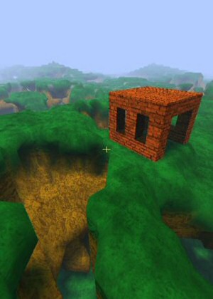
But remember that interior I showed you earlier?

There’s no windows here. All the lighting, in theory, is coming from that candelabra–or assuming we don’t insist the game’s environments have real light sources that make sense, which doesn’t seem like a whole lot to ask, the light’s coming from a magical miasma conjured by a Bard College too cheap to spring for glass or tallow. Neither demand such oppressive bleakness. Nor does the area’s context, which actually rejects that austerity: this isn’t the frozen and hostile outdoors, crawling with bandits, beasts, dragons, and the dead–it’s a nice warm safe building in a big town. It’s a building dedicated to art and culture in a vibrant fantasy setting, and it’s as depressing as a dentist’s office. In other words, while the grayness makes sense as an artistic statement in some contexts, the thoroughness with which it’s applied is overbearing. And it needn’t be this way.
Compare that shot of Riften at the top of the article to this screenshot of Cloud Ruler Temple, a frosty mountain fortress in Oblivion:

It’s absolutely a subtle thing, but note how the warmth of the orange contrasts against the noticeably blue tint of the environment. The result conveys a sense of coldness without being sterile. You can convey cold with subtle choices in coloration. You can convey cold with sound–and Skyrim does this so well in places the art is secondary. You can convey cold through NPC behavior, such as warming hands in a fire (which they do) or huddling and shivering as they walk (which they really don’t). Simply dropping the saturation is a broad and ungainly solution.
These screenshots are absolutely chosen to make my point–you could find a Skyrim screenshot that’s more colorful than an Oblivion screenshot, but I contend that you couldn’t do it quickly. The game’s visual palette is bland and its depressive effect is cumulative. What’s really interesting, however, is that this isn’t a new problem. Morrowind has borne rightful complaints about its brownish cast since release. If anything, I find it interesting that Skyrim hasn’t provoked as strong a backlash–is this because Skyrim‘s art style accomplishes its goal of making things feel cold, while Morrowind‘s patina arguably counters its exotic tone? Is it because more of Morrowind is focused on atmosphere and more of Skyrim is focused on gameplay? Or are people just better disposed toward Skyrim?
Most probably, the answer is “all of the above.”
Rutskarn is a writer, author, wordsmith, text producer, article deviser, prose architect, and accredited language-talker. If you enjoy his contributions to this site you could always back his Patreon.
The Best of 2011

My picks for what was important, awesome, or worth talking about in 2011.
Seven Springs

The true story of three strange days in 1989, when the last months of my adolescence ran out and the first few sparks of adulthood appeared.
Silver Sable Sucks

This version of Silver Sable is poorly designed, horribly written, and placed in the game for all the wrong reasons.
The Opportunity Crunch

No, brutal, soul-sucking, marriage-destroying crunch mode in game development isn't a privilege or an opportunity. It's idiocy.
Project Octant
A programming project where I set out to make a Minecraft-style world so I can experiment with Octree data.
I think one problem is that there’s rarely a noticeable shift between outside and inside like you note. People who live in cold places do not necessarily have cold interior color schemes. Stone as a building material is sturdy but also saps heat. The inside of Skyrim houses, especially rich skyrim houses, should be covered in exotic furs and rugs and tapestries.
I feel like the only place that begins to get this feeling right is the longhall in Whiterun.
It would have been very interesting if they’d used colour and light to differentiate between the richer and poorer households. Rich people could afford brightly coloured fabrics, plenty of large windows and candles at night. The poor would have only minimal colour, minimal light, plenty of dark shadows.
Of course relative wealth is difficult to measure when the Dragonborn wanders through your town loaded down with coin, precious gems, ancient artefacts and enough arms and armour for half an army after a few days of adventuring…
There is a pretty simple reason Skyrim lacks windows, because the engine cannot do it. Windows in Elder Scrolls games have to be a solid non-transparent colour since the inside of a building is completely separate from the outside. Since that kind of window looks fake as hell, Bethesda have never used them much.
In Morrowind they could actually get away with it thanks to exotic building designs, Oblivion had by far the most windows, but thy were normally nothing but background set dressing and you’d ignore them.
Or you can just do what Immersive Interiors does, and put some fake terrain outside the building. You still can’t watch someone walking past the window, but this does a pretty good job of pretending you’re in a real city.
And then they have to do it for all possible window position in every house in every city. If there’s one thing we know about Bethesda, it’s that they always take the easy, lazy way out
Is there no way of doing this quickly? these outside landscapes?
Surely you could just build one very low res city landscape and use that again and again, maybe have it automatically cull every asset not in a 180deg radius facing out from the window to cut down on the performance hit.
As for windows out in the stix, i dunno. For that one the low res outside landscape would have to be more bespoke i suppose.
Can anyone tell me why you couldn’t automatically generate one of these low LOD landscapes? Is that beyond feasibility?
Actually in retrospect, maybe the big reason they dont want to do this is because it would make things possibly a lot harder on modders. And beth kinda need their modding community.
Or, they could make the interiors and exteriors a singular map. Granted that might provide a slightly greater challenge for pathfinding and impose a higher load time, but the second is a matter of scale rather than thinking.
Not every window, every house. All you’re doing is making a low quality copy of the city outdoors zone, and then dropping it down around your high quality interior. Each window would just be looking out into different parts of the same copy of the city.
I actually attempted to hack around Morrowind’s lack of true windows by adding light sources everywhere that were scripted to move in/out at different times of day.
Trouble is, the scripting engine has never been the most reliable thing in the game either. It’d have been easy enough for Skyrim’s team to fix, they had the power to make windows do all sorts of nice effects depending on the light level outside, but I guess it just wasn’t considered to be worth the effort.
Wasn’t considered within the power of the consoles is more like it.
Remember that Skyrim is a 32 bit game running on Dx9. And on the consoles (and when it was first released on PC – though they patched in LAA later) it was limited to 2 GB of RAM.
*That’s* the hardware target they were shooting for. Its why New Vegas is surrounded by walls and is far less impressive once you get there than you were lead to believe.
The engine totally can do it. It’s perfectly possible to have all cells be directly connected, without loading screens.
Stuff like this is also possible: http://www.nexusmods.com/skyrim/mods/39208/?
However, said engine can’t do any of that on the hardware it was supposed to run on.
And to be far: The engine would still be struggling on modern, high-end PCs if everything was in the same worldspace. Skyrim’s Creation Engine was a huge improvement (*), but Bethesda’s engine is still not good at handling large amounts of NPCs.
* That is, before patch 1.9 hit and Todd you-want-spears-we’ll-give-you-spears Howard & co screwed up something with how the engine handles memory, while they got the game working properly on the PS3. At least they fixed that for FO4.
Wouldn’t windows allow heat to escape? Wouldn’t it be to their advantage to not make them so that heat remains better trapped?
They really missed a chance to make different dungeons appear rather different by using different colors of lighting. DDO does this–they have only a very few basic dungeon sets, but many dungeons still feel very unique because of some unique lighting or fog or whatever.
This difference in artstyle is one of the main reasons why I never liked running around the countryside in Skyrim (the other being mountains). It’s just much nicer to walk through a forest than it is to walk through snowy Skyrim.
They didn’t even bother to make ruin stand out from the gameworld. In Oblivion Ayleid ruins have a very distinct white artstyle that stands out from the green countryside. In Skyrim? Grey and dark grey it is.
Its funny because in real life in some of the coldest most northern places on earth colours are very vibrant
http://static.thousandwonders.net/Svalbard.Islands.original.2860.jpg
This is Svalbard one of the most northenly inhabited places on earth.
https://32minutes.files.wordpress.com/2012/10/heddal-stave-church-back.jpg
This is a some 800 year old Church on norway.
The architecture and aestethtic in Skyrim is supposed to be in-vocative of the Vikings, of the Norse. and yet its just dull, bland same colour for everything stone or wood work.
This reminds me of the church from The Vanishing of Ethan Carter… it’s been a while since I played, but I remember it looking a lot like this. I wonder if it was reference material?
Though with digital photography, there’s always the question of whether someone just moved the “vivid” slider a bit farther to the right than is faithful to the scene.
Maybe not. I know when I went to England for the first time, I was surprised to see green fields that really looked like the cover of The Fellowship of the Ring I’d grown up with, which I’d always thought was stylized and exaggerated. But the default for a lot of cameras and phones is set a little more towards “pretty” than “accurate colors”.
i can understand that. but im fortunate i live in the English countryside, and it really is green even when its raining.
The part of this comment I find difficult to believe is your implication that it is sometimes not raining.
Today we got hail instead.
Having been to Norway I can say that it is every bit as pretty as in that picture, if not more so throughout. Norway is honestly one of the most beautiful countries I’ve been to. A friend I have who lives in Norway complains about how Skyrim looks almost every time the game comes up, their chief complaint being that the mountains are wrong (too sharp).
I had a parallel experience: When I watched the making-of features of the Lord of the Rings movies, I was shocked that they had digitally enhanced the Shire’s colors, since I had grown up in a wet north-ish region where the countryside really looked like that every spring. I’d just assumed all places were brightly colored by default, whenever they weren’t hidden under three-foot snowdrifts. I guess if I had put my mistake into a book cover or video game, everyone would have just assumed I was aiming for a stylized art direction. ^_^;
That church is damn pretty. Why haven’t more game designers tried to rip it off?
It’s easy to forget the surviving medieval castles used to be comfortable living spaces, because they’ve been uninhabited for centuries. But the castles still around today are ruins. Their walls aren’t whitewashed and painted, like they would have been when they were lived in. Seeing the bare stonework of castle walls devoid of coverings and colour is like seeing the walls of your own house or apartment with bare, unpainted drywall–or maybe even bare studs without covering.
So, ive been inside of the Houses of Parliament (Westminster Palace) In London, and if you just google places like Windsor Palace (one of the oldest palace/castles in the world) you’ll see that Royal buildings tend to be lavishly furnished.
Then we see the interior of the Blue Palace (Capitol) of Skyrim where Elisef is and it does not resemble a Royal place at all, even a norse one which would you’d think have things to show the kings valor and honour or whatever, its just another stone building.
I think the artists should looked a little more at Rohan in the LoTR trilogy. The great hall was all kinds of colorful.
Colour would be wonderful, ofc you can say that in skyrim they dont do extravagance, they don’t do gold and red, but how about some nice warm woods and shit. not cold dark grey stone.
Again ofc were bemoaning the interior aesthetic choices of a 5? year old game.
People haven’t stopped bemoaning the flaws of every other piece of art in living memory. This is how we know games are art, we’re never going to stop complaining about their aesthetics.
I think the color palette was largely responsible for my dislike and swift abandonment of Skyrim. I’m a pretty visual person and I like exploring in these open world adventure games but there’s just nothing to see in Skyrim. It’s really drab. To the degree that the lived in houses look exactly like the ancient ruins.
I wonder if there are any mods that add that to the castles of Skyrim. It seems like an easy mod to add (it’s only surface textures, after all,) but it would do wonders to change the atmosphere of the keeps.
To this day, the only visual mod I’ve ever run for Skyrim does nothing but boost the saturation. It doesn’t fix all its visual problems, but it’s impressive how much that simple change does. On one hand, it’s nice that I can make things noticeably prettier so easily. On the other, it makes it odd that they left things so extreme in the first place.
The valley in which Kaer Morhan sits in the Witcher 3 felt very cold, but it’s also wonderfully colourful, one of the most beautiful areas of the game. Desaturation does not imply cold, it implies unreality and thus fantasy.
Witcher 1, on the other hand…
Skellige also comes to mind for me too.
This is my biggest problem with Skyrim. Morrowind looks alien, Oblivion looks beautiful, if a little generic, and Skyrim looks grey, grey, grey and sometimes brown if you’re lucky. It makes exploring a real chore, because everything looks the same. At least Oblivion’s copy-paste dungeons had different tilesets.
Where Oblivion resembles standard fantasy aesthetics a little too much for my taste (but looks pretty otherwise), Skyrim’s overall look depresses me. I understand the artists went for the popular mixture of “realism” and “dark and gritty” with all the black, grey, brown, white and silver, and the rough, Vikings-inspired culture. And I know that the province Skyrim has always been described as this cold, nordic, mountainous and mostly human inhabited region in previous games, so strange elvish architecture as a dominant style would look out of place. Certainly, Skyrim makes sense from an in-universe perspective. Still, there is a difference between reading about what Skyrim is like in books or hearing about it in conversations in previous games ““ and to actually experience Skyrim first hand.
A visually more interesting game, which tried to present a rough and often hostile medieval society, but nontheless had colourful clothes, armour, magic as well as strange wildlife and locations, was the first Gothic game.
I use a series of mods that make all the building textures much more vibrant and colorful. Here’s Whiterun: http://i.imgur.com/OpKkzfP.jpg
Looks pretty good, actually. What mods do you run for that?
The mods are called “Sexy Whiterun”, “Sexy Solitude”, etc. If you find one of them on Nexus there are links to all the others. Yes, they’re the worst names in the world considering the other kinds of mods there are.
I’m sure there’s a way to have a compelling art-style that’s monochromatic. But I still think that if your fans have to modify your game to make it not look bad, your game’s art-design sucks.
Bethesda was notoriously bad at this for a long time. I’m glad Fallout 4 has shown they’ve finally learned their lesson. In fact, I think the industry in general is starting to grow out of that “GRAY = GOOD GRAPHIX” mentality. Even stuff like Gears of War and Call of Duty, the mascots of bland-looking, colourless video games have gotten better at this.
On a related note, it’s been awhile since I played, but my overwhelming memory is of everyone wearing varying shades of brown and cream. Which is particularly annoying because the real-life Vikings actually had extremely colorful textiles, using a wide variety of dyes, both produced domestically and imported. Yeah, they had varying shades of brown and gray, but also reds, blues, yellows, purples, and greens. And light colors are easier to dye than darker ones (really rich colors are hard to get right–black in particular was basically non-existent).
I can only assumed you spent the majority of your time in towns, which is rather antithetical to what Skyrim represents: the frontier. I honestly cannot understand how someone can say a game that features the northern lights is bland, but I digress…
This game has one of the most effective lighting engines I’ve ever seen. It’s a level of nuance that I didn’t see in game’s prior. It evoked not just the cold of a northern climate, but subtler things like the ‘crispness’ of a sunny morning. I’ll take that restraint over garish saturation any day of the week.
Your assumption’s actually incorrect–there isn’t much to do in towns, after all. I split my time between camping outdoors and clearing out dungeons, and the whole time felt like one long rainy day.
The northern lights are pretty, but they’re an exception–same as fire, which to be honest, looks strangely wan in most screenshots. And the game’s lighting is rather well engineered, and utilizing a fan-made tweak to bring the vibrancy back turns it into a real thing of beauty.
When I went back to Oblivion to do this series it was after months of playing Skyrim, and it felt like the sun had come out for the first time in ages.
Skyrim also released at a time where desaturating your games was the cool thing to do, and everybody did it. The worst part about it is that it works incredibly badly for the medium game. A lack of colour makes reading a 3D world on a 2D plane harder. Look at the Underwater Palace in Wind Waker for a good example: It’s jarringly hard to navigate despite its simplicity, because grey-scale gives you very poor indication of depth. Or build a maze in Minecraft from Obsidian. No matter how many torches you put down, it’s shockingly difficult to figure out what is in front or back. (I did that on the 20sided minecraft server, and it was the only riddle nobody ever solved – by the way where is that server?)
What I’m trying to say: Skyrim (and Fallout 3) should sometimes use the desaturation for effect, but definitely not have it on 24/7. The very first mod that people install is a saturation shader, which all make the game look artistically worse, but at least you get some colours.
The worst thing about this is how easy it would have been to do better: Write half a dozen shaders instead of one (an afternoon’s work), and apply them depending on tile-set: Warm for heated indoor, green for ghost castles, red for caves, and so on. Doing that via mod is not easy without a performance impact (via ENB or SweetFX)
It’s very typical of Sykrim: It’s good, but even just two weeks of extra effort with developer accesses (and not just modding) would have made a huge impact. Fix the talent trees (most would be much more sensible if vertically inverted), make spells scale in damage with level, add better keybindings, add shaders, write some non-shitty dialogue.
I’d not thought about the fact that the indoors could have (and should have, if they were going for realism) had a very different feel. It’s amazing how much the color casting matters.
It’s funny, the environments come in two flavors; exterior and interior cell. Because interiors are cut off from the rest of the world, every cave, every house, every castle, temple, and ruin feels completely set apart from the world, except for the entrances and exits.
It’s bad. It’s bad that they made a beautiful world with broad views that no ruler, Jarl, or bandit king can look over from his bedroom window. Because in the Elder Scrolls so far, there are no windows, and this time it felt wrong. Every time I looked out from an outpost or tower in the wilderness, I knew what was missing. You knew it too, you just felt it but there was too much distraction.
Also for a magical world there’s precious little outside of combat, and that’s a damn shame. Even in a land somewhat hostile to magic, there should be a lot of little touches, like an NPC using Flames to spark a campfire, that just aren’t there because no one thought of it.