 T w e n t y S i d e d

Here is something I’ve been thinking about: Readers come and go. There was a time when I refreshed Lileks.com obsessively. I’m a sucker for nostalgia and ruminations on the first half of the 20th century, and if you want to cruelly mock while also secretly appreciating the quaint, kitschy, corny styles of middle America then he’s the best in the business. I’d read everything the guy wrote, and when he didn’t post new content I’d go back and re-read some of my favoritesThis retrospective on the 70s is pretty cathartic, for my money. I think that was my introduction to his work, actually.. His blog was pretty influential on my own writing and is probably why I drop into autobiographical mode once in a while.
Then one day I just… stopped. I have no idea why. James Lileks didn’t lose his mojo, sell out, offend me, or or anything else that usually causes a rift between fan and artist. I just finally got enough of whatever I was looking for, and I stopped going. I know the same thing happens to people who read this site. They eventually get enough of my crap and move on. It happens.
So part of this job is entertaining the existing audience, and part of the job is replacing people who wander off. This was really easy in 2012 when I was spamming The Escapist with content three or four times a week. I was putting up a lot of media-richThe polite way of saying “has lots of pictures”. content and all those bylines led people back here. But those days are gone.
In its day, this site was a shining Texaco station on a major highway. But now there’s an an interstate and an expressway and people don’t come this way anymore. And when we do get a visitor, they usually blow through without stopping to take in the sights. They binge on the comic or read one of my ill-advised tirades and then their taillights vanish in the distance. So it’s important to make the site interesting and eye-grabbing for new people, or I’ll eventually return to the days of obscurity.
 |
On a positive note, I’ve got about a decade of archivesThis site turns 10 in September.. And even under the harsh light of self-criticism, I can admit that some of that stuff turned out really well. I just need a way to let passers-by know that stuff is there, and hope a few of them will stick around.
If you’ve ever been on a networked site then you’ll notice that when you get to the bottom of an article it has a grid of clickbait-ish little images and captions. “Five movies that ran out of money”. “Top five wardrobe malfunctions by sitting US senators”. “Seven people that worked as rodeo clowns before becoming pediatric opthamologists”. And so on.
Yes, that content is usually trash. And even when it isn’t trash, it’s tortuously divided into tiny little snippets so you have to hit the next button and reload ads hundreds of times just to get through it. But I love the idea of getting to the bottom of an article and having the site point me in the direction of some fluffy, easily-digestible content without needing to dig for it myself.
So on Sunday I took a crack at making the same thing for this site. As of right now, now at the bottom of the page you’ll see a link to 6 different posts from the archives. I’m still fiddling with this feature. The six entries are chosen randomly from a “best of” list I’ve curated myself. If you’re curious, you can see the full list here. If there’s something you really love that isn’t on that list, let me know.
EDIT: Now there’s five, and they’re listed between the post and the comments. Seems to be working out pretty well so far.
Footnotes:
[1] This retrospective on the 70s is pretty cathartic, for my money. I think that was my introduction to his work, actually.
[2] The polite way of saying “has lots of pictures”.
[3] This site turns 10 in September.
Shamus Young is a programmer, an author, and nearly a composer. He works on this site full time. If you'd like to support him, you can do so via Patreon or PayPal.
The No Politics Rule

Here are 6 reasons why I forbid political discussions on this site. #4 will amaze you. Or not.
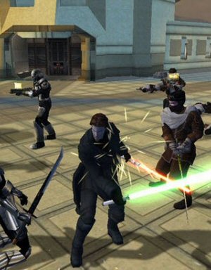
Joker's Last Laugh

Did you anticipate the big plot twist of Batman: Arkham City? Here's all the ways the game hid that secret from you while also rubbing your nose in it.
Self-Balancing Gameplay
There's a wonderful way to balance difficulty in RPGs, and designers try to prevent it. For some reason.
Video Compression Gone Wrong
How does image compression work, and why does it create those ugly spots all over some videos and not others?
Starcraft 2: Rush Analysis
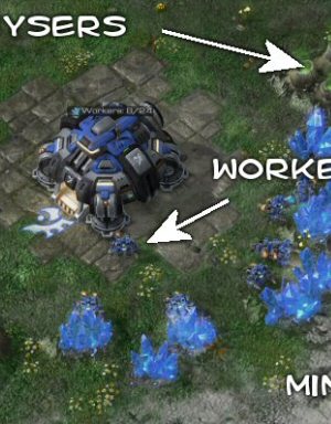
I write a program to simulate different strategies in Starcraft 2, to see how they compare.
Sorry Shamus if I have to burst your newly created bubblette.
I only see a From the archive text and no linky stuff. I am using FF35 or whatever is current.
Just thought you would like to know.
Well, there *is* an iframe (but the src-attribute has backslashes where slashes should be), but the contents just evaluates to a few empty lines and HTML-comment things.
And that thing should probably sit above the comments instead of below them, I guess?
Ah, I see the problem: It links to shamusyoung.com slash twentysidedtale slash promo (+ wrong backslashes) instead of shamusyoung.com slash promo. I.e. there’s an extra “twentysidedtale” in there.
EDIT: Oh, yes, and the extra “twentysidedtale” is because of the backslash, duh. :)
Ah! Wrong slashes. I really should have tested with other browsers. Got lazy.
I am still seeing nothing down there in FF34.
Same, I also see nothing. Not sure this is the best place though, I’d be OK with scrolling a little more to see the comments, if it means you get more new viewers
I’m also seeing nothing. I checked to see if my adblock was getting it, and discovered I didn’t have this website whitelisted at all.
But… when I added www(.)shamusyoung(.)com to my whitelist, the page did this.
P.S. Been following you for years. I rarely speak, but I enjoy most of it. :3
ETA: It changes the www(.)shamusyoung(.)com into an http:// link when I write it exactly as I added it into my whitelist! :/ That’s… inconvenient for precision. I had to add parens.
Whatever you did when you moved it fixed it. I now see links.
I can see the section myself (Chrome user here) but it looks like some escaped HTML is working its way in there. Some of the titles have a ‘br’ tag in them.
The alt text is where I’m seeing the br tags. You can see it in any of the Spoiler Warning titles in the alt text. Not that its a big deal nor is it terribly visible. Its just a quirk.
Okay. I tested it on FF and IE now like a grown-up web developer. They SEEM to be working on the latest versions of both.
If you’re viewing a single post, then the suggestions appear just before the comments. If you’re on the front page, you get a larger block of them at the very bottom.
We’ll see how this works / doesn’t work for now.
Seeing it now! :3 It’s a little weird, but I’m sure I’ll get used to it. It’s small and not really obnoxious, just new.
ETA: Okay, I feel it’s important to tell you this. Thanks to the new links, I’ve now read the part of The Witch Watch that you’ve posted, and want to buy it. :p
So congrats, there’s a bonus effect from them.
The only problem I see with it being here instead of bellow is that it uses the same border as the post/comments and is therefore broken into two rows,with a slider,which makes it ugly looking:
http://imgur.com/U1fkmgv
Same thing for me, on Chrome.
Hmm. That’s not right. What browser?
Looking at this more: I changed the CSS to make the boxes narrower, and it looks like you don’t have that update. My guess is that either your browser is caching them, or there’s some caching shenanigans between you and the site.
Does CTRL-F5 fix it?
It works now that youve changed it.Though unzooming has revealed that your background picture loops only horizontally,but cuts off vertically:
http://imgur.com/k9yrkLR
Im using opera 29.
Same is happening to me on my phone, with Chrome
I like the effect that creates when zooming the page on my phone… :)
CSS will fix that…
background-size: cover;
Professionalism!
I’ve been a regular reader/lurker here for about 5 years now (since whenever you ran that Champions Online LP) and have always been super impressed about how you continuously try and make the blog more usable and interesting!
Much better than some others I used to read that look like something from 1998.
Uhm, so the “from the archieves” is BELOW the comments?
As someone who usually doesn’t read comments on the internet, I would never ever have seen this feature by random chance…
Seconding this, it’s a weird usability thing though. If you put it before the comments, regulars who like commenting may be irked by the extra scrolling necessary to get to the comments, but where it is now is very close to invisible for the readership Shamus is trying to cultivate.
Hm. I think this warrants some discussion. For people who read the comments: How annoying is it to have to scroll past the links? And does that make the comments seem less interesting / valuable?
If the “best of” content is aimed at new readers, it should be above the comments. Comments sections can get very, very (very, very, very) long. Good posts make them even longer. It only takes a couple boring comments to make someone inclined to stop scrolling.
Agreed. This is also how most of the click-bait sites do it ( not that following them is necessarily the best road ). I read (present-tense, not past; gosh the English language is confusing) almost everything on the site, but rarely read the entire comment scroll.
I think the expectation is that it be directly below the content and before user comments. It’s not a huge amount of scrolling added.
Another vote in favour. If the “X comments–witty phrase” link lets you jump right to the comments, and it’s just a single ribbon of links/thumbnails, there shouldn’t be any problems.
Honestly, as long as the “X comments” links take me to the comments past the thumbnails, I don’t mind. It’s not like I don’t have to click that link anyway if I want to check up on a discussion I’m in from the front page.
As someone who regularly reads comments,I can say that scrolling past a ribbon to get to them would be very annoying.HOWEVER,I never scroll past the article Ive already read when reading new comments,but rather use the link that leads to the top comment instead,which is immediately below the header.So if that remained the same,I wouldnt complain where you put the best of ribbon.
It’s not so much that it is annoying, just very easy to miss/overlook/forget?
I have to say, I expected it to be between the article and the comments, if only out of tradition. If it were a thin bar of some other article links, I think it’d be fine, not too intrusive or anything. I think you perhaps don’t want it to be too tall, or people might not notice you have a lovely comments section full of intelligent good-looking people.
The comments are what keep long-time readers, but depending on how big your “from the archives” bit is, scrolling past it wouldn’t really be an issue.
Maybe place this in the right column ? There is plenty of space, users that don’t go to the end of an article can see it too and it does not interfere with users habits. However, it may be distracting (but you would still be far from the average website…).
I agree it should be above the comments. It would be bit more annoying for me to have to scroll past, but it’s probably not going to do any good at all sitting at the very bottom of the page. And as someone who loves this site and doesn’t have to pay a penny for it, I’m not going to complain where you put it!
Not annoying at all. One or two mouse wheels and you’re past the links.
Of course, since they point to actual content, instead of clickbait, they are totally worth a look.
Some sites make the comments collapsible and put that above. Or you could have a jump to comments link above the widgets so that people can click to comments or scroll without losing the draw of the clickbait section.
To be clear, it would be article, then link that jumps to comments (taking up as little vertical space as is practical) then the “Also by Author” section, then the actual comments.
Addendum: Duh! You already had a “Jump to comments” link. My face is pink.
As long as it’s only like one line of links I think above the comments works fine. Scrolling past a huge list of stuff to get to the comments is annoying, scrolling past a small box is fine.
I don’t mind it being between the article and the comments. I actually think it might need to be one line _higher_ (or at least be more visually obtrusive).
Right now there’s a visual break between the article and the links, strong enough that it’s very natural not to scroll down enough to see the links. There’s a line gap atm between the end of the article and the links, maybe if that didn’t exist the mind would naturally scroll down to read them
I read comments about as often as I don’t (mostly I look at them if it’s a discussion I want to see and/or participate in, or I’m really bored). Given the size of the links box, it doesn’t bug me at all. If it were as large as it sometimes is on the sites you reference, where the link boxes consume an entire screens-worth of real estate, that would be irritating. But that little block is no big deal. Besides, for the eager/impatient you’ve got a link at the bottom of each post to jump them straight to the comments anyway, and it leaps past the “From the archives” block, anyway.
Seeing it in action now, I’m okay with it. It’s just small enough (possibly too small? The blurb text is a bit tiny on my display) to not really impact me getting to the comments, and anyone who reads through the whole article will see it well enough. I think it should do exactly what you want it to.
It’s so tiny, I can’t imagine it would impact me much at all. In fact, I almost didn’t even notice it initially (I got distracted by one of your links and read another article before finishing this one).
Just to drop this in:
The placement is – in my opinion – much much better now.
BUT – nitpicking ahead – there’s a scroll bar on the thing now, because the Skyrim feature-text seems to be too long for the box. The /promo/index.php has several of those. Maybe it’s better to make the boxes in general bigger? Also, no idea whether or not this was mentioned somewhere here, so sorry if so.
Nice idea. You should add this very post here to that list, so that, in a moment of random irony, users may be directed to a post explaining why they are directed to others posts, where some idiot suggested in the comment section to add that very post to the list of posts users should be directed towards.
:)
Recursion must be your most liked search on google.
I’m dusting off an internet and rewarding it to you.
Nice timing, this post. As I probably belong to the Come And Go And Come variety. And today, right now, is come. Even made a gravatar, test test!!
(test test with the other email)
So,what you are saying is that you are trying to make your site more inclusive?
The solution for bringing new people in is quite simple:
Make DM of the hobbits.
The thingie is still not showing on Firefox. Other than that, what about the side bar on the right? I remember you used to have bunch of links to sites of friends and stuff there and I don’t think anybody found that bothersome.
How much do you think that the release of Good Robot could bring new people through the site?
The archives links though are a bit lost way down here at the end of the comments. And on the bigger articles which would bring new people in, they are below 150+ comments that brief visitors are not going to read through. Sort of misses the point of placing them if only people already interacting with the blog are the only ones that will end up seeing them.
Another idea is to do something like what LoadingReadyRun has on their main page. In the sidebar they have a random video link, which can sucker people in. Hell, it often has me spend time re-watching old videos when it randomly throws up something I haven’t seen in a while. Instead of being an obvious ‘look here’, it’s just a extra section on the menu that is used for each page.
FYI, I see the text that says “From the archives:”, but I don’t actually see the little tiles.
Object-Disoriented Programming!
And now I’m sitting here refreshing the page continuously to see what gets suggested to me….
Chrome (42.0), viewing the front page, the links appear *after* every article on the page. I’m not your target audience, but will someone scroll all the way down and actually see those?
ACK! Thanks for sharing that 70s retrospective by Lileks.
I’ve now wasted my entire morning reliving my childhood in all of its mustard yellow/pea green glory.
You really should do another Let’s Play. I can’t imagine that MMOs are getting less stupid and less ripe for mockery.
Or you could go avant-guard and do an Eve Online Let’s Play.
Yeah, but how many new MMOs are there? I think the last one to come out was Wildstar, right? And Shamus already tried it, found it disappointing (great sense of humor, painfully derivative gameplay) and stopped. You don’t want to make him play a game he’s already gotten bored of to feed your thirst for content, do you?
(you do, don’t you. You monster.)
I read the post. I checked the recommendations. Right off the bat, it suggests “Star Wars: Done Today.” One of my all-time favorite posts. One that’s really hard to usually find or overlook, because it’s not part of your regular content rotation.
This is 100% completely awesome feature.
Great idea! I like the principle of these things but the click-baitedness of it all is just too annoying. Doing the same thing (i.e. “if you liked this then you may like this”) without the “headlines for stoopids” is a nice feature that I approve of. :)
It’s weird to have so many of the From the Archives descriptions end in questions, especially ones that are answered in their usual descriptions. Earlier today I watched a Q&A video that Patrick Klepek of Kotaku does, and he talked about their policies for headlines. In particular, he mentioned that they aren’t allowed to have headlines that are questions that are answered by the article. If even Kotaku won’t do that anymore, I don’t think it’s a good idea that you use them.
I would also like to see the Jade Empire articles in there. Besides the Fable 2 articles, that are in there, that’s the “early” ones I remember reading on the site and really liking. Made me play Jade Empire, too.
Ok, Jade Empire will get added to the mix.
Although, I don’t understand the rationale behind “Don’t ask a question that the article answers.” Isn’t that the right thing to do? I find it obnoxious when an article poses a question but the article doesn’t really address it, or the question is poorly justified.
I agree with Shamus on this one. If I’m scrolling through and see a question posed I’m initially going to ponder that question for myself. Quick example, what DO I think about Deus Ex: HR? Do I want to know more about it? And more importantly what does Shamus think about this? If he’s posing the question then I’m interested to see what his response will be. Removing questions entirely seems a poor fix since questions promote discussion and encourage people to think and in so doing stimulate thoughtful responses. The Kotaku comment of not posing questions that get answered in the article is borderline nonsensical. If you put a question in the title then don’t answer it you’re going to piss me off and I’ll feel cheated since my time was wasted. I’m honestly perfectly happy with questions and downright prefer them since I know that when Shamus is asking questions he actually goes all in and explores all his thoughts.
Some people will simply pose a question to get conversation going among the readers and leave out their own opinion so as not to influence reader opinion unduly.
This generally seems more useful for fairly discussing politics, but I don’t feel that one method is inherently superior to another.
Cool! (About JE)
Those examples are annoying too, but I believe the thing with asking questions that are answered by the article is that those questions can easily be statements. It means one has to read to find out the answer instead of getting the answer upfront and reading to see how you came to that conclusion.
Stuck out to me because of cases like the description for Deus Ex Human revolution just saying “Is this game a masterful and cunning improvement on modern shooters, or a short, dumbed-down bastardization of its predecessor?”, while in the Spoiler Warning archive, it also answers that question with “I think we conclude that it’s kind of both.”. I think “So OF COURSE we crap all over it.” is better than “So what did we think of it?” when it comes to Skyrim, too, because it just says what to expect. It’s not a big deal, but it’s the only thing that I thought was a bit odd.
It’ll just be because of Betteridge’s Law, I suspect:
http://en.wikipedia.org/wiki/Betteridge%27s_law_of_headlines
So, assuming that’s not actually a fundamental constant of the Universe, it’s just a stylistic choice, I reckon. I wouldn’t worry about them!
Edit: Oh, hold on, we’re not talking about headlines, are we? Ignore me!; carry on; sorry.
As a side note, do the little notes underneath the titles count as a title in and of themselves? I don’t actually know. Bottomlines? Anyway the nice thing about those messages is that for everyone I’ve seen (so far, minus the question that asks if you disliked the mass effect 3 ending in which case the answer could be yes or no, though I’m willing to bet the answer for most people is yes) on the blog none of which can be answered by no. The problem is that Betteridge’s Law is there for click bait or scare articles. The articles on the blog are more discussion topics or at the very least give a question between two choices. None of these questions are strictly yes or no which again makes them useful for asking questions and developing ideas.
This is my own personal preference but going back to the Deus Ex if I had the choice of “Is this game a masterful and cunning improvement on modern shooters, or a short, dumbed-down bastardization of its predecessor?” or “This game is both a masterful and cunning improvement on modern shooters and a dumbed-down bastardization bastardization.” I much prefer the question. Regardless of format the answer will of course always be a bit of both but in what degree? Which parts are one or the other? Are there moments where it does both? I’m asking myself more questions based on the initial one whereas when I see a statement I’m more inclined to go ok it’s both lets just read the article and see what’s up then. As a person I much prefer the question since regardless of statement or question the answer is still the same but by having it in the form of a question I feel more interested in what’s about to be read.
“Lede” would probably be what you call them, although definitions & etymology are all a bit fuzzy. Either way, I agree: I can certainly get behind Grimwear’s Law of Ledes! :D
Maybe it’s related to Betteridge’s Law of Headlines?
I don’t mind them, but I think there’s a perception of them being clickbait-y, like only one step down from “List of Top X” articles. If the article’s an opinion piece (“Is UPlay the worst thing ever?”), the rhetorical question is just forcing people to click on the headline to see your stance, instead of stating it upfront (“UPlay is the worst thing ever”). If it’s just news, the question forces the reader to click to get the answer, the kind of thing the Saved You a Click Twitter account makes fun of.
You should write an article on that:
Should headlines be questions answered in the article?
And the then article starts with: “Thanks for clicking. Today, we’re going to discuss the eroding habitats of North American salmon.”
I think the important difference here is whether the headline asks a question which the article discusses to which there may be more than one answer or different experiences, or whether it is a question about a plain fact which is then answered in the article (“Did the chicken cross the road? Read to find out!”) — the latter type is stupid and should not be used.
Oh, and then there are the questions which the author is asking from the audience. Not appropriate for a news outlet, completely fine on this blog.
Wow, was just reading an old post clicking on one of the links:
“However, if other previous trends continue, then in three years Obsidian will come out with Mass Effect 2, a game which will trap you on a spaceship with a crew of dysfunctional morons and sociopaths who all hate you yet still call you their captain for no discernable reason. The gameplay will consist of navigating dialog trees which insult or infuriate you in various ways, for sixty hours, until your ship at last crashes into the sun and the game ends.”
You were wrong about one thing in that paragraph.
That is uncanny. Yikes.
I remember following Lileks avidly for a while. At some point, I just missed checking in for a day. Then it was two. *poof* Out of the habit. I did check back when I saw Jasper died, but it still didn’t turn me back to a consistent reader. It really was a simple case of the itch no longer needing scratched.
“If there's something you really love that isn't on that list, let me know.”
I am quite a fan of your piece on the ” Philosophy of Moderation “. I thought it gave a pretty good analogy for how people work on the internet and I have found it quite useful with defining how I (and others) should moderate things. Since I can’t see it on the best of list, I thought I would humbly suggest this article since I quite liked its content and what it said about how you organize this site.
I think you need more of your review stuff up there, Spec ops, Gta vs saints row, Mass effect 2:Mordin Solas, The Witcher and the Fallout 3 deconstruction (most of it is said in SW, but this is the most coherent version of it.)
Mass effect 3 dlcs,the witcher 3,lets play witcher 1+2,lets play fable 3,and all that fun stuff.
Just used it to find the post on “If Star Wars was written in 2006”, which I missed the first time round – must have been on vacation or something – and quite enjoyed. So it can work for us old farts too.
That’s a good way to get people to navigate a bit longer in the website because it doesn’t “seem” to have any menu but a large header with comic like vignettes.
This is fine for people who have a way to get your last posts like using RSS feeds as I do but others might not understand at a glance. (The main page is also hard to read and to understand what each topic is about which makes this feature even better).
Anyway, to improve the choice of archives links that get pulled out, I’d suggest picking topics that use the same tags as the current one and filling any blank spots with random.
I’d like to recommend the article on the (mis)use of colour in The Old Republic MMO by contrasting it with Guild Wars 2. I’m not sure if you want to highlight content that is mostly highlighting a misstep in design but I find them quite insightful.
When I played TOR a year or so later and I found myself impressed by how much it helped me understand why I found myself so bored with the environments. They were clearly inspired by KOTOR, a game whose design I loved, and there were certainly a lot of them yet I was bored despite being the target audience (ie a huge Star Wars nerd). Your comments on excessive expanses of a single colour combined with poorly scaled environments (seriously the heating bills must be off the charts with those ceilings) solidified why everything seemed askew for me.
Anyway I’m kind of trying to sell you on your own article here but as one last point it’s media-rich too with really lovely images! :D
I think your boxes/links are probably good idea, but there is one thing that i don’t like. The boxes you generate have different height. The 6 of them next to each other look … cluttered? for a lack of a better word. I would find them much easier on the eye if they were the same height.
Yeah, like the idea, don’t like the different heights. Chrome on Android, if it matters.
I’m, guessing this is now fixed, but the headline of the articles still varies. Leading to this zigzag effect: http://i.imgur.com/tHKLURE.png (ignore the dropshadow, that’s just Opera being fancy when I’m trying to take a screenshot).
You could fix this by giving the .bawx h2 a fixed height;
The Spoiler Warning links in the “best of” section seem to take people directly to the Youtube page for that video, instead of the blog post that has the video embedded. I think that it’s probably better to do the latter, because it means that people aren’t surprised by an auto-playing video, and it keeps them on your site (where they might look at even more of the “best of” links when they’re done).
That the grey boxes aren’t all the same height bugs my compulsive side.
It feels a bit big; perhaps only show two or three and put the descriptive text next to the promo image? Sadly I have no idea on the trade-off between “throw more spaghetti at the wall” and “don’t drown them in options.”
I don’t usually read the comments, and when I got to the end of the article it happened to land with the “X comments. (Clever comment)” line right at the bottom. Which was my signal to stop since I wasn’t interested in the comments. So I paused for a moment genuinely confused as to where the internal ads were. I’m not sure what the right answer is. Move it above the “X comments” line and I might conclude there were no comments. I’ve certainly run into this on sides with massive internal ad blocks. Putting them to the side seems like it would make sense, but banner blindness might mean they essentially disappear.
I think it’s a good idea, and had I not dug through your archives already it very well might tempt me. Heck, it might convince me to re-read something. Best of luck with it!
Imo there are too many series and not enough one-offs on the list. Makes me want to dig through the archives to find something to recommend :)
so you want to draw people into your small internet town hmm…we could build a giant dinosaur…or a monorail…maybe put a theme park in the shut down car dealers place?
on topic: this is a really interesting problem that i never would have thought of, probably part of the reason i haven’t forgotten to stop in every day. it also kind of makes me feel sad about those blogs i dont go to regularly anymore
No. Absolutely no f###ing way should this guy be let anywhere near theme park plans.
Just trust me on this.
Maybe some insane cowboy robots do the trick to attract people to oblige reading his half a website?;)
Joking aside: though I have my favorites on the site already, I hope it will work out getting people to generate traffic for you.
While I’m still highly amused by the accidental photo+caption combo…your daughter was not a life changing blunder.
You know something you could do to liven the site up a bit? Re-launch DM of the Rings in HD.
I’m serious, btw. One time I wanted to re-read it and was somewhat put-off by the low-res captured stills you originally used in order to not munch on bandwidth. The fonts are jagged too. It even put off friends of mine I recommended the webcomic to.
It’d probably be effortless, or at least much more effortless than writing everything in the first place was. You don’t even need to do it yourself, all you need is to find someone willing to do it (I’m told family makes for particularly cheap labor! Especially children.)
The links are working fine and it’s a great idea.
Just a curiosity. How are RSS readers handled by your view count? I have this site on my reader for a long time and I rarely click to read here, except when I want to comment or something you posted isn’t being properly translated to the reader.
The links are showing up great for me (chrome on windows) and I was delighted to see a link to the post on the skyrim thieves guild, which I had completely forgotten about, but which was a post I really loved. I might go re-read it.
As a side note, I actually found this site through the programming stuff (project octant specifically). I was looking for information on coherent noise, procedural content, terrain generation, etc. and I stayed because I liked the opinion pieces.
Personally I really liked your interpretations of the stories in The Path. I would argue that they would deserve being added to your best of list. Although I can also see why that might be more trouble than its worth.
I like the idea, but I already almost automatically scrolled past it without checking it out, because my mind registered it as advertisement (even though your site doesn’t do advertisement anymore!), and I suspect many other people will do this as well… You might want to fiddle with the design aspect a bit… Either that, or I’m an exception and you have nothing to worry about =P.
Super minor nitpick that will probably only make a difference to me:
I’m running Firefox but apparently have your page zoomed to 90%.
When it’s like this there is a tiny scrollbar next to the links as the text doesn’t quite cover the grey background behind them.
Aside from that it looks a bit odd to me having a whole line worth of space between “From the archives” and the top of the top of the links, but only about half a line worth of space between the bottom of the links and the top of the comments.
Hmm. This makes me wonder about analytics. You said you didn’t use Google analytics anymore, right? How do you go about determining traffic information?
Basically, I’m curious how I personally show up on the reports – I’ve been reading since what, 2008? But I don’t comment much, so I may not actually appear to be here. Of course, if you don’t actually track details like source IP and whatnot, none of this even matters. But on the other hand, I’m not enough of a web guru to even know of another tracking system apart from Google’s.
Or I could just up and say “I’m still here! Even if I’m just lurking all the time! You still have some old readers!” since that’s the gist of it.
Links working fine for me as well!
The idea of links at the bottom of pages reminds me of a thing my dad did with his website: the CorrelOracle – a bit of Perl code that scans his website looking for pages with similar words. (CorrelOracle 3 is his latest version.) I feel as if links are more attractive when they are topically related to the page at hand; I don’t know if some analogous kind of script would be feasible here.
The links look nice, and have actually sent me back to read a couple of older posts for nostalgia…
However, you said “six” links in your post, and I see five. I have no idea which is the mistake – but I thought I should point it out.
http://imgur.com/F30y1MU
The article links are completely fine (except sometimes they have a scrollbar next to them (current FF on Windows) which scrolls for about half a line of text. But since they take up so little space compared to the post and the comment section, I don’t think they really get in the way. There is a lot of space on the side, below the side bar, though, so that might be another option place to put them — advantage being that they’d appear even before scrolling to the end of an article. Disadvantage being that people with narrow screens or narrow browsing windows may not see them at all.
Yeah, so there used to be a bit more content if you count the Escapist stuff too. Were you just working more and sleeping less in those days? Or is it that the current type of stuff you’re making is more time-consuming?
I think I would totally not mind at all if Stolen Pixels or indeed a DMotR-like thing made a comeback on these pages — but I once had a taste of what burn-out is, which is making me very careful about urging people to do more work (especially for free…)
Some of the text on the recommended links is too large for the text box it’s in, which is making it so that there’s a scroll bar next to the recommended section. The Stolen Pixels recommendation is the only one I’ve noticed that has this problem so far, but to be fair, I haven’t looked for more.
Corollary: there’s some really cool stuff from the blog that I completely forgot about.
Man, this blog’s been going a long time. I feel old
I like this new feature. It’s useful but, unlike those other ones you mention, it doesn’t link to pointless crap.
More feedback: I am surprised that your “From the Archives” stuff takes you *away* from this site. :-(
After reading this post, I saw in the set a thumbnail of your Rollercoaster Tycoon thing you did. But clicking it takes you away from this site, to YouTube.
At the very least, it should have done so in a new tab/window (leaving this site intact in the browser), and at the best, it should have taken me to your actual blog post on the subject … keeping me on your site.
I’m a new reader and I have been looking through your archives chronologically. If you look back you may notice the few comments I have left behind. Your content is interesting and I doubt I would be leaving for a while. :)
Yep. I saw your comments on the old posts. I have to ask: How were you reading the archives? Was it by category, or chronologically? Or just jumping around at random?
I’m always curious what method people use.
Personally, I use a mixture of all three! So, that’s pretty helpful, I’d imagine…
By category is certainly easiest, as you have the “Previously On” & “Next On Category X’ links at the top & bottom of each post. I guess the ‘random’ delving isn’t entirely random: usually for me that means following a link within a post to another page on the site. (It feels like there almost always is at least one such link: I don’t know if it’s almost a policy to have one, but anyway, that works really well.)
One thing I got wrong when I was new around here was with the month pages. They tend to break across two or more pages, with an ‘older posts’ link at the bottom. I wasn’t really paying attention to the dates, so I assumed that clicking on that would take me to the previous month, rather than older bits of the current month. So I used the dropdown instead, and missed swathes of the month each time! This is definitely not a huge issue, but if it were a simple task with no hidden drawbacks to combine the month pages into one, that’d make chronological delving a bit easier. (I know sod-all about web-design, though, so I’ve no idea how big that ‘if’ is!)
I’ve been reading for a long time (2007?), but when I start reading an established thing, it’s almost always a couple articles that get me interested, then a full chronological, from the beginning archive binge.
Where do the text summaries come from? Some of this is pretty far back; did you give EVERYTHING a summary, just in case?
I wrote those on Sunday. To be fair, the Spoiler Warning ones were already written, I just needed to shorten a few of them.
Howabout adding PC Hardware is Toast to that list? That’s always been one of my favorite rants on the site.
I like it. It took me a while to realize that I shouldn’t just filter those out the way I do with the usual linkbait stuff at the bottom of articles, but now that I see what they actually are, I enjoy the idea of subverting that whole style with links to your own stuff.
Oh, and having them before the comments is fine, I don’t find that it diminishes the importance of the comments or anything of that nature.
Do you have the article on Self-Balancing Gameplay in the rotation? I think that was one of the ones that got me here in the first place, and even if it wasn’t, it’s one I’ve shared before and I think I’ve seen others share (like on the rpgtoolkit forums). I recommend putting that one in the archives ribbon.
Very much enjoying the new feature (your archives are more dangerous to me than tvtropes), only one suggestion…
I tend to want to watch spoiler warning episodes from your site, so I can read the intro and viewer comments, rather than go to youtube. Sadly all the spoiler warning links go to youtube. Would it be possible to link to an intermediate step (perhaps the series on the spoiler warning collection page) so that people can choose between youtube and here?
I may be an odd duck (I watch one ep and then watch the next while reading the comments on the one I just watched), but I thought it was worth asking.
Hi Shamus. I made a few small tweaks to the CSS of the snippets, nothing major but it looks a little cleaner now. Here is the jsfiddle: http://jsfiddle.net/pz98fecg/
I know I’m late to the party, because I was away and have a backlog of reading (now less than 1 month, yay!). I was wondering why the change of the site and now I understand it. I am the type that rarely comments (I think I did it only once) and I’m usually happy to just read and sometimes send a link from here to others. But I must say I don’t like the links between the main text and comment section. For me, it just makes me not looking at the comments. Maybe I’m an old person but I found this site in 2007 (yeah, DM of the Rings :D) and grew used to how it looked. I like some changes, accepted others and I guess I will have to get used to this one, too. This comment is not a rant, just a viewpoint :)
In short – Thanks for all the goodies! Keep writing and I will eventually get used to the graphical overhauls :D
PS I saw your comment about the method of reading. I try to read in chronological order (thus the current backlog). I was skipping Spoilers Warning and Diecast posts because I prefer reading but now I read the post and even occasionally watch/listen to the podcasts ;)